Measured entry
kibo-comparison
feature-gridminimal-flatmotion on file
A client-side before-and-after comparison slider shipped as source through a shadcn registry. It layers two supplied React views with an animated clipping boundary and supports drag or hover interaction. It relies on Tailwind utilities, a shadcn-style cn helper, Motion, and Lucide React.
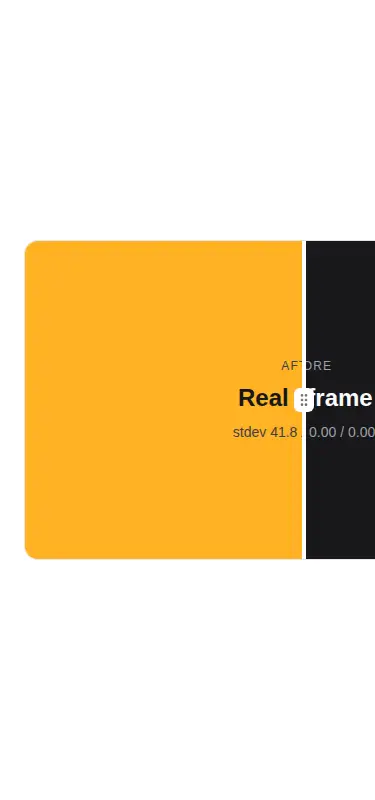
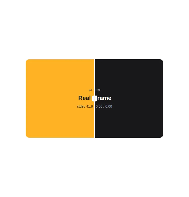
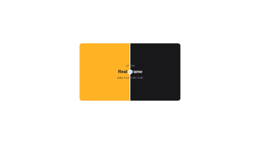
Measured
Every value below was written by the harness on the run that produced the frames above. None of it is derived from the prose.
| Build | OK |
|---|---|
| Mount | OK |
| Console errors | 0 |
| Uncaught page errors | 0 |
| Horizontal overflow | flagged at 375 |
| Axe critical | 0 |
| Axe serious | 0 |
| Axe moderate | 0 |
| Axe minor | 0 |
| Gzip marginal | 71.9 KB (137.4 KB build, 65.5 KB baseline) |
| Bare mode | OK |
| Provider required | NO |
| Demo used | written from the component source API |
Verdict
A clean, composable reveal control that builds and mounts without special providers. It is a practical pick for media comparisons, but teams should add keyboard controls and make the surrounding dimensions responsive before treating it as production-ready.
Use it if
- You need an image or UI before-and-after reveal with either drag or hover behavior.
- Your React app already uses Tailwind and can absorb Motion and Lucide React.
- You want composable comparison panels rather than an image-only widget.
Skip it if
- The comparison must fit a narrow viewport without adapting the fixed dimensions supplied by the caller.
- You need complete keyboard operation out of the box, since the slider is focusable but has no arrow-key handling.
- You want to avoid adding a substantial client-side animation dependency for one interaction.
Install
| Declared dependencies | lucide-react, motion, clsx, tailwind-merge |
|---|---|
| Missing on install | none |
| Bare install | builds and mounts without the shadcn-style helpers |
| Provider | no provider required in the harness |
In a non-shadcn project, add Motion and Lucide React, configure Tailwind, provide the background and muted foreground theme tokens used by the classes, and supply a cn utility backed by clsx and tailwind-merge. Keep it in a client-rendered React boundary.
Source and credit
This page is a review, not a copy. The component source lives with its author and this site does not republish it. Read the license before you use anything.
Author repository
github.com/shadcnblocks/kiboAlternatives
Other published entries for the feature-grid pattern, ordered by what they measured: mounts first, then clean axe scans, then bare-mode passes, then the smaller bundle.
- hyperui-feature-grids-3editorial
- Renders
- YES
- A11y
- 0
- Gzip
- 17.7KB
- Bare
- pass
- Prov
- NO
- hyperui-feature-grids-1editorial
- Renders
- YES
- A11y
- 0
- Gzip
- 17.9KB
- Bare
- pass
- Prov
- NO
- hyperui-feature-grids-4editorial
- Renders
- YES
- A11y
- 0
- Gzip
- 17.9KB
- Bare
- pass
- Prov
- NO
- hyperui-feature-grids-2editorial
- Renders
- YES
- A11y
- 0
- Gzip
- 18.3KB
- Bare
- pass
- Prov
- NO
- meraki-feature-grid-list-with-imageminimal-flat
- Renders
- YES
- A11y
- 0
- Gzip
- 18.5KB
- Bare
- pass
- Prov
- NO
- meraki-feature-simpleminimal-flat
- Renders
- YES
- A11y
- 0
- Gzip
- 20.2KB
- Bare
- pass
- Prov
- NO