Measured entry
magicui-bento-grid
feature-gridunclassifiedmotion on file
A React and Tailwind bento layout shipped as a shadcn registry item. It includes a grid wrapper and an optional hover-animated card with a linked call to action. The source expects the project's cn utility and Button component, plus React and a Radix icon package.
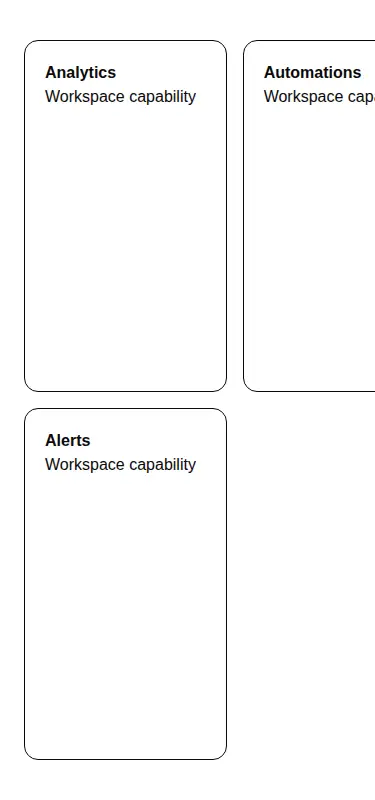
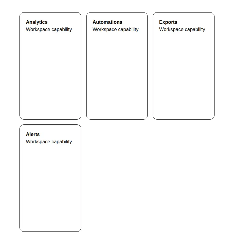
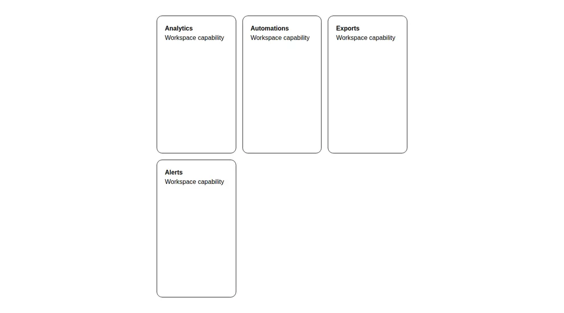
Measured
Every value below was written by the harness on the run that produced the frames above. None of it is derived from the prose.
| Build | OK |
|---|---|
| Mount | OK |
| Console errors | 0 |
| Uncaught page errors | 0 |
| Horizontal overflow | flagged at 375 |
| Axe critical | 0 |
| Axe serious | 0 |
| Axe moderate | 0 |
| Axe minor | 0 |
| Gzip marginal | 15.5 KB (80.9 KB build, 65.4 KB baseline) |
| Bare mode | FAIL |
| Provider required | NO |
| Demo used | written from the component source API |
What the harness recorded
BARE BUILD
✗ Build failed in 1.69s
error during build:
[vite:load-fallback] Could not load <sandbox>/src/lib/utils (imported by src/cut/bento-grid.tsx): ENOENT: no such file or directory, open '<sandbox>/src/lib/utils'
Verdict
A useful starting point for shadcn-based feature grids, but it is not drop-in for a bare React app. It needs a shadcn-style setup, and the default grid assumptions need responsive adjustment before narrow-screen use.
Use it if
- You need a dashboard or feature grid whose cards can supply their own spans, backgrounds, and content.
- Your app already uses shadcn conventions, Tailwind utilities, and the local Button primitive.
- You want the included card's hover reveal and linked call to action.
Skip it if
- The layout must fit narrow screens without adding responsive column rules or removing a fixed demo width.
- You want a standalone component with no project aliases or local UI primitives.
- You need cards with neutral, unopinionated styling rather than the bundled shadows, colors, and hover behavior.
Install
| Declared dependencies | @radix-ui/react-icons, radix-ui |
|---|---|
| Missing on install | @radix-ui/react-icons |
| Bare install | fails once the shadcn-style helpers are removed, so it needs that setup |
| Provider | no provider required in the harness |
In a non-shadcn project, add Tailwind processing, configure the source alias, provide a compatible cn class-merging helper and Button component with link composition, and install the Radix icon package. Alternatively, replace those local imports and the icon with equivalents from your own design system.
Source and credit
This page is a review, not a copy. The component source lives with its author and this site does not republish it. Read the license before you use anything.
Author repository
github.com/magicuidesign/magicuiAlternatives
Other published entries for the feature-grid pattern, ordered by what they measured: mounts first, then clean axe scans, then bare-mode passes, then the smaller bundle.
- hyperui-feature-grids-3editorial
- Renders
- YES
- A11y
- 0
- Gzip
- 17.7KB
- Bare
- pass
- Prov
- NO
- hyperui-feature-grids-1editorial
- Renders
- YES
- A11y
- 0
- Gzip
- 17.9KB
- Bare
- pass
- Prov
- NO
- hyperui-feature-grids-4editorial
- Renders
- YES
- A11y
- 0
- Gzip
- 17.9KB
- Bare
- pass
- Prov
- NO
- hyperui-feature-grids-2editorial
- Renders
- YES
- A11y
- 0
- Gzip
- 18.3KB
- Bare
- pass
- Prov
- NO
- meraki-feature-grid-list-with-imageminimal-flat
- Renders
- YES
- A11y
- 0
- Gzip
- 18.5KB
- Bare
- pass
- Prov
- NO
- meraki-feature-simpleminimal-flat
- Renders
- YES
- A11y
- 0
- Gzip
- 20.2KB
- Bare
- pass
- Prov
- NO