Measured entry
magicui-lens
A client-side React magnifier that renders its children twice, revealing the enlarged copy through an animated circular mask. It ships as a shadcn registry component, uses Motion for the reveal, and relies on utility classes for positioning, clipping, rounding, and stacking.

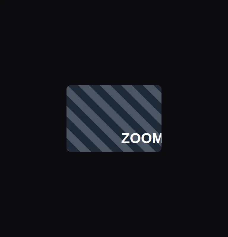
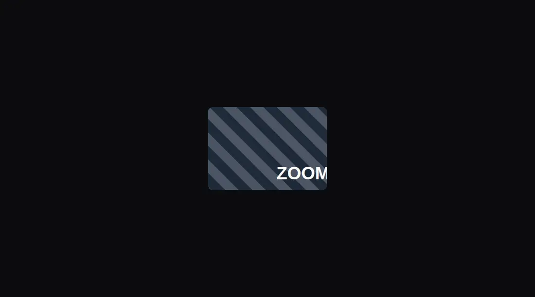
Measured
Every value below was written by the harness on the run that produced the frames above. None of it is derived from the prose.
| Build | OK |
|---|---|
| Mount | OK |
| Console errors | 0 |
| Uncaught page errors | 0 |
| Horizontal overflow | clean at 375, 768, 1440 |
| Axe critical | 0 |
| Axe serious | 0 |
| Axe moderate | 0 |
| Axe minor | 0 |
| Gzip marginal | 63.5 KB (129.0 KB build, 65.5 KB baseline) |
| Bare mode | OK |
| Provider required | NO |
| Demo used | written from the component source API |
Verdict
A focused, dependable magnifier with static and pointer-following modes. It built and mounted cleanly, stayed contained across the tested layouts, and produced no automated accessibility findings. The desktop interaction is convincing, but touch and keyboard movement need custom work.
Use it if
- You need a hover magnifier for product imagery, diagrams, or other detail-heavy media.
- You want either pointer-following behavior or a fixed lens position for a guided comparison.
- Your React interface already uses Motion and utility-class styling, or can accommodate them.
Skip it if
- Touch interaction is primary, since the moving lens listens to mouse movement rather than pointer or touch input.
- Keyboard users must be able to reposition the magnified area, since focus only supports dismissing the hover state.
- Repeating complex interactive children would create duplicate controls or confusing semantics.
Install
| Declared dependencies | motion |
|---|---|
| Missing on install | none |
| Bare install | builds and mounts without the shadcn-style helpers |
| Provider | no provider required in the harness |
In a non-shadcn React project, install Motion, copy the client component, and provide the utility classes it uses through Tailwind or equivalent CSS. Ensure the surrounding app supports client-side state and masking styles.
Source and credit
This page is a review, not a copy. The component source lives with its author and this site does not republish it. Read the license before you use anything.
Author repository
github.com/magicuidesign/magicuiAlternatives
Other published entries for the image pattern, ordered by what they measured: mounts first, then clean axe scans, then bare-mode passes, then the smaller bundle.
- magicui-androidskeuomorphism
- Renders
- YES
- A11y
- 0
- Gzip
- 17.8KB
- Bare
- pass
- Prov
- NO
- magicui-iphoneskeuomorphism
- Renders
- YES
- A11y
- 0
- Gzip
- 18.5KB
- Bare
- pass
- Prov
- NO
- magicui-safariskeuomorphism
- Renders
- YES
- A11y
- 0
- Gzip
- 20.8KB
- Bare
- pass
- Prov
- NO
- kibo-image-zoomminimal-flat
- Renders
- YES
- A11y
- 0
- Gzip
- 36.6KB
- Bare
- pass
- Prov
- NO
- ruixen-scroll-tilted-gridunclassified
- Renders
- YES
- A11y
- 0
- Gzip
- 60.5KB
- Bare
- pass
- Prov
- NO
- ruixen-glass-image-editorliquid-glass
- Renders
- YES
- A11y
- 0
- Gzip
- 65.3KB
- Bare
- pass
- Prov
- NO