Measured entry
magicui-safari
A React and TypeScript Safari browser mockup delivered as a shadcn registry component. It draws the browser chrome in SVG and can place an image or autoplaying muted video behind the viewport cutout. It has no declared third-party package dependencies, but its layout, colors, and dark theme rely on Tailwind utility classes.


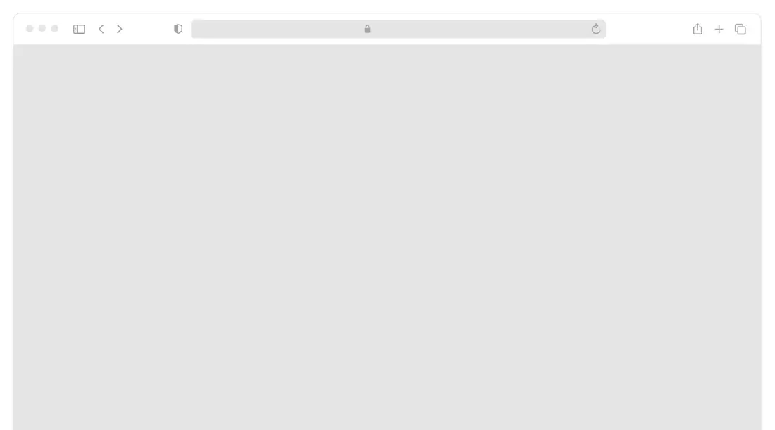
Measured
Every value below was written by the harness on the run that produced the frames above. None of it is derived from the prose.
| Build | OK |
|---|---|
| Mount | OK |
| Console errors | 0 |
| Uncaught page errors | 0 |
| Horizontal overflow | clean at 375, 768, 1440 |
| Axe critical | 0 |
| Axe serious | 0 |
| Axe moderate | 0 |
| Axe minor | 0 |
| Gzip marginal | 20.8 KB (86.2 KB build, 65.4 KB baseline) |
| Bare mode | OK |
| Provider required | NO |
| Demo used | written from the component source API |
Verdict
A focused, dependency-light mockup that builds and mounts cleanly and stays within its container across the tested layouts. It is a good fit for decorative product showcases, provided you treat the browser controls as visual chrome and address SVG identifier collisions when rendering multiple copies.
Use it if
- You need a responsive browser frame for a product screenshot or landing-page demo.
- You want to swap between an image and a looping muted video without changing the surrounding mockup.
- Your interface already uses Tailwind and can preserve the component's utility classes and dark variants.
Skip it if
- You need interactive browser controls, navigation, or an embedded live webpage.
- The framed image or video must expose meaningful alternative text, controls, or other accessible media semantics.
- You need several instances on one page without first making the SVG mask and clip identifiers unique.
- Your design should be browser-neutral rather than recognizably Safari.
Install
| Declared dependencies | none declared |
|---|---|
| Missing on install | none |
| Bare install | builds and mounts without the shadcn-style helpers |
| Provider | no provider required in the harness |
In a non-shadcn project, copy the TypeScript component into your source tree, ensure React and TypeScript JSX support are configured, and add Tailwind CSS utility processing with dark variants. If Tailwind is unavailable, replace the utility classes with equivalent positioning, sizing, color, overflow, and media-fit styles.
Source and credit
This page is a review, not a copy. The component source lives with its author and this site does not republish it. Read the license before you use anything.
Author repository
github.com/magicuidesign/magicuiAlternatives
Other published entries for the image pattern, ordered by what they measured: mounts first, then clean axe scans, then bare-mode passes, then the smaller bundle.
- magicui-androidskeuomorphism
- Renders
- YES
- A11y
- 0
- Gzip
- 17.8KB
- Bare
- pass
- Prov
- NO
- magicui-iphoneskeuomorphism
- Renders
- YES
- A11y
- 0
- Gzip
- 18.5KB
- Bare
- pass
- Prov
- NO
- kibo-image-zoomminimal-flat
- Renders
- YES
- A11y
- 0
- Gzip
- 36.6KB
- Bare
- pass
- Prov
- NO
- ruixen-scroll-tilted-gridunclassified
- Renders
- YES
- A11y
- 0
- Gzip
- 60.5KB
- Bare
- pass
- Prov
- NO
- magicui-lens3d
- Renders
- YES
- A11y
- 0
- Gzip
- 63.5KB
- Bare
- pass
- Prov
- NO
- ruixen-glass-image-editorliquid-glass
- Renders
- YES
- A11y
- 0
- Gzip
- 65.3KB
- Bare
- pass
- Prov
- NO