Measured entry
neobrutalism-sonner
A client-side Toaster wrapper that restyles Sonner with neobrutalist borders, shadows, theme colors, typography, and action states. It ships as a shadcn registry component, delegates toast behavior to sonner, reads the active theme through next-themes, and expects Tailwind plus the source project's custom design tokens.
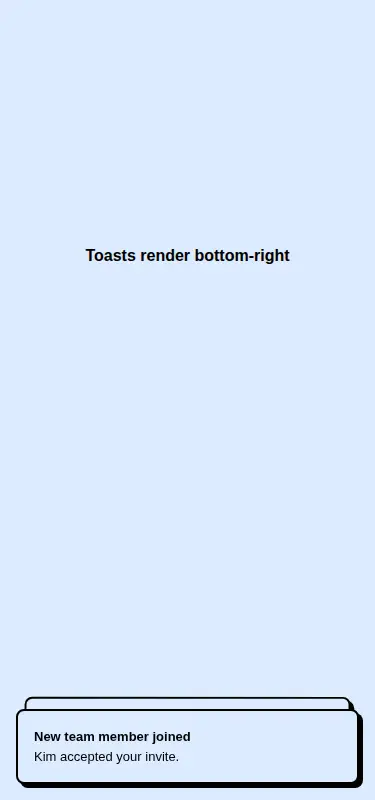
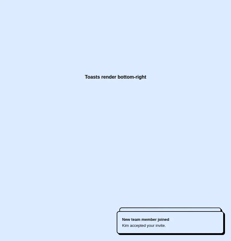
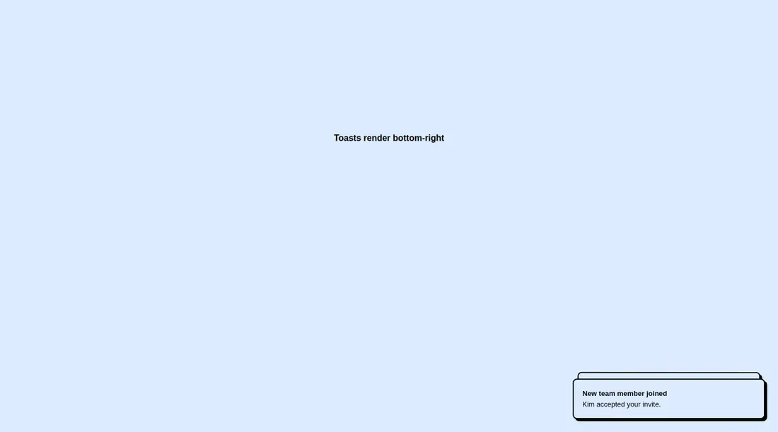
Measured
Every value below was written by the harness on the run that produced the frames above. None of it is derived from the prose.
| Build | OK |
|---|---|
| Mount | OK |
| Console errors | 0 |
| Uncaught page errors | 0 |
| Horizontal overflow | clean at 375, 768, 1440 |
| Axe critical | 0 |
| Axe serious | 0 |
| Axe moderate | 0 |
| Axe minor | 0 |
| Gzip marginal | 31.6 KB (97.1 KB build, 65.5 KB baseline) |
| Bare mode | OK |
| Provider required | NO |
| Demo used | written from the component source API |
Verdict
A sound choice for a neobrutalist Tailwind app: it builds, mounts without special shadcn plumbing, stays within the viewport, and exposes Sonner's normal API. The main tradeoff is integration work around custom theme tokens and typography, plus a noticeable dependency cost for a small wrapper.
Use it if
- You already use Sonner and want its toast behavior presented in a neobrutalist visual system.
- Your app has compatible Tailwind theme tokens for the component's colors, fonts, radius, and shadow.
- You need actionable, descriptive, loading, and error toasts from one root-level toaster.
Skip it if
- Your interface uses a restrained or platform-native style where heavy borders and offset shadows would feel out of place.
- You do not use Tailwind and do not want to translate the registry classes into your own CSS.
- You want a notification system without the added Sonner and theme-management dependencies.
- You need toast styling that can be adopted without importing or recreating project-specific design tokens.
Install
| Declared dependencies | sonner, next-themes |
|---|---|
| Missing on install | none |
| Bare install | builds and mounts without the shadcn-style helpers |
| Provider | no provider required in the harness |
Install sonner and next-themes, add the component to your client-side UI layer, and mount Toaster once near the app root. Configure Tailwind equivalents for the referenced background, foreground, border, accent, radius, shadow, and font tokens. Add a theme provider if the toaster should track an application theme.
Source and credit
This page is a review, not a copy. The component source lives with its author and this site does not republish it. Read the license before you use anything.
Author repository
github.com/ekmas/neobrutalism-componentsAlternatives
Other published entries for the alert pattern, ordered by what they measured: mounts first, then clean axe scans, then bare-mode passes, then the smaller bundle.
- 8bitcn-toastskeuomorphism
- Renders
- YES
- A11y
- 0
- Gzip
- 30.8KB
- Bare
- pass
- Prov
- NO
- shadcn-alertunclassified
- Renders
- YES
- A11y
- 0
- Gzip
- 12.5KB
- Bare
- fail
- Prov
- NO
- reui-alertminimal-flat
- Renders
- YES
- A11y
- 0
- Gzip
- 29.9KB
- Bare
- fail
- Prov
- NO
- neobrutalism-alertbrutalism
- Renders
- YES
- A11y
- 0
- Gzip
- 30.0KB
- Bare
- fail
- Prov
- NO
- shadcn-sonnerunclassified
- Renders
- YES
- A11y
- 0
- Gzip
- 31.9KB
- Bare
- fail
- Prov
- NO
- hextaui-sonnerminimal-flat
- Renders
- YES
- A11y
- 0
- Gzip
- 32.1KB
- Bare
- fail
- Prov
- NO