Measured entry
shadcn-sonner
alertunclassifiedmotion on file
A client-side Toaster wrapper around Sonner that follows shadcn's New York styling. It reads the active theme through next-themes, supplies status icons from lucide-react, and maps toast colors and rounding to shadcn CSS variables while forwarding standard Sonner props.
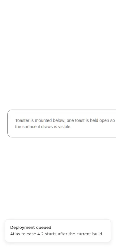
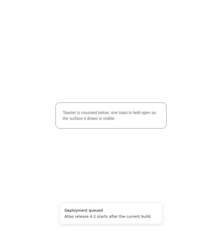
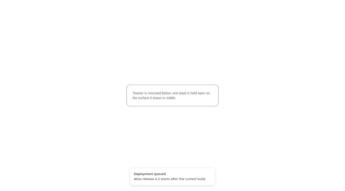
Measured
Every value below was written by the harness on the run that produced the frames above. None of it is derived from the prose.
| Build | OK |
|---|---|
| Mount | OK |
| Console errors | 0 |
| Uncaught page errors | 0 |
| Horizontal overflow | flagged at 375 |
| Axe critical | 0 |
| Axe serious | 0 |
| Axe moderate | 0 |
| Axe minor | 0 |
| Gzip marginal | 31.9 KB (97.4 KB build, 65.5 KB baseline) |
| Bare mode | FAIL |
| Provider required | NO |
| Demo used | written from the component source API |
What the harness recorded
BARE BUILD
✗ Build failed in 834ms
error during build:
[vite]: Rollup failed to resolve import "lucide-react" from "<sandbox>re-d4a1128d9630/src/cut/components/ui/sonner.tsx".
Verdict
A dependable adapter for teams already using shadcn tokens, Sonner, and next-themes. It builds and mounts cleanly without a provider in the harness, but the narrow viewport overflow deserves attention before shipping on mobile.
Use it if
- You want Sonner notifications to inherit an existing shadcn theme and token set.
- You need a small wrapper that standardizes success, info, warning, error, and loading icons.
- Your app already uses next-themes and can mount one shared toaster near the application root.
Skip it if
- Your narrow mobile layout cannot tolerate the observed horizontal overflow without additional testing or overrides.
- You do not use next-themes and want to avoid carrying a theme dependency for a toast wrapper.
- You need a fully custom notification system rather than Sonner's behavior and public API.
Install
| Declared dependencies | sonner, next-themes |
|---|---|
| Missing on install | none |
| Bare install | fails once the shadcn-style helpers are removed, so it needs that setup |
| Provider | no provider required in the harness |
In a non-shadcn project, add sonner, next-themes, and lucide-react; configure a next-themes provider if the application needs live theme switching; define the popover, foreground, border, and radius CSS variables; and provide equivalents for the Tailwind utility classes used by the wrapper.
Source and credit
This page is a review, not a copy. The component source lives with its author and this site does not republish it. Read the license before you use anything.
Author repository
github.com/shadcn-ui/uiAlternatives
Other published entries for the alert pattern, ordered by what they measured: mounts first, then clean axe scans, then bare-mode passes, then the smaller bundle.
- 8bitcn-toastskeuomorphism
- Renders
- YES
- A11y
- 0
- Gzip
- 30.8KB
- Bare
- pass
- Prov
- NO
- neobrutalism-sonnerbrutalism
- Renders
- YES
- A11y
- 0
- Gzip
- 31.6KB
- Bare
- pass
- Prov
- NO
- shadcn-alertunclassified
- Renders
- YES
- A11y
- 0
- Gzip
- 12.5KB
- Bare
- fail
- Prov
- NO
- reui-alertminimal-flat
- Renders
- YES
- A11y
- 0
- Gzip
- 29.9KB
- Bare
- fail
- Prov
- NO
- neobrutalism-alertbrutalism
- Renders
- YES
- A11y
- 0
- Gzip
- 30.0KB
- Bare
- fail
- Prov
- NO
- hextaui-sonnerminimal-flat
- Renders
- YES
- A11y
- 0
- Gzip
- 32.1KB
- Bare
- fail
- Prov
- NO