Measured entry
originui-comp-143
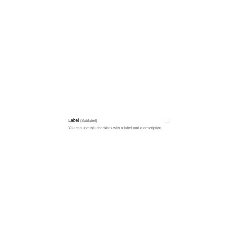
A compact checkbox row with a primary label, inline sublabel, and linked description. It ships as a shadcn registry component, composes local Checkbox and Label primitives, and relies on React useId, Radix UI, Tailwind utility classes, theme tokens, and project aliases.


Measured
Every value below was written by the harness on the run that produced the frames above. None of it is derived from the prose.
| Build | OK |
|---|---|
| Mount | OK |
| Console errors | 0 |
| Uncaught page errors | 0 |
| Horizontal overflow | clean at 375, 768, 1440 |
| Axe critical | 0 |
| Axe serious | 0 |
| Axe moderate | 0 |
| Axe minor | 0 |
| Gzip marginal | 32.7 KB (98.1 KB build, 65.4 KB baseline) |
| Bare mode | FAIL |
| Provider required | NO |
| Demo used | written from the component source API |
What the harness recorded
BARE BUILD
✗ Build failed in 4.89s
error during build:
[vite:load-fallback] Could not load <sandbox>/src/lib/utils (imported by src/components/ui/checkbox.tsx): ENOENT: no such file or directory, open '<sandbox>/src/lib/utils'
Verdict
A sensible, accessible composition for settings that need context, but it is a presentation example rather than a complete form field. It builds and mounts in the prepared harness, while a bare project fails because the local utility import is absent. It needs a shadcn-style setup.
Use it if
- You need a checkbox whose choice benefits from both a short qualifier and supporting copy.
- Your project already uses shadcn conventions, Radix primitives, Tailwind utilities, and theme tokens.
- You want the label and description wired to the control with generated identifiers.
Skip it if
- You need a standalone checkbox without explanatory text.
- Your design system does not use Tailwind classes or shadcn-style local UI primitives.
- You need a controlled value, validation state, or form-library integration included out of the box.
Install
| Declared dependencies | radix-ui |
|---|---|
| Missing on install | none |
| Bare install | fails once the shadcn-style helpers are removed, so it needs that setup |
| Provider | no provider required in the harness |
In a non-shadcn project, add the Radix checkbox dependency, equivalent Checkbox and Label primitives, Tailwind utilities and the referenced theme tokens, the project import alias, and the local class-name utility used by the checkbox primitive. Then adapt the imports to your folder structure.
Source and credit
This page is a review, not a copy. The component source lives with its author and this site does not republish it. Read the license before you use anything.
Author repository
github.com/origin-space/originuiAlternatives
Other published entries for the checkbox pattern, ordered by what they measured: mounts first, then clean axe scans, then bare-mode passes, then the smaller bundle.
- neu-checkboxneumorphism
- Renders
- YES
- A11y
- 0
- Gzip
- 17.9KB
- Bare
- pass
- Prov
- NO
- clay-checkboxclaymorphism
- Renders
- YES
- A11y
- 0
- Gzip
- 18.2KB
- Bare
- pass
- Prov
- NO
- shadcn-checkboxunclassified
- Renders
- YES
- A11y
- 0
- Gzip
- 18.4KB
- Bare
- fail
- Prov
- NO
- originui-comp-132minimal-flat
- Renders
- YES
- A11y
- 0
- Gzip
- 32.5KB
- Bare
- fail
- Prov
- NO
- originui-comp-135minimal-flat
- Renders
- YES
- A11y
- 0
- Gzip
- 32.5KB
- Bare
- fail
- Prov
- NO
- originui-comp-140minimal-flat
- Renders
- YES
- A11y
- 0
- Gzip
- 32.5KB
- Bare
- fail
- Prov
- NO