Measured entry
originui-comp-32
A floating-label email input that moves its label into the field border on focus or after text is entered. It ships as a shadcn registry component, using React's useId, an Origin UI Input primitive, Tailwind utility classes, and the clsx and tailwind-merge helpers pulled in by that primitive.
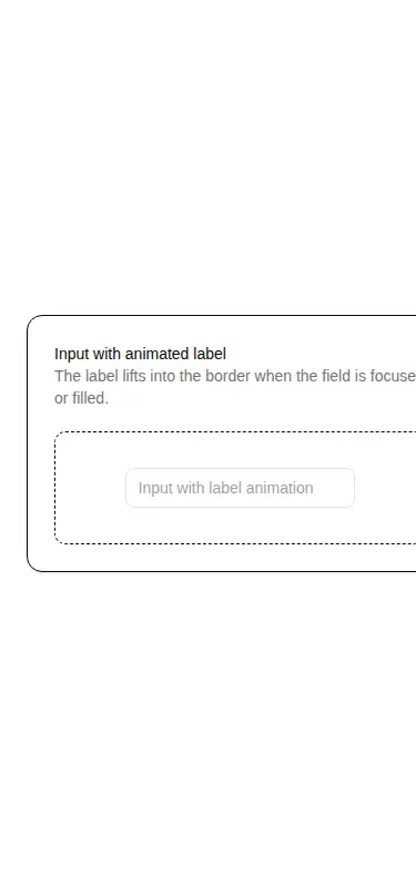
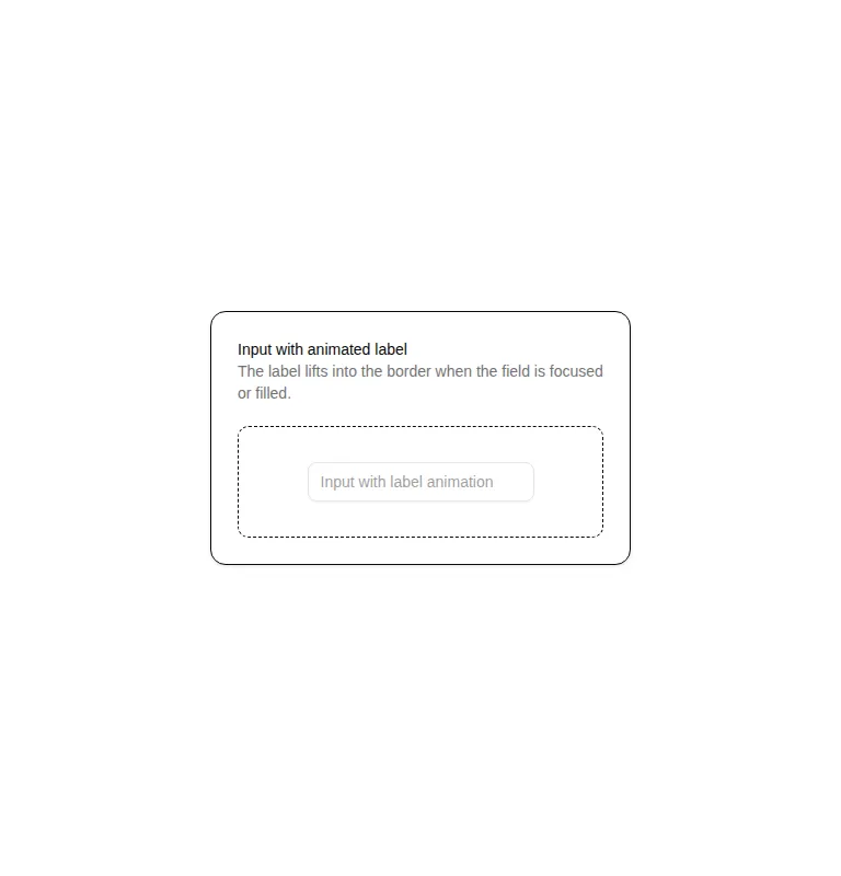
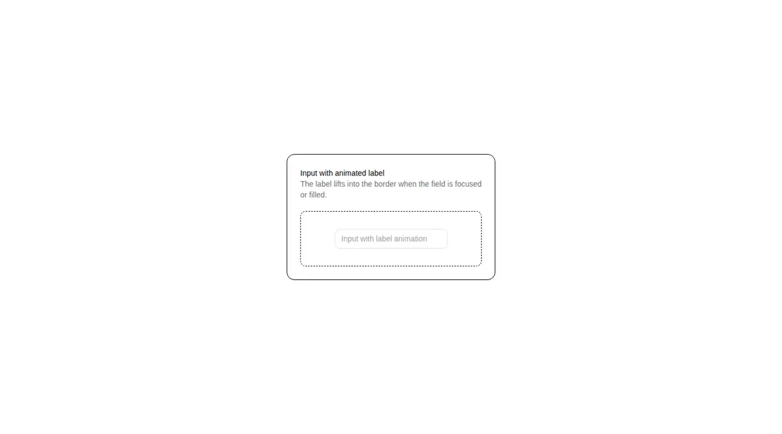
Measured
Every value below was written by the harness on the run that produced the frames above. None of it is derived from the prose.
| Build | OK |
|---|---|
| Mount | OK |
| Console errors | 0 |
| Uncaught page errors | 0 |
| Horizontal overflow | flagged at 375 |
| Axe critical | 0 |
| Axe serious | 1 |
| Axe moderate | 0 |
| Axe minor | 0 |
| Gzip marginal | 30.1 KB (95.6 KB build, 65.5 KB baseline) |
| Bare mode | OK |
| Provider required | NO |
| Demo used | written from the component source API |
Verdict
A small, focused pattern that builds and mounts cleanly, including outside a shadcn scaffold. It is a reasonable pick for Tailwind forms, but fix the muted label contrast and verify the containing layout at narrow widths before shipping.
Use it if
- You need a compact email field whose label remains visible after the user starts typing.
- Your form already uses Tailwind theme tokens and can adopt the Origin UI Input primitive.
- You want the label and control linked with a generated React identifier.
Skip it if
- Your mobile layout cannot tolerate a fixed-width demo wrapper; the narrow viewport test overflowed.
- You must ship with passing contrast checks without adjusting the muted label color.
- You need a generic text field without changing the hard-coded email type or label copy.
Install
| Declared dependencies | clsx, tailwind-merge |
|---|---|
| Missing on install | none |
| Bare install | builds and mounts without the shadcn-style helpers |
| Provider | no provider required in the harness |
In a non-shadcn project, add React, Tailwind CSS with the expected background, foreground, muted, and input theme tokens, the Origin UI Input primitive, clsx, tailwind-merge, and an alias or relative import for the primitive. Ensure your Tailwind setup supports the relational variants used by the label.
Source and credit
This page is a review, not a copy. The component source lives with its author and this site does not republish it. Read the license before you use anything.
Author repository
github.com/origin-space/originuiAlternatives
Other published entries for the input pattern, ordered by what they measured: mounts first, then clean axe scans, then bare-mode passes, then the smaller bundle.
- clay-inputclaymorphism
- Renders
- YES
- A11y
- 0
- Gzip
- 17.9KB
- Bare
- pass
- Prov
- NO
- neu-search-inputneumorphism
- Renders
- YES
- A11y
- 0
- Gzip
- 18.1KB
- Bare
- pass
- Prov
- NO
- clay-search-inputclaymorphism
- Renders
- YES
- A11y
- 0
- Gzip
- 18.3KB
- Bare
- pass
- Prov
- NO
- originui-comp-33minimal-flat
- Renders
- YES
- A11y
- 0
- Gzip
- 20.7KB
- Bare
- pass
- Prov
- NO
- hextaui-labelminimal-flat
- Renders
- YES
- A11y
- 0
- Gzip
- 31.3KB
- Bare
- pass
- Prov
- NO
- ruixen-circular-stepper-inputliquid-glass
- Renders
- YES
- A11y
- 0
- Gzip
- 61.1KB
- Bare
- pass
- Prov
- NO