Measured entry
originui-number-28
A client-side React number field with decrement and increment buttons around a centered input. It ships as a shadcn registry component, uses React Aria Components for number-field behavior and accessibility, imports Lucide icons, and expects Tailwind utilities plus shadcn-style color tokens for its presentation.
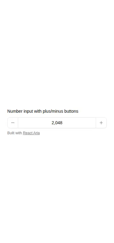
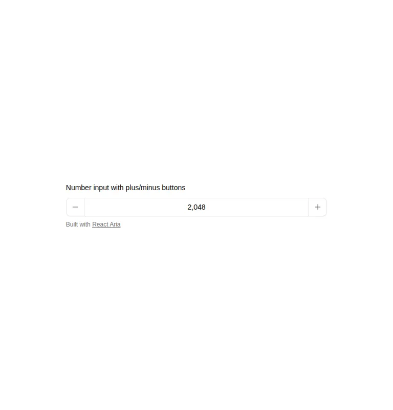

Measured
Every value below was written by the harness on the run that produced the frames above. None of it is derived from the prose.
| Build | OK |
|---|---|
| Mount | OK |
| Console errors | 0 |
| Uncaught page errors | 0 |
| Horizontal overflow | clean at 375, 768, 1440 |
| Axe critical | 0 |
| Axe serious | 0 |
| Axe moderate | 0 |
| Axe minor | 0 |
| Gzip marginal | 31.4 KB (96.0 KB build, 64.6 KB baseline) |
| Bare mode | FAIL |
| Provider required | NO |
| Demo used | written from the component source API |
What the harness recorded
BARE BUILD
✗ Build failed in 21.00s
error during build:
[vite]: Rollup failed to resolve import "lucide-react" from "<sandbox>re-fa992670370c/src/cut/components/ui/comp-28.tsx".
Verdict
A sound, compact quantity control that built and mounted cleanly, stayed within its viewports, and raised no automated accessibility findings. It is a good fit for React Aria stacks, but the fixed demo values and styling conventions make it a starting component rather than a finished form primitive.
Use it if
- You need an accessible quantity or count control with direct typing and step buttons.
- Your interface already uses React Aria Components and Lucide icons.
- You are comfortable editing the hardcoded default and minimum values to match your form state.
Skip it if
- You want a dependency-free native number input.
- Your project does not use Tailwind utilities or compatible theme tokens and you do not want to restyle it.
- You need a drop-in controlled field with domain-specific validation, formatting, or form-library wiring.
Install
| Declared dependencies | react-aria-components |
|---|---|
| Missing on install | react-aria-components |
| Bare install | fails once the shadcn-style helpers are removed, so it needs that setup |
| Provider | no provider required in the harness |
In a non-shadcn project, add React Aria Components and Lucide React, configure Tailwind to process the component classes, and define equivalents for the referenced background, foreground, border, accent, ring, muted, and destructive theme tokens. Then replace the demo defaults with your own state and constraints.
Source and credit
This page is a review, not a copy. The component source lives with its author and this site does not republish it. Read the license before you use anything.
Author repository
github.com/origin-space/originuiAlternatives
Other published entries for the input pattern, ordered by what they measured: mounts first, then clean axe scans, then bare-mode passes, then the smaller bundle.
- clay-inputclaymorphism
- Renders
- YES
- A11y
- 0
- Gzip
- 17.9KB
- Bare
- pass
- Prov
- NO
- neu-search-inputneumorphism
- Renders
- YES
- A11y
- 0
- Gzip
- 18.1KB
- Bare
- pass
- Prov
- NO
- clay-search-inputclaymorphism
- Renders
- YES
- A11y
- 0
- Gzip
- 18.3KB
- Bare
- pass
- Prov
- NO
- originui-comp-33minimal-flat
- Renders
- YES
- A11y
- 0
- Gzip
- 20.7KB
- Bare
- pass
- Prov
- NO
- hextaui-labelminimal-flat
- Renders
- YES
- A11y
- 0
- Gzip
- 31.3KB
- Bare
- pass
- Prov
- NO
- ruixen-circular-stepper-inputliquid-glass
- Renders
- YES
- A11y
- 0
- Gzip
- 61.1KB
- Bare
- pass
- Prov
- NO