Measured entry
originui-search-27
A client-side React search field shipped as shadcn registry source. It composes the registry Input and Label, Lucide search, loader, and microphone icons, React state and effects, plus Tailwind utility and theme classes. Typing triggers a simulated loader, while the microphone is only a labeled submit button.

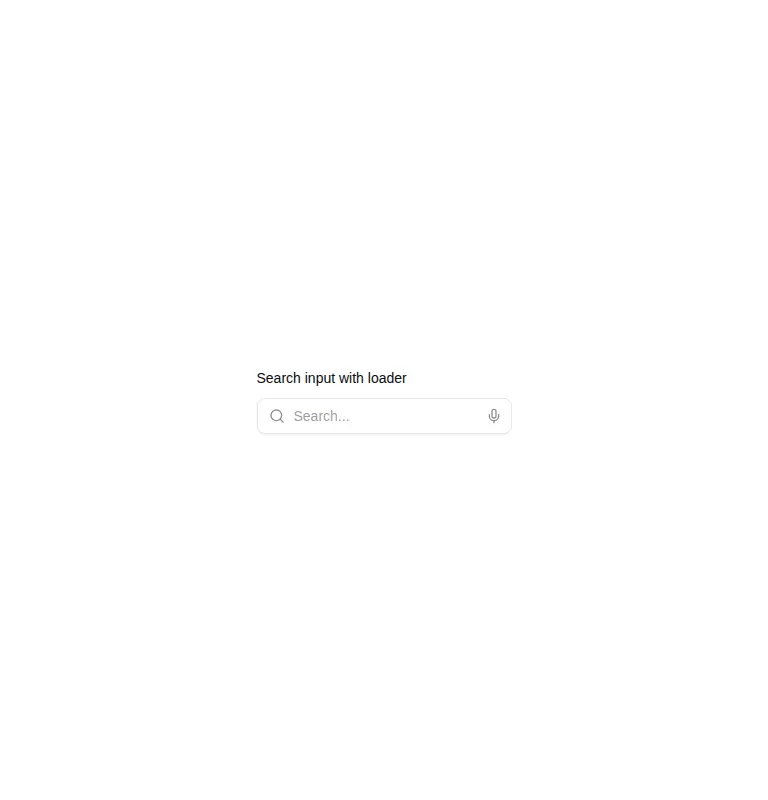

Measured
Every value below was written by the harness on the run that produced the frames above. None of it is derived from the prose.
| Build | OK |
|---|---|
| Mount | OK |
| Console errors | 0 |
| Uncaught page errors | 0 |
| Horizontal overflow | clean at 375, 768, 1440 |
| Axe critical | 0 |
| Axe serious | 0 |
| Axe moderate | 0 |
| Axe minor | 0 |
| Gzip marginal | 15.3 KB (79.9 KB build, 64.6 KB baseline) |
| Bare mode | FAIL |
| Provider required | NO |
| Demo used | written from the component source API |
What the harness recorded
BARE BUILD
✗ Build failed in 3.67s
error during build:
[vite:load-fallback] Could not load <sandbox>/src/lib/utils (imported by src/components/ui/input.tsx): ENOENT: no such file or directory, open '<sandbox>/src/lib/utils'
Verdict
A sound visual starting point with clean mounting, responsive containment, and accessible labeling in the prepared harness. It is still demo logic, not a complete search control, and it needs a shadcn-style setup before it can build or mount in a bare project.
Use it if
- You want a labeled search field with clear search, loading, and voice affordances.
- Your app already uses shadcn-style aliases, primitives, theme tokens, and Tailwind utilities.
- You plan to replace the demo timer and wire the microphone control to real behavior.
Skip it if
- You need working voice input out of the box, because the microphone has no speech logic.
- Your loading state must reflect an actual request rather than a timer started by typing.
- You need a framework-neutral input without shadcn registry imports or utility-theme coupling.
- A submit button inside the field would conflict with the behavior of an enclosing form.
Install
| Declared dependencies | radix-ui |
|---|---|
| Missing on install | none |
| Bare install | fails once the shadcn-style helpers are removed, so it needs that setup |
| Provider | no provider required in the harness |
In a non-shadcn project, add React client-component support, Lucide icons, the registry Input and Label primitives, a compatible class-merging utility, the expected import alias, and Tailwind styles with the referenced color, spacing, focus-ring, animation, and disabled-state theme tokens. Then connect loading and voice actions to application logic.
Source and credit
This page is a review, not a copy. The component source lives with its author and this site does not republish it. Read the license before you use anything.
Author repository
github.com/origin-space/originuiAlternatives
Other published entries for the input pattern, ordered by what they measured: mounts first, then clean axe scans, then bare-mode passes, then the smaller bundle.
- clay-inputclaymorphism
- Renders
- YES
- A11y
- 0
- Gzip
- 17.9KB
- Bare
- pass
- Prov
- NO
- neu-search-inputneumorphism
- Renders
- YES
- A11y
- 0
- Gzip
- 18.1KB
- Bare
- pass
- Prov
- NO
- clay-search-inputclaymorphism
- Renders
- YES
- A11y
- 0
- Gzip
- 18.3KB
- Bare
- pass
- Prov
- NO
- originui-comp-33minimal-flat
- Renders
- YES
- A11y
- 0
- Gzip
- 20.7KB
- Bare
- pass
- Prov
- NO
- hextaui-labelminimal-flat
- Renders
- YES
- A11y
- 0
- Gzip
- 31.3KB
- Bare
- pass
- Prov
- NO
- ruixen-circular-stepper-inputliquid-glass
- Renders
- YES
- A11y
- 0
- Gzip
- 61.1KB
- Bare
- pass
- Prov
- NO