Measured entry
originui-select-18
A compact React field that pairs a text input with a native suffix selector for domain-style values. It ships as a shadcn registry component and composes the project Input, Label, and SelectNative primitives, with React useId, Tailwind utility classes, the shared cn helper, and the declared radix-ui package in its install graph.


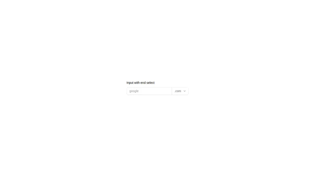
Measured
Every value below was written by the harness on the run that produced the frames above. None of it is derived from the prose.
| Build | OK |
|---|---|
| Mount | OK |
| Console errors | 0 |
| Uncaught page errors | 0 |
| Horizontal overflow | clean at 375, 768, 1440 |
| Axe critical | 1 |
| Axe serious | 0 |
| Axe moderate | 0 |
| Axe minor | 0 |
| Gzip marginal | 15.2 KB (79.8 KB build, 64.6 KB baseline) |
| Bare mode | FAIL |
| Provider required | NO |
| Demo used | written from the component source API |
What the harness recorded
BARE BUILD
✗ Build failed in 1.61s
error during build:
[vite:load-fallback] Could not load <sandbox>/src/lib/utils (imported by src/components/ui/select-native.tsx): ENOENT: no such file or directory, open '<sandbox>/src/lib/utils'
Verdict
A practical compound field with a clean native-control approach, but it should not ship unchanged because the select lacks an accessible name. It builds and mounts in the prepared harness, while a bare project fails, so it needs a shadcn-style setup and a small accessibility fix.
Use it if
- You need a text value followed by a short, fixed suffix choice such as a domain ending.
- Your app already uses shadcn conventions, Tailwind theme tokens, and the shared form primitives this component imports.
- You prefer a native select for straightforward keyboard and platform behavior.
Skip it if
- You need the selector to have an accessible name without modifying the source; the provided label names only the text input.
- Your options need rich content, search, grouping, or custom popover behavior.
- Your project does not use shadcn-style aliases and shared utilities, and you do not want to recreate that infrastructure.
Install
| Declared dependencies | radix-ui |
|---|---|
| Missing on install | none |
| Bare install | fails once the shadcn-style helpers are removed, so it needs that setup |
| Provider | no provider required in the harness |
For a non-shadcn project, add the Input, Label, and SelectNative implementations, configure the at-sign import alias, provide the cn class-merging helper under the expected utilities path, install the declared radix-ui dependency, and supply Tailwind plus the referenced theme utilities. Give the native select its own visible label or accessible label before release.
Source and credit
This page is a review, not a copy. The component source lives with its author and this site does not republish it. Read the license before you use anything.
Author repository
github.com/origin-space/originuiAlternatives
Other published entries for the select pattern, ordered by what they measured: mounts first, then clean axe scans, then bare-mode passes, then the smaller bundle.
- hextaui-native-selectminimal-flat
- Renders
- YES
- A11y
- 0
- Gzip
- 30.6KB
- Bare
- fail
- Prov
- NO
- 8bitcn-difficulty-selectskeuomorphism
- Renders
- YES
- A11y
- 0
- Gzip
- 32.7KB
- Bare
- fail
- Prov
- NO
- hextaui-checkboxminimal-flat
- Renders
- YES
- A11y
- 0
- Gzip
- 35.8KB
- Bare
- fail
- Prov
- NO
- hextaui-radio-groupminimal-flat
- Renders
- YES
- A11y
- 0
- Gzip
- 40.3KB
- Bare
- fail
- Prov
- NO
- ruixen-tag-cloud-selectunclassified
- Renders
- YES
- A11y
- 0
- Gzip
- 58.8KB
- Bare
- fail
- Prov
- NO
- tripled-animated-select-shadcnuiminimal-flat
- Renders
- YES
- A11y
- 0
- Gzip
- 60.4KB
- Bare
- fail
- Prov
- NO