Measured entry
reui-icon-stack
A compact React and TypeScript wrapper that renders a layered SVG tile with an optional child icon positioned over it. It ships as a shadcn registry component, uses Tailwind utility classes and theme tokens, and imports the local cn helper through the usual project alias. It has no declared package dependencies or provider requirement.

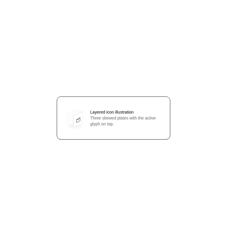
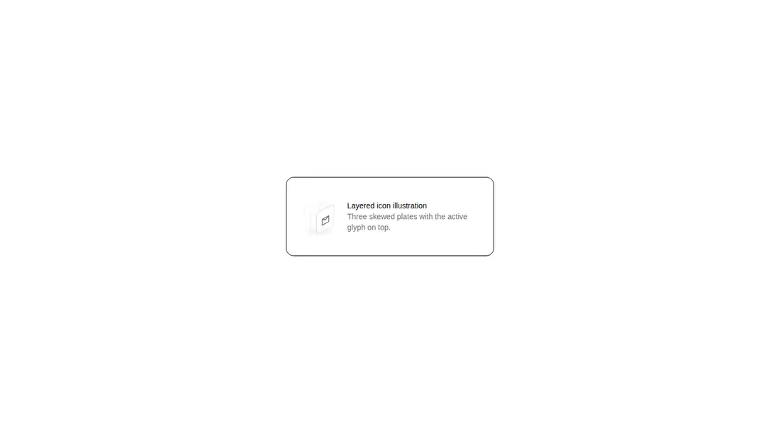
Measured
Every value below was written by the harness on the run that produced the frames above. None of it is derived from the prose.
| Build | OK |
|---|---|
| Mount | OK |
| Console errors | 0 |
| Uncaught page errors | 0 |
| Horizontal overflow | flagged at 375 |
| Axe critical | 0 |
| Axe serious | 0 |
| Axe moderate | 0 |
| Axe minor | 0 |
| Gzip marginal | 30.1 KB (95.6 KB build, 65.5 KB baseline) |
| Bare mode | OK |
| Provider required | NO |
| Demo used | written from the component source API |
Verdict
A focused decorative primitive that builds, mounts, stays within its viewport, and exposes no tested accessibility issues in the prepared harness. It needs a shadcn-style setup because a bare project cannot resolve the expected local utility alias. Choose it when its fixed layered motif fits your interface.
Use it if
- You need a decorative icon holder for feature cards, empty states, or compact callouts.
- Your project already uses shadcn conventions, Tailwind theme tokens, and the local cn helper.
- You want children to supply the foreground icon while the component owns the layered SVG treatment.
Skip it if
- You need a self-contained component that can be copied into a plain React project without setup.
- Your styling system does not support Tailwind utilities, arbitrary variants, or the expected theme tokens.
- You need the stacked artwork itself to convey meaningful content to assistive technology, since its SVG is decorative.
- You need configurable layer geometry rather than a fixed illustration with only wrapper props and styles.
Install
| Declared dependencies | clsx, tailwind-merge |
|---|---|
| Missing on install | none |
| Bare install | builds and mounts without the shadcn-style helpers |
| Provider | no provider required in the harness |
In a non-shadcn project, add a cn class-merging helper, configure the local import alias or replace that import with a relative path, enable Tailwind processing for the utility syntax used here, and define the foreground, background, and muted foreground theme tokens. Ensure React TypeScript types are available.
Source and credit
This page is a review, not a copy. The component source lives with its author and this site does not republish it. Read the license before you use anything.
Author repository
github.com/keenthemes/reuiAlternatives
Other published entries for the card pattern, ordered by what they measured: mounts first, then clean axe scans, then bare-mode passes, then the smaller bundle.
- tailark-veil-content-1minimal-flat
- Renders
- YES
- A11y
- 0
- Gzip
- 17.6KB
- Bare
- pass
- Prov
- NO
- tailark-veil-content-2minimal-flat
- Renders
- YES
- A11y
- 0
- Gzip
- 17.6KB
- Bare
- pass
- Prov
- NO
- tailark-mist-content-3minimal-flat
- Renders
- YES
- A11y
- 0
- Gzip
- 24.1KB
- Bare
- pass
- Prov
- NO
- neobrutalism-cardbrutalism
- Renders
- YES
- A11y
- 0
- Gzip
- 29.6KB
- Bare
- pass
- Prov
- NO
- neobrutalism-ncardbrutalism
- Renders
- YES
- A11y
- 0
- Gzip
- 29.6KB
- Bare
- pass
- Prov
- NO
- kibo-relative-timeminimal-flat
- Renders
- YES
- A11y
- 0
- Gzip
- 30.8KB
- Bare
- pass
- Prov
- NO