Measured entry
tailark-veil-content-2
A static editorial section with a serif heading and paired benefit blurbs. It ships as a single TSX file through a shadcn registry, with no imported component package or provider. Styling depends on Tailwind utilities, container queries, and theme tokens for surfaces, text, borders, spacing, and typography.
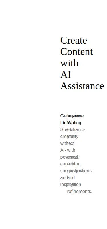
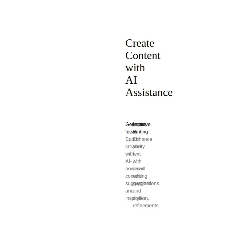
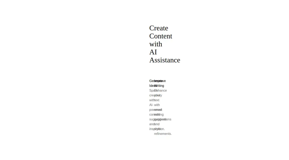
Measured
Every value below was written by the harness on the run that produced the frames above. None of it is derived from the prose.
| Build | OK |
|---|---|
| Mount | OK |
| Console errors | 0 |
| Uncaught page errors | 0 |
| Horizontal overflow | clean at 375, 768, 1440 |
| Axe critical | 0 |
| Axe serious | 0 |
| Axe moderate | 0 |
| Axe minor | 0 |
| Gzip marginal | 17.6 KB (83.0 KB build, 65.4 KB baseline) |
| Bare mode | OK |
| Provider required | NO |
| Demo used | written from the component source API |
Verdict
A lean static starting point, but not ready to drop into every layout unchanged. The fixed split grid can compress its copy badly inside a shrink-to-fit parent. Give the section full available width or add a narrow-layout stacking rule, then replace the generic copy.
Use it if
- You need a compact heading-and-benefits section for a landing page.
- Your Tailwind theme already supplies the expected color and serif typography tokens.
- You can give the section the available row width and replace the placeholder copy.
Skip it if
- You need a true card with its own boundary, actions, or interactive behavior.
- You need narrow layouts to stack automatically without editing the grid classes.
- Your project does not use Tailwind or compatible theme tokens.
- Your content must come from props or a CMS without first refactoring the hard-coded text.
Install
| Declared dependencies | none declared |
|---|---|
| Missing on install | none |
| Bare install | builds and mounts without the shadcn-style helpers |
| Provider | no provider required in the harness |
For a non-shadcn project, add a React-compatible TSX build and Tailwind CSS with container-query support. Define background, foreground, muted text, border, spacing, and serif font tokens. No extra runtime package or provider is required.
Source and credit
This page is a review, not a copy. The component source lives with its author and this site does not republish it. Read the license before you use anything.
Author repository
github.com/tailark/blocksAlternatives
Other published entries for the card pattern, ordered by what they measured: mounts first, then clean axe scans, then bare-mode passes, then the smaller bundle.
- tailark-veil-content-1minimal-flat
- Renders
- YES
- A11y
- 0
- Gzip
- 17.6KB
- Bare
- pass
- Prov
- NO
- tailark-mist-content-3minimal-flat
- Renders
- YES
- A11y
- 0
- Gzip
- 24.1KB
- Bare
- pass
- Prov
- NO
- neobrutalism-cardbrutalism
- Renders
- YES
- A11y
- 0
- Gzip
- 29.6KB
- Bare
- pass
- Prov
- NO
- neobrutalism-ncardbrutalism
- Renders
- YES
- A11y
- 0
- Gzip
- 29.6KB
- Bare
- pass
- Prov
- NO
- reui-icon-stackminimal-flat
- Renders
- YES
- A11y
- 0
- Gzip
- 30.1KB
- Bare
- pass
- Prov
- NO
- kibo-relative-timeminimal-flat
- Renders
- YES
- A11y
- 0
- Gzip
- 30.8KB
- Bare
- pass
- Prov
- NO