Measured entry
ruixen-calendar-crest
selectunclassifiedmotion on file
A client-side dual-month date-range picker with animated hover previews, raised range styling, month navigation, optional click sounds, and a range callback. It ships as a TypeScript shadcn registry component and depends on React, Motion, Tailwind utility classes, and the shadcn-style cn helper imported through the app alias.
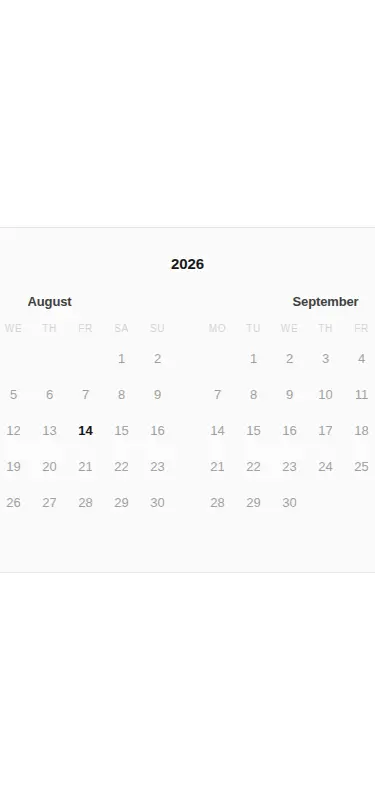


Measured
Every value below was written by the harness on the run that produced the frames above. None of it is derived from the prose.
| Build | OK |
|---|---|
| Mount | OK |
| Console errors | 0 |
| Uncaught page errors | 0 |
| Horizontal overflow | flagged at 375 |
| Axe critical | 0 |
| Axe serious | 0 |
| Axe moderate | 0 |
| Axe minor | 0 |
| Gzip marginal | 70.3 KB (135.7 KB build, 65.4 KB baseline) |
| Bare mode | FAIL |
| Provider required | NO |
| Demo used | written from the component source API |
What the harness recorded
BARE BUILD
✗ Build failed in 24.79s
error during build:
[vite:load-fallback] Could not load <sandbox>/src/lib/utils (imported by src/cut/calendar-crest.tsx): ENOENT: no such file or directory, open '<sandbox>/src/lib/utils'
Verdict
A distinctive range picker for roomy layouts, with a clear hover preview and animated selection ridge. It builds and mounts cleanly in the prepared harness, but it needs a shadcn-style setup and is not ready for narrow mobile containers without a responsive redesign.
Use it if
- You need adjacent-month range selection for booking, leave, or availability flows on tablet and desktop layouts.
- Your app already uses shadcn conventions, Tailwind utilities, and Motion, so the source can drop into the existing component layer.
- You want hover preview and animated range elevation while keeping selected dates available through a callback.
Skip it if
- The picker must fit a narrow mobile container without overflow or a responsive redesign.
- You need built-in disabled dates, minimum or maximum stays, time selection, controlled values, or locale configuration.
- Your accessibility requirements call for explicit month-navigation labels, full-date labels, and announced range state without further work.
- You want a dependency-light calendar with no animation library or shadcn utility coupling.
Install
| Declared dependencies | motion |
|---|---|
| Missing on install | none |
| Bare install | fails once the shadcn-style helpers are removed, so it needs that setup |
| Provider | no provider required in the harness |
In a non-shadcn project, install Motion, provide a client-rendered React environment, configure Tailwind for the utility and dark-mode classes, add the app import alias and a cn class-merging helper, or replace that helper and its alias with local equivalents. Add responsive layout rules before using it on narrow screens.
Source and credit
This page is a review, not a copy. The component source lives with its author and this site does not republish it. Read the license before you use anything.
Author repository
github.com/ruixenui/ruixen.comAlternatives
Other published entries for the select pattern, ordered by what they measured: mounts first, then clean axe scans, then bare-mode passes, then the smaller bundle.
- hextaui-native-selectminimal-flat
- Renders
- YES
- A11y
- 0
- Gzip
- 30.6KB
- Bare
- fail
- Prov
- NO
- 8bitcn-difficulty-selectskeuomorphism
- Renders
- YES
- A11y
- 0
- Gzip
- 32.7KB
- Bare
- fail
- Prov
- NO
- hextaui-checkboxminimal-flat
- Renders
- YES
- A11y
- 0
- Gzip
- 35.8KB
- Bare
- fail
- Prov
- NO
- hextaui-radio-groupminimal-flat
- Renders
- YES
- A11y
- 0
- Gzip
- 40.3KB
- Bare
- fail
- Prov
- NO
- ruixen-tag-cloud-selectunclassified
- Renders
- YES
- A11y
- 0
- Gzip
- 58.8KB
- Bare
- fail
- Prov
- NO
- tripled-animated-select-shadcnuiminimal-flat
- Renders
- YES
- A11y
- 0
- Gzip
- 60.4KB
- Bare
- fail
- Prov
- NO