Measured entry
ruixen-clean-tag-input
inputliquid-glassmotion on file
A client-side React tag field that adds entries on Enter and removes them by button or Backspace. It ships as a shadcn registry source file, keeps its own state, emits changes through a callback, injects light and dark theme CSS, uses Motion for transitions, and optionally creates feedback sounds with the Web Audio API.

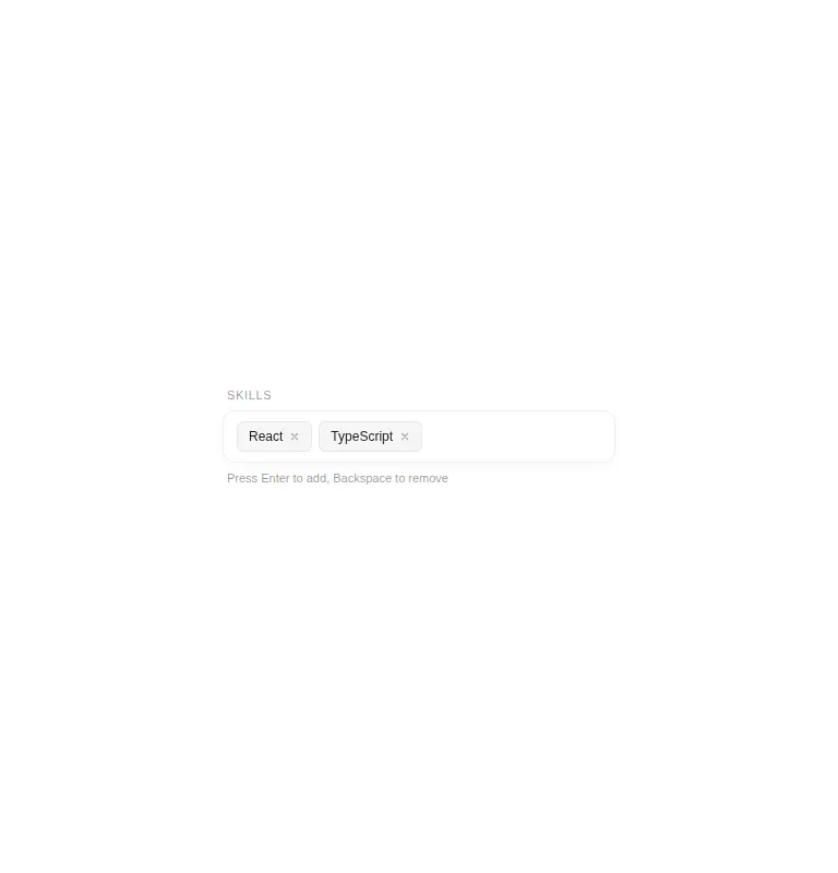
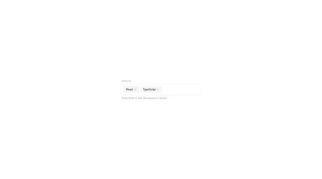
Measured
Every value below was written by the harness on the run that produced the frames above. None of it is derived from the prose.
| Build | OK |
|---|---|
| Mount | OK |
| Console errors | 0 |
| Uncaught page errors | 0 |
| Horizontal overflow | flagged at 375 |
| Axe critical | 2 |
| Axe serious | 1 |
| Axe moderate | 0 |
| Axe minor | 0 |
| Gzip marginal | 63.9 KB (129.4 KB build, 65.5 KB baseline) |
| Bare mode | OK |
| Provider required | NO |
| Demo used | written from the component source API |
Verdict
A polished interaction with a compact API and no provider requirement, but not production-ready as supplied. Fix the input and button labeling, strengthen muted text contrast, make its width fluid on narrow layouts, and decide whether sound should be opt-in before adopting it.
Use it if
- You need a compact free-form tag field with animated add and remove behavior.
- Your form can use an uncontrolled field initialized from default tags and consume updates through a callback.
- You want light and dark styling without adopting a separate component provider.
Skip it if
- You need a controlled value prop, validation, duplicate prevention, or a maximum tag limit.
- You require accessible defaults, since the input lacks an associated label, remove buttons lack names, and muted text needs stronger contrast.
- Your layout must fit narrow screens without adjustment, since the supplied fixed-width usage can overflow.
- You do not want an animation dependency or browser-generated feedback sounds in a basic form control.
Install
| Declared dependencies | motion |
|---|---|
| Missing on install | none |
| Bare install | builds and mounts without the shadcn-style helpers |
| Provider | no provider required in the harness |
In a non-shadcn React project, copy the client component into your source tree and install Motion. Preserve its injected CSS and theme selectors, render it on the client, and connect its change callback to your form. Add accessible labels and responsive width rules during integration.
Source and credit
This page is a review, not a copy. The component source lives with its author and this site does not republish it. Read the license before you use anything.
Author repository
github.com/ruixenui/ruixen.comAlternatives
Other published entries for the input pattern, ordered by what they measured: mounts first, then clean axe scans, then bare-mode passes, then the smaller bundle.
- clay-inputclaymorphism
- Renders
- YES
- A11y
- 0
- Gzip
- 17.9KB
- Bare
- pass
- Prov
- NO
- neu-search-inputneumorphism
- Renders
- YES
- A11y
- 0
- Gzip
- 18.1KB
- Bare
- pass
- Prov
- NO
- clay-search-inputclaymorphism
- Renders
- YES
- A11y
- 0
- Gzip
- 18.3KB
- Bare
- pass
- Prov
- NO
- originui-comp-33minimal-flat
- Renders
- YES
- A11y
- 0
- Gzip
- 20.7KB
- Bare
- pass
- Prov
- NO
- hextaui-labelminimal-flat
- Renders
- YES
- A11y
- 0
- Gzip
- 31.3KB
- Bare
- pass
- Prov
- NO
- ruixen-circular-stepper-inputliquid-glass
- Renders
- YES
- A11y
- 0
- Gzip
- 61.1KB
- Bare
- pass
- Prov
- NO