Measured entry
ruixen-color-picker-input
inputliquid-glassmotion on file
A client-side React color picker that ships as a shadcn registry component, but is otherwise self-contained. It renders preset swatches, a draggable opacity control, an RGBA hex value, and clipboard feedback with inline styles. It depends on Motion and optionally uses browser audio for interaction ticks.
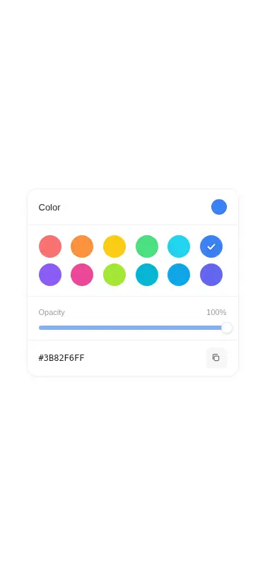
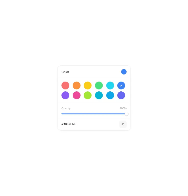
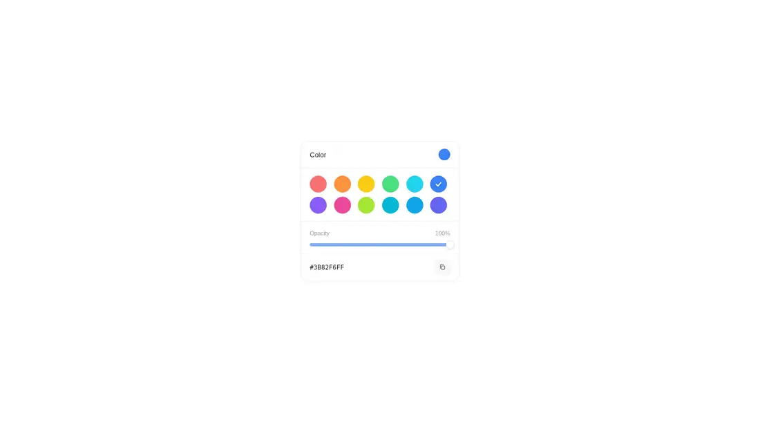
Measured
Every value below was written by the harness on the run that produced the frames above. None of it is derived from the prose.
| Build | OK |
|---|---|
| Mount | OK |
| Console errors | 0 |
| Uncaught page errors | 0 |
| Horizontal overflow | clean at 375, 768, 1440 |
| Axe critical | 1 |
| Axe serious | 0 |
| Axe moderate | 0 |
| Axe minor | 0 |
| Gzip marginal | 61.5 KB (126.9 KB build, 65.4 KB baseline) |
| Bare mode | OK |
| Provider required | NO |
| Demo used | written from the component source API |
Verdict
Visually tidy and functional across the tested layouts, with useful customization and no provider requirement. Treat it as a starting point, not production-ready UI: accessible names and a keyboard-operable semantic opacity slider should be added before shipping.
Use it if
- You need a compact preset-color selector with opacity and copy-to-clipboard behavior.
- You want a liquid-glass control whose palette, initial value, sound, and change callback are easy to configure.
- Your interface already accepts pointer-first controls and Motion as a dependency.
Skip it if
- You need accessible controls out of the box, since the swatches and copy button lack discernible names.
- Keyboard operation is required, because the opacity control is a pointer-driven div rather than a semantic slider.
- You need free-form color entry instead of choosing from a supplied palette.
- You want to avoid browser audio, clipboard APIs, or a comparatively substantial animation dependency.
Install
| Declared dependencies | motion |
|---|---|
| Missing on install | none |
| Bare install | builds and mounts without the shadcn-style helpers |
| Provider | no provider required in the harness |
In a non-shadcn React project, copy the client component, install Motion, and ensure it runs only in the browser. No utility CSS or shared UI primitives are required because the styles are embedded. Add accessible labels, slider semantics, and keyboard handling during integration.
Source and credit
This page is a review, not a copy. The component source lives with its author and this site does not republish it. Read the license before you use anything.
Author repository
github.com/ruixenui/ruixen.comAlternatives
Other published entries for the input pattern, ordered by what they measured: mounts first, then clean axe scans, then bare-mode passes, then the smaller bundle.
- clay-inputclaymorphism
- Renders
- YES
- A11y
- 0
- Gzip
- 17.9KB
- Bare
- pass
- Prov
- NO
- neu-search-inputneumorphism
- Renders
- YES
- A11y
- 0
- Gzip
- 18.1KB
- Bare
- pass
- Prov
- NO
- clay-search-inputclaymorphism
- Renders
- YES
- A11y
- 0
- Gzip
- 18.3KB
- Bare
- pass
- Prov
- NO
- originui-comp-33minimal-flat
- Renders
- YES
- A11y
- 0
- Gzip
- 20.7KB
- Bare
- pass
- Prov
- NO
- hextaui-labelminimal-flat
- Renders
- YES
- A11y
- 0
- Gzip
- 31.3KB
- Bare
- pass
- Prov
- NO
- ruixen-circular-stepper-inputliquid-glass
- Renders
- YES
- A11y
- 0
- Gzip
- 61.1KB
- Bare
- pass
- Prov
- NO