Measured entry
ruixen-magnetic-tabs
selectglassmorphismmotion on file
A client-side React tab switcher with a spring-following glass pill, animated content transitions, and an optional synthesized click sound. It ships as a single shadcn registry TSX file with inline styles, depends on Motion, and uses browser AudioContext and ResizeObserver APIs.
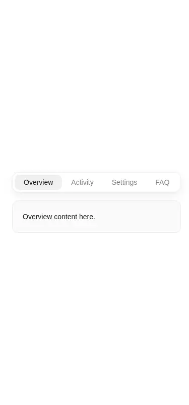
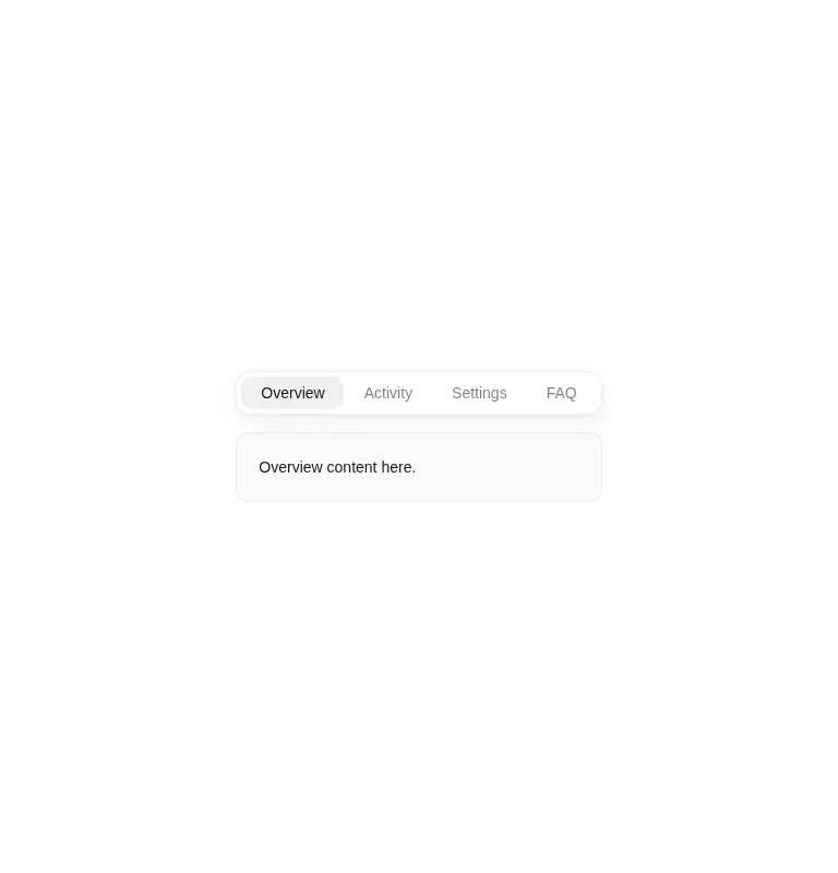
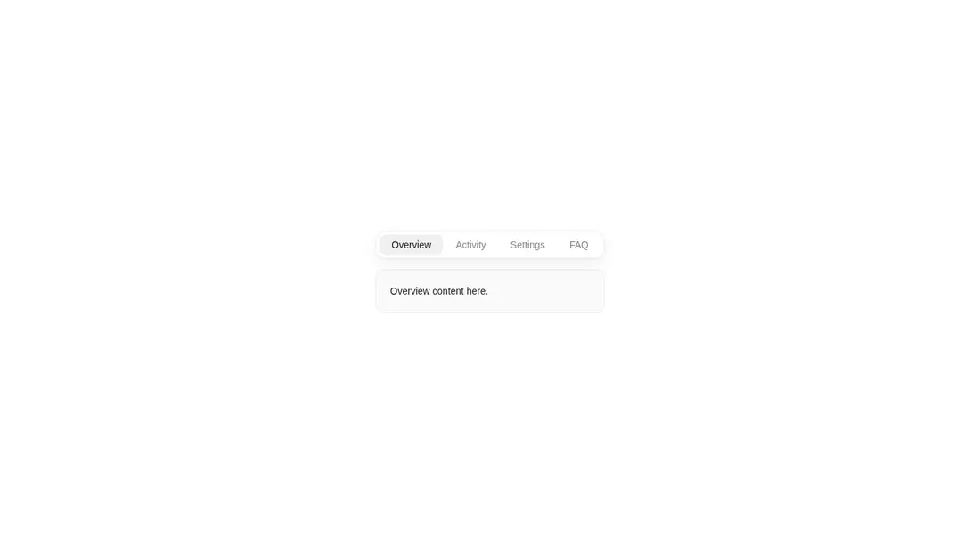
Measured
Every value below was written by the harness on the run that produced the frames above. None of it is derived from the prose.
| Build | OK |
|---|---|
| Mount | OK |
| Console errors | 0 |
| Uncaught page errors | 0 |
| Horizontal overflow | clean at 375, 768, 1440 |
| Axe critical | 0 |
| Axe serious | 1 |
| Axe moderate | 0 |
| Axe minor | 0 |
| Gzip marginal | 61.6 KB (127.0 KB build, 65.4 KB baseline) |
| Bare mode | OK |
| Provider required | NO |
| Demo used | written from the component source API |
Verdict
A polished interaction that builds and mounts on its own, with useful configuration and no provider requirement. Adopt it only if you are prepared to fix contrast and add proper tab semantics and keyboard behavior; the current button row is visually convincing but not a complete accessible tab pattern.
Use it if
- You want compact tabs whose indicator follows hover before settling on the selected item.
- Your interface can benefit from animated panel changes and an optional audible selection cue.
- You prefer a self-contained component whose labels, content, callback, sound, and outer class are configurable.
Skip it if
- You need accessible tab semantics, arrow-key navigation, or managed focus without extending the component.
- Your design system cannot accept the measured color-contrast issue in the supplied theme values.
- You want a lightweight selector without adding Motion or browser audio behavior.
- Your tab list may be wider than the viewport and needs built-in wrapping, scrolling, or overflow handling.
Install
| Declared dependencies | motion |
|---|---|
| Missing on install | none |
| Bare install | builds and mounts without the shadcn-style helpers |
| Provider | no provider required in the harness |
In a non-shadcn React project, copy the client component into your source tree and install Motion so the motion/react imports resolve. Ensure the component runs only in the browser, keep React available, and add your own accessible tab roles, keyboard handling, focus treatment, and contrast-adjusted theme values.
Source and credit
This page is a review, not a copy. The component source lives with its author and this site does not republish it. Read the license before you use anything.
Author repository
github.com/ruixenui/ruixen.comAlternatives
Other published entries for the select pattern, ordered by what they measured: mounts first, then clean axe scans, then bare-mode passes, then the smaller bundle.
- hextaui-native-selectminimal-flat
- Renders
- YES
- A11y
- 0
- Gzip
- 30.6KB
- Bare
- fail
- Prov
- NO
- 8bitcn-difficulty-selectskeuomorphism
- Renders
- YES
- A11y
- 0
- Gzip
- 32.7KB
- Bare
- fail
- Prov
- NO
- hextaui-checkboxminimal-flat
- Renders
- YES
- A11y
- 0
- Gzip
- 35.8KB
- Bare
- fail
- Prov
- NO
- hextaui-radio-groupminimal-flat
- Renders
- YES
- A11y
- 0
- Gzip
- 40.3KB
- Bare
- fail
- Prov
- NO
- ruixen-tag-cloud-selectunclassified
- Renders
- YES
- A11y
- 0
- Gzip
- 58.8KB
- Bare
- fail
- Prov
- NO
- tripled-animated-select-shadcnuiminimal-flat
- Renders
- YES
- A11y
- 0
- Gzip
- 60.4KB
- Bare
- fail
- Prov
- NO