Measured entry
ruixen-password-field
auth-formliquid-glassmotion on file
A client-side React password field with visibility control, password generation, a strength meter, and a validation checklist. It ships as a single shadcn registry component with embedded styles, depends on Motion for animation, and optionally uses the browser audio API for interaction sounds.

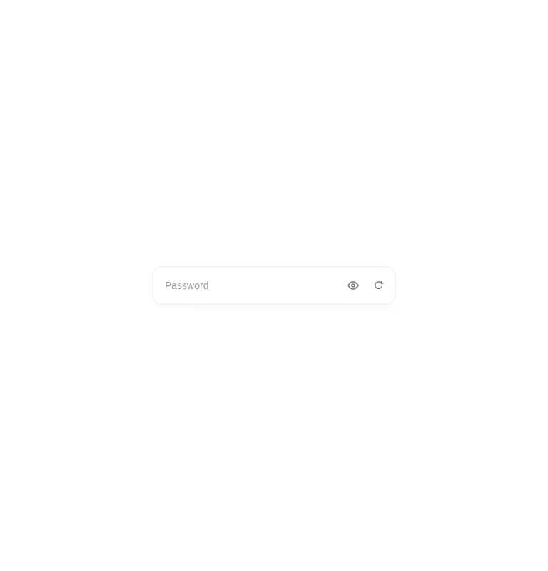
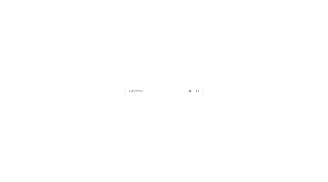
Measured
Every value below was written by the harness on the run that produced the frames above. None of it is derived from the prose.
| Build | OK |
|---|---|
| Mount | OK |
| Console errors | 0 |
| Uncaught page errors | 0 |
| Horizontal overflow | clean at 375, 768, 1440 |
| Axe critical | 2 |
| Axe serious | 0 |
| Axe moderate | 0 |
| Axe minor | 0 |
| Gzip marginal | 64.5 KB (130.0 KB build, 65.5 KB baseline) |
| Bare mode | OK |
| Provider required | NO |
| Demo used | written from the component source API |
Verdict
It builds and mounts on its own, but it is not production-ready unchanged. The icon buttons lack accessible names, the input lacks a programmatic label, the controls may submit a parent form, and the password generator uses Math.random.
Use it if
- You are prototyping an auth flow and can harden the component before release.
- You want a self-contained password field with an animated checklist and optional sound feedback.
- Your form can work with internally managed input state exposed through an onChange callback.
Skip it if
- You need a production-safe generated password without replacing the Math.random implementation.
- You must meet accessibility requirements without first adding a programmatic input label and names for both icon buttons.
- Your form requires controlled values, standard field attributes, or direct form-library registration.
- You cannot add explicit button types to prevent the controls from submitting a parent form.
Install
| Declared dependencies | motion |
|---|---|
| Missing on install | none |
| Bare install | builds and mounts without the shadcn-style helpers |
| Provider | no provider required in the harness |
In a non-shadcn React app, add the Motion package, copy the client component, and ensure browser APIs are available. No provider, shadcn primitives, or Tailwind styles are required. Add accessible labels, explicit button types, secure password generation, and any needed form-library wiring before release.
Source and credit
This page is a review, not a copy. The component source lives with its author and this site does not republish it. Read the license before you use anything.
Author repository
github.com/ruixenui/ruixen.comAlternatives
Other published entries for the auth-form pattern, ordered by what they measured: mounts first, then clean axe scans, then bare-mode passes, then the smaller bundle.
- meraki-auth-sign-in-card-with-side-imageminimal-flat
- Renders
- YES
- A11y
- 0
- Gzip
- 18.9KB
- Bare
- pass
- Prov
- NO
- shadcn-block-login-01minimal-flat
- Renders
- YES
- A11y
- 0
- Gzip
- 30.3KB
- Bare
- fail
- Prov
- NO
- shadcn-block-login-02minimal-flat
- Renders
- YES
- A11y
- 0
- Gzip
- 31.9KB
- Bare
- fail
- Prov
- NO
- shadcn-block-login-05minimal-flat
- Renders
- YES
- A11y
- 0
- Gzip
- 31.9KB
- Bare
- fail
- Prov
- NO
- 8bitcn-login-formskeuomorphism
- Renders
- YES
- A11y
- 0
- Gzip
- 33.2KB
- Bare
- fail
- Prov
- NO
- 8bitcn-advanced3skeuomorphism
- Renders
- YES
- A11y
- 0
- Gzip
- 33.3KB
- Bare
- fail
- Prov
- NO