Measured entry
ruixen-verification-input
inputliquid-glassmotion on file
A client-side React verification-code field shipped as a shadcn registry component. It renders a visually split set of cells over one hidden native input, uses Motion for entry and focus animation, embeds its own light and dark theme styles, and can create a short Web Audio tick without a provider.

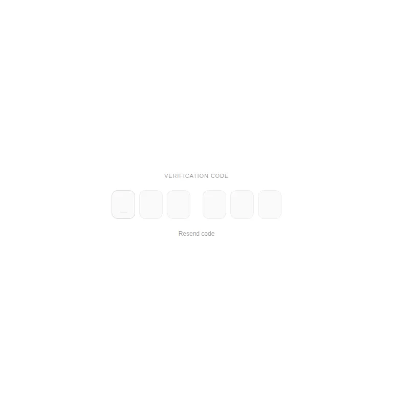
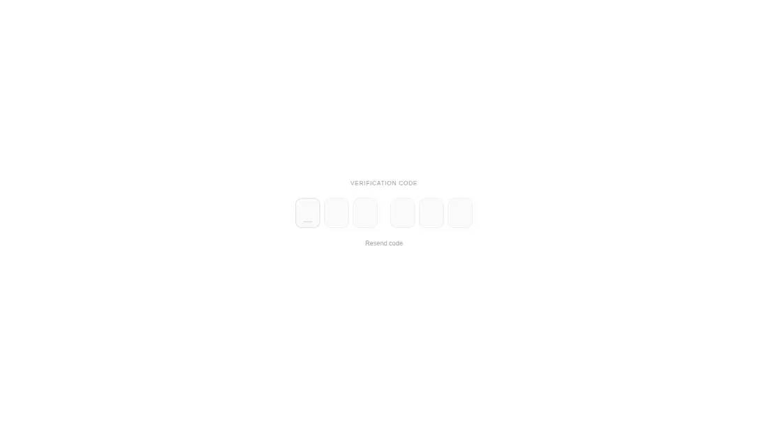
Measured
Every value below was written by the harness on the run that produced the frames above. None of it is derived from the prose.
| Build | OK |
|---|---|
| Mount | OK |
| Console errors | 0 |
| Uncaught page errors | 0 |
| Horizontal overflow | clean at 375, 768, 1440 |
| Axe critical | 0 |
| Axe serious | 1 |
| Axe moderate | 0 |
| Axe minor | 0 |
| Gzip marginal | 63.8 KB (129.3 KB build, 65.5 KB baseline) |
| Bare mode | OK |
| Provider required | NO |
| Demo used | written from the component source API |
Verdict
A polished starting point for a focused verification step, and it builds and mounts without shadcn infrastructure. Use it only after correcting the contrast issue and checking the unexplained blank wide-screen capture. Its narrow, uncontrolled API also makes it better for simple flows than form-heavy authentication systems.
Use it if
- You need a self-contained numeric one-time-code field with paste and mobile autofill support.
- Your flow benefits from animated digit feedback and an optional resend action.
- You can accept an uncontrolled field and handle the completed code through a callback.
Skip it if
- Your accessibility bar requires the supplied colors to pass contrast checks without modification.
- You need controlled value, validation error, disabled, loading, or reset props from the component API.
- You want to avoid adding Motion or browser-generated input sounds to an authentication screen.
- You need confidence in very wide layouts without investigating the blank wide-viewport capture.
Install
| Declared dependencies | motion |
|---|---|
| Missing on install | none |
| Bare install | builds and mounts without the shadcn-style helpers |
| Provider | no provider required in the harness |
In a non-shadcn React project, copy the component file, install Motion, and ensure the framework supports client components. Add a dark class or data-theme attribute if needed, review the embedded color tokens for contrast, and decide whether to keep the Web Audio tick. Tailwind is only used by the demo wrapper, not the component itself.
Source and credit
This page is a review, not a copy. The component source lives with its author and this site does not republish it. Read the license before you use anything.
Author repository
github.com/ruixenui/ruixen.comAlternatives
Other published entries for the input pattern, ordered by what they measured: mounts first, then clean axe scans, then bare-mode passes, then the smaller bundle.
- clay-inputclaymorphism
- Renders
- YES
- A11y
- 0
- Gzip
- 17.9KB
- Bare
- pass
- Prov
- NO
- neu-search-inputneumorphism
- Renders
- YES
- A11y
- 0
- Gzip
- 18.1KB
- Bare
- pass
- Prov
- NO
- clay-search-inputclaymorphism
- Renders
- YES
- A11y
- 0
- Gzip
- 18.3KB
- Bare
- pass
- Prov
- NO
- originui-comp-33minimal-flat
- Renders
- YES
- A11y
- 0
- Gzip
- 20.7KB
- Bare
- pass
- Prov
- NO
- hextaui-labelminimal-flat
- Renders
- YES
- A11y
- 0
- Gzip
- 31.3KB
- Bare
- pass
- Prov
- NO
- ruixen-circular-stepper-inputliquid-glass
- Renders
- YES
- A11y
- 0
- Gzip
- 61.1KB
- Bare
- pass
- Prov
- NO