Measured entry
ruixen-wizard-stepper
feature-gridunclassifiedmotion on file
A client-side React progress stepper for controlled or self-managed wizard state, with horizontal and vertical layouts, clickable stages, completion icons, loading feedback, and animated connectors. It ships as a shadcn registry component styled with Tailwind classes and depends on Motion, Lucide React, and a local cn utility backed by clsx and tailwind-merge.

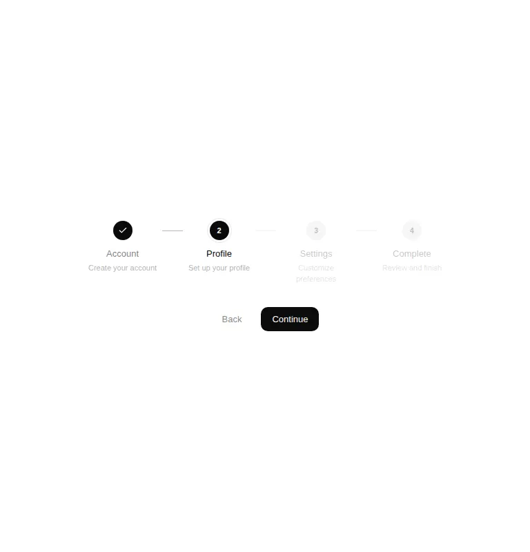
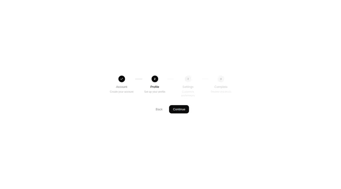
Measured
Every value below was written by the harness on the run that produced the frames above. None of it is derived from the prose.
| Build | OK |
|---|---|
| Mount | OK |
| Console errors | 0 |
| Uncaught page errors | 0 |
| Horizontal overflow | clean at 375, 768, 1440 |
| Axe critical | 0 |
| Axe serious | 1 |
| Axe moderate | 0 |
| Axe minor | 0 |
| Gzip marginal | 71.6 KB (137.1 KB build, 65.5 KB baseline) |
| Bare mode | FAIL |
| Provider required | NO |
| Demo used | written from the component source API |
What the harness recorded
BARE BUILD
✗ Build failed in 1m 34s
error during build:
[vite:load-fallback] Could not load <sandbox>/src/lib/utils (imported by src/cut/components/ruixen/wizard-stepper.tsx): ENOENT: no such file or directory, open '<sandbox>/src/lib/utils'
Verdict
A polished starting point for short wizard flows, with useful state and orientation options and reliable responsive rendering. It needs a shadcn-style setup to mount, and teams should fix contrast, keyboard semantics, and unrestricted step jumping before treating it as production-ready navigation.
Use it if
- You need a compact progress header for onboarding, checkout, account setup, or another short staged flow.
- Your product already uses Tailwind theme tokens and a shadcn-style cn helper.
- You want either parent-controlled navigation or simple internal step state, with optional vertical presentation and loading feedback.
Skip it if
- You need accessible step navigation out of the box, since the clickable stage wrappers lack native button and keyboard semantics.
- Your design system cannot accept faint pending and descriptive text without revising its contrast styles.
- You want a dependency-light static progress indicator and do not need spring animation or icon-based completion states.
- Your flow must prevent users from jumping directly to arbitrary stages unless you are prepared to add navigation guards.
Install
| Declared dependencies | lucide-react, motion, clsx, tailwind-merge |
|---|---|
| Missing on install | none |
| Bare install | fails once the shadcn-style helpers are removed, so it needs that setup |
| Provider | no provider required in the harness |
In a non-shadcn project, add Motion, Lucide React, clsx, and tailwind-merge; configure Tailwind with the foreground and background theme tokens; create the cn utility; and map the source alias to it. Keep the file in a client-rendered React boundary.
Source and credit
This page is a review, not a copy. The component source lives with its author and this site does not republish it. Read the license before you use anything.
Author repository
github.com/ruixenui/ruixen.comAlternatives
Other published entries for the feature-grid pattern, ordered by what they measured: mounts first, then clean axe scans, then bare-mode passes, then the smaller bundle.
- hyperui-feature-grids-3editorial
- Renders
- YES
- A11y
- 0
- Gzip
- 17.7KB
- Bare
- pass
- Prov
- NO
- hyperui-feature-grids-1editorial
- Renders
- YES
- A11y
- 0
- Gzip
- 17.9KB
- Bare
- pass
- Prov
- NO
- hyperui-feature-grids-4editorial
- Renders
- YES
- A11y
- 0
- Gzip
- 17.9KB
- Bare
- pass
- Prov
- NO
- hyperui-feature-grids-2editorial
- Renders
- YES
- A11y
- 0
- Gzip
- 18.3KB
- Bare
- pass
- Prov
- NO
- meraki-feature-grid-list-with-imageminimal-flat
- Renders
- YES
- A11y
- 0
- Gzip
- 18.5KB
- Bare
- pass
- Prov
- NO
- meraki-feature-simpleminimal-flat
- Renders
- YES
- A11y
- 0
- Gzip
- 20.2KB
- Bare
- pass
- Prov
- NO