Measured entry
shadcn-combobox
A client-side, source-owned combobox built as styled wrappers around Base UI. It ships through the shadcn registry as TSX copied into your app and relies on Base UI behavior, Lucide icons, shadcn Button and Input Group parts, the cn helper, and Tailwind theme utilities.
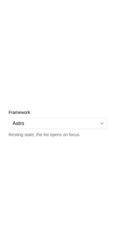
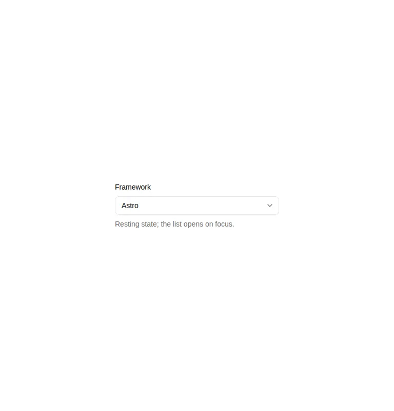
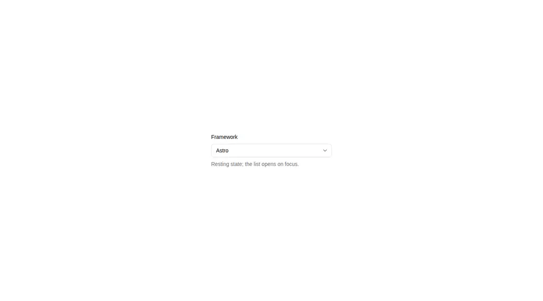
Measured
Every value below was written by the harness on the run that produced the frames above. None of it is derived from the prose.
| Build | OK |
|---|---|
| Mount | OK |
| Console errors | 0 |
| Uncaught page errors | 0 |
| Horizontal overflow | clean at 375, 768, 1440 |
| Axe critical | 1 |
| Axe serious | 0 |
| Axe moderate | 0 |
| Axe minor | 0 |
| Gzip marginal | 82.4 KB (147.9 KB build, 65.5 KB baseline) |
| Bare mode | FAIL |
| Provider required | NO |
| Demo used | written from the component source API |
What the harness recorded
BARE BUILD
✗ Build failed in 2.59s
error during build:
[vite]: Rollup failed to resolve import "lucide-react" from "<sandbox>re-d694c94aec44/src/cut/components/ui/combobox.tsx".
Verdict
It builds, mounts, and renders across the tested layouts without overflow, and its API covers more than a basic picker. The verified demo still has a critical accessibility failure from an unnamed button, so adoption should be conditional on adding an accessible name and retesting the interactive states.
Use it if
- You need searchable selection with composable groups, empty states, clear controls, or multi-select chips.
- Your app already uses shadcn conventions, Tailwind theme tokens, and source-owned UI components.
- You want Base UI interaction behavior while retaining direct control over markup and styling.
Skip it if
- You cannot audit and label its icon-only controls before release; the verified demo contains an unnamed button.
- Your bundle budget is tight and a native select or smaller autocomplete would meet the requirement.
- Your design system is not Tailwind-based and you do not want to port its tokens, state selectors, and supporting components.
Install
| Declared dependencies | @base-ui/react, radix-ui, clsx, tailwind-merge |
|---|---|
| Missing on install | none |
| Bare install | fails once the shadcn-style helpers are removed, so it needs that setup |
| Provider | no provider required in the harness |
In a non-shadcn project, add Base UI and Lucide React, provide equivalent Button and Input Group components, and implement the cn helper with clsx and tailwind-merge. You must also supply the Tailwind theme tokens, animation utilities, aliases, and client-component handling used by the source. Add accessible labels to icon-only controls before shipping.
Source and credit
This page is a review, not a copy. The component source lives with its author and this site does not republish it. Read the license before you use anything.
Author repository
github.com/shadcn-ui/uiAlternatives
Other published entries for the select pattern, ordered by what they measured: mounts first, then clean axe scans, then bare-mode passes, then the smaller bundle.
- hextaui-native-selectminimal-flat
- Renders
- YES
- A11y
- 0
- Gzip
- 30.6KB
- Bare
- fail
- Prov
- NO
- 8bitcn-difficulty-selectskeuomorphism
- Renders
- YES
- A11y
- 0
- Gzip
- 32.7KB
- Bare
- fail
- Prov
- NO
- hextaui-checkboxminimal-flat
- Renders
- YES
- A11y
- 0
- Gzip
- 35.8KB
- Bare
- fail
- Prov
- NO
- hextaui-radio-groupminimal-flat
- Renders
- YES
- A11y
- 0
- Gzip
- 40.3KB
- Bare
- fail
- Prov
- NO
- ruixen-tag-cloud-selectunclassified
- Renders
- YES
- A11y
- 0
- Gzip
- 58.8KB
- Bare
- fail
- Prov
- NO
- tripled-animated-select-shadcnuiminimal-flat
- Renders
- YES
- A11y
- 0
- Gzip
- 60.4KB
- Bare
- fail
- Prov
- NO