Measured entry
shadcn-input-group
A source-distributed React and TypeScript input wrapper for placing text, buttons, icons, or other add-ons beside an input or textarea. It ships as copied shadcn registry code, composes the shadcn Button, Input, and Textarea, and relies on Tailwind utilities, class-variance-authority, the cn helper, radix-ui, clsx, and tailwind-merge.

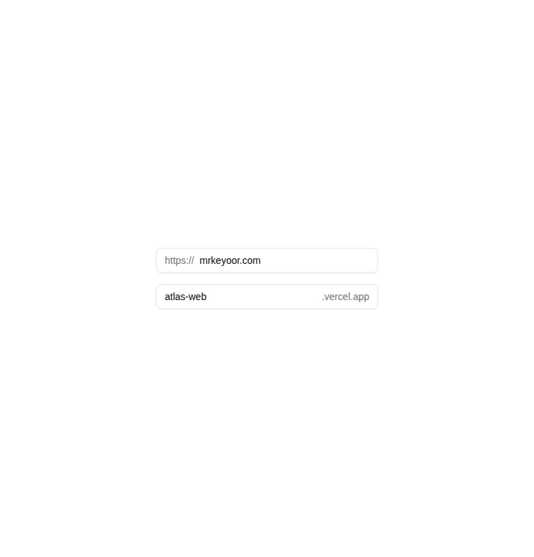
Measured
Every value below was written by the harness on the run that produced the frames above. None of it is derived from the prose.
| Build | OK |
|---|---|
| Mount | OK |
| Console errors | 0 |
| Uncaught page errors | 0 |
| Horizontal overflow | clean at 375, 768, 1440 |
| Axe critical | 1 |
| Axe serious | 0 |
| Axe moderate | 0 |
| Axe minor | 0 |
| Gzip marginal | 32.7 KB (98.2 KB build, 65.5 KB baseline) |
| Bare mode | FAIL |
| Provider required | NO |
| Demo used | written from the component source API |
What the harness recorded
BARE BUILD
✗ Build failed in 826ms
error during build:
[vite]: Rollup failed to resolve import "class-variance-authority" from "<sandbox>re-1d3a274244dd/src/cut/components/ui/input-group.tsx".
Verdict
A solid fit for an existing shadcn codebase: it builds, mounts without a provider, and handles the tested layouts without overflow. Do not copy the demo as-is into production because its controls lack accessible labels. Add visible labels or equivalent accessible names before shipping.
Use it if
- You need prefixes, suffixes, icons, or compact actions inside the same visual field as an input.
- Your app already uses shadcn conventions and can reuse its Button, Input, Textarea, theme tokens, and cn helper.
- You want source-owned primitives that support both inline and stacked add-ons without a provider.
Skip it if
- You need a drop-in package with isolated styles instead of copied source tied to Tailwind and local shadcn primitives.
- Your forms cannot guarantee an explicit accessible label for every grouped input or textarea.
- You want a minimal dependency footprint for a simple prefix or suffix that could be implemented with local markup.
Install
| Declared dependencies | radix-ui, clsx, tailwind-merge |
|---|---|
| Missing on install | none |
| Bare install | fails once the shadcn-style helpers are removed, so it needs that setup |
| Provider | no provider required in the harness |
In a non-shadcn project, add Tailwind with the expected theme tokens, class-variance-authority, radix-ui, clsx, and tailwind-merge. Provide a compatible cn utility plus local Button, Input, and Textarea components, then replace the registry aliases with your own import paths. Add explicit labels when integrating the controls.
Source and credit
This page is a review, not a copy. The component source lives with its author and this site does not republish it. Read the license before you use anything.
Author repository
github.com/shadcn-ui/uiAlternatives
Other published entries for the input pattern, ordered by what they measured: mounts first, then clean axe scans, then bare-mode passes, then the smaller bundle.
- clay-inputclaymorphism
- Renders
- YES
- A11y
- 0
- Gzip
- 17.9KB
- Bare
- pass
- Prov
- NO
- neu-search-inputneumorphism
- Renders
- YES
- A11y
- 0
- Gzip
- 18.1KB
- Bare
- pass
- Prov
- NO
- clay-search-inputclaymorphism
- Renders
- YES
- A11y
- 0
- Gzip
- 18.3KB
- Bare
- pass
- Prov
- NO
- originui-comp-33minimal-flat
- Renders
- YES
- A11y
- 0
- Gzip
- 20.7KB
- Bare
- pass
- Prov
- NO
- hextaui-labelminimal-flat
- Renders
- YES
- A11y
- 0
- Gzip
- 31.3KB
- Bare
- pass
- Prov
- NO
- ruixen-circular-stepper-inputliquid-glass
- Renders
- YES
- A11y
- 0
- Gzip
- 61.1KB
- Bare
- pass
- Prov
- NO