Measured entry
shadcn-scroll-area
A client-side React wrapper around Radix UI Scroll Area that renders a viewport, vertical scrollbar, thumb, and corner. It ships as source code styled with Tailwind utilities and relies on the shadcn-style cn helper, backed by clsx and tailwind-merge.
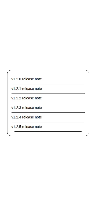
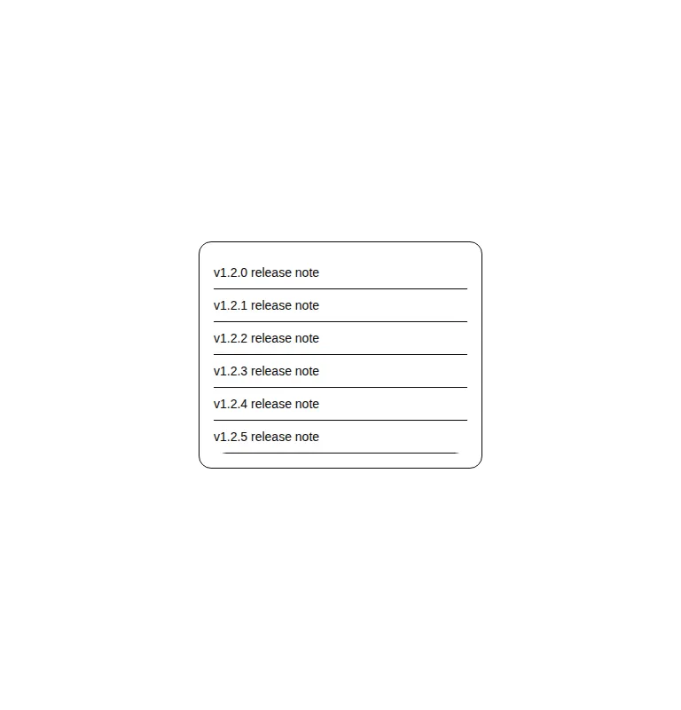
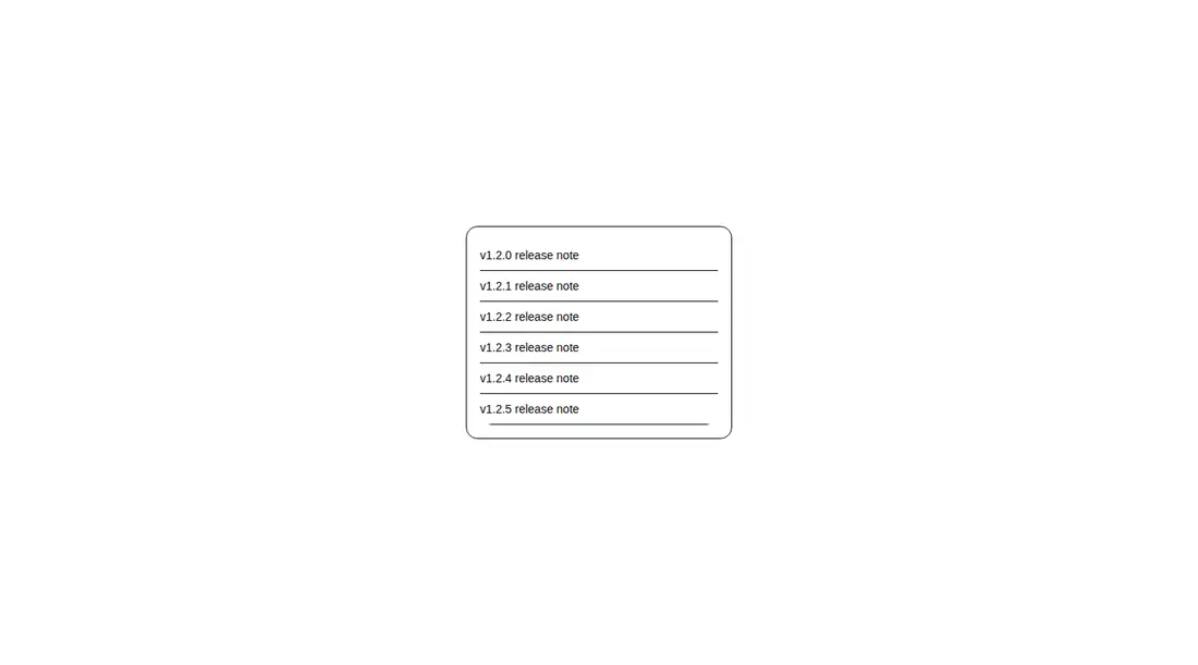
Measured
Every value below was written by the harness on the run that produced the frames above. None of it is derived from the prose.
| Build | OK |
|---|---|
| Mount | OK |
| Console errors | 0 |
| Uncaught page errors | 0 |
| Horizontal overflow | clean at 375, 768, 1440 |
| Axe critical | 0 |
| Axe serious | 1 |
| Axe moderate | 0 |
| Axe minor | 0 |
| Gzip marginal | 36.7 KB (102.2 KB build, 65.5 KB baseline) |
| Bare mode | OK |
| Provider required | NO |
| Demo used | written from the component source API |
Verdict
It builds, mounts, and stays contained across the tested layouts, so the implementation is usable. The serious caveat is keyboard access: the tested scrollable viewport is not focusable. Add and verify focus behavior before shipping it in an accessible interface.
Use it if
- You want a source-owned Radix scroll area that matches an existing shadcn and Tailwind interface.
- You need a constrained list or panel with a styled vertical scrollbar across supported browsers.
- Your team is comfortable patching the viewport to make keyboard scrolling explicit.
Skip it if
- Native overflow scrolling already meets the design, since this adds Radix and utility-helper dependencies.
- You require a scrollable region to pass keyboard-access checks without modifying the component.
- You need horizontal scrolling from the wrapper as shipped, because it renders only the vertical scrollbar.
Install
| Declared dependencies | radix-ui, clsx, tailwind-merge |
|---|---|
| Missing on install | none |
| Bare install | builds and mounts without the shadcn-style helpers |
| Provider | no provider required in the harness |
In a non-shadcn project, add Radix UI, Tailwind CSS, and a cn utility using clsx with tailwind-merge. Map the border and ring theme tokens used by the classes, keep the file client-rendered where required, and update the viewport so keyboard users can focus and scroll it.
Source and credit
This page is a review, not a copy. The component source lives with its author and this site does not republish it. Read the license before you use anything.
Author repository
github.com/shadcn-ui/uiAlternatives
Other published entries for the scroll-effect pattern, ordered by what they measured: mounts first, then clean axe scans, then bare-mode passes, then the smaller bundle.
- reui-scrollspyminimal-flat
- Renders
- YES
- A11y
- 0
- Gzip
- 21.5KB
- Bare
- pass
- Prov
- NO
- kibo-marqueeminimal-flat
- Renders
- YES
- A11y
- 0
- Gzip
- 31.3KB
- Bare
- pass
- Prov
- NO
- motion-primitives-in-viewspatial
- Renders
- YES
- A11y
- 0
- Gzip
- 58.1KB
- Bare
- pass
- Prov
- NO
- tripled-interactive-timeline-shadcnuiminimal-flat
- Renders
- YES
- A11y
- 0
- Gzip
- 58.7KB
- Bare
- pass
- Prov
- NO
- ruixen-container-text-scrollspatial
- Renders
- YES
- A11y
- 0
- Gzip
- 61.5KB
- Bare
- pass
- Prov
- NO
- fancy-parallax-floating3d
- Renders
- YES
- A11y
- 0
- Gzip
- 27.5KB
- Bare
- fail
- Prov
- NO