Measured entry
shadcn-spinner
loaderunclassifiedmotion on file
A small React loading indicator shipped as copy-in registry source. It wraps Lucide's loader icon, adds an accessible status label and Tailwind spin classes, and uses the shadcn cn helper with its class-merging dependencies.

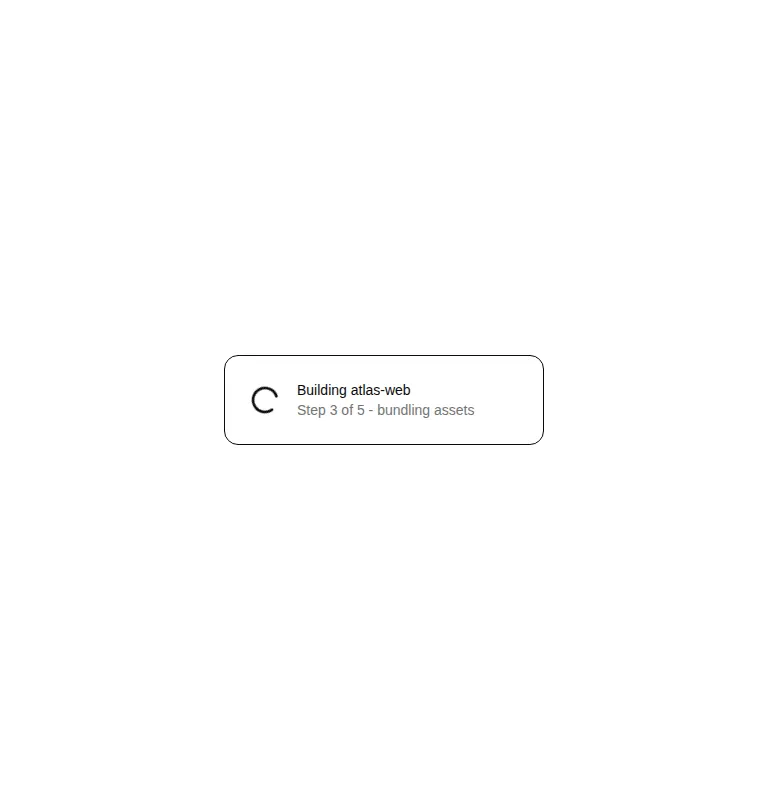
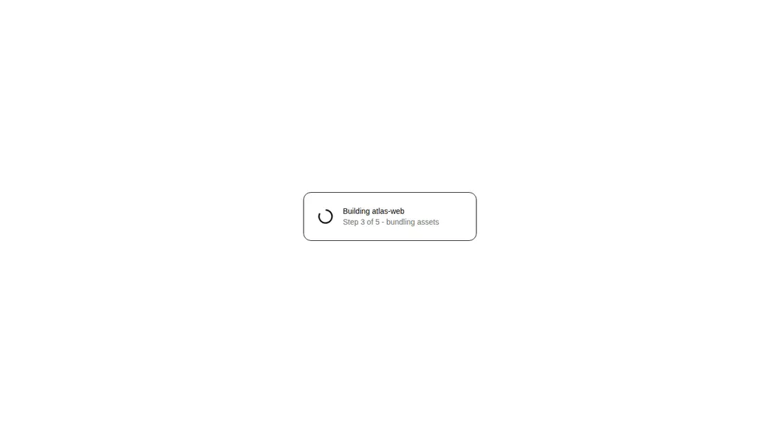
Measured
Every value below was written by the harness on the run that produced the frames above. None of it is derived from the prose.
| Build | OK |
|---|---|
| Mount | OK |
| Console errors | 0 |
| Uncaught page errors | 0 |
| Horizontal overflow | clean at 375, 768, 1440 |
| Axe critical | 0 |
| Axe serious | 0 |
| Axe moderate | 0 |
| Axe minor | 0 |
| Gzip marginal | 29.9 KB (95.4 KB build, 65.5 KB baseline) |
| Bare mode | FAIL |
| Provider required | NO |
| Demo used | written from the component source API |
What the harness recorded
BARE BUILD
✗ Build failed in 663ms
error during build:
[vite]: Rollup failed to resolve import "lucide-react" from "<sandbox>re-1809de24ea9d/src/cut/components/ui/spinner.tsx".
Verdict
A sensible, low-complexity spinner for React teams already aligned with shadcn conventions. It mounts cleanly without a provider and exposes the underlying SVG props, but it is only a visual busy-state primitive, not a complete progress or live-status pattern.
Use it if
- You need a compact inline progress indicator beside status text or inside a control.
- Your React interface already uses Lucide icons and Tailwind utility classes.
- You want a copy-owned primitive whose class name and SVG props remain easy to customize.
Skip it if
- You need determinate progress, elapsed-time feedback, or multi-step progress semantics.
- Your design system avoids Lucide or Tailwind and adding their conventions is not worthwhile for one icon.
- You need loading announcements that change dynamically, since the fixed accessible label only identifies a loading state.
Install
| Declared dependencies | class-variance-authority, clsx, tailwind-merge |
|---|---|
| Missing on install | none |
| Bare install | fails once the shadcn-style helpers are removed, so it needs that setup |
| Provider | no provider required in the harness |
In a non-shadcn project, add Lucide React, Tailwind animation utilities, and a cn helper backed by clsx and tailwind-merge. Either preserve the source import alias or replace it with your local utility path; retain the status role and accessible label.
Source and credit
This page is a review, not a copy. The component source lives with its author and this site does not republish it. Read the license before you use anything.
Author repository
github.com/shadcn-ui/uiAlternatives
Other published entries for the loader pattern, ordered by what they measured: mounts first, then clean axe scans, then bare-mode passes, then the smaller bundle.
- ruixen-solar-loaderspatial
- Renders
- YES
- A11y
- 0
- Gzip
- 19.5KB
- Bare
- pass
- Prov
- NO
- tripled-folder-animationminimal-flat
- Renders
- YES
- A11y
- 0
- Gzip
- 70.8KB
- Bare
- pass
- Prov
- NO
- tripled-folder-animation-carbonminimal-flat
- Renders
- YES
- A11y
- 0
- Gzip
- 70.8KB
- Bare
- pass
- Prov
- NO
- 8bitcn-spinnerskeuomorphism
- Renders
- YES
- A11y
- 0
- Gzip
- 30.0KB
- Bare
- fail
- Prov
- NO
- hextaui-spinnerminimal-flat
- Renders
- YES
- A11y
- 0
- Gzip
- 30.2KB
- Bare
- fail
- Prov
- NO
- kokonut-ai-loadingdark-futuristic
- Renders
- YES
- A11y
- 1
- Gzip
- 21.9KB
- Bare
- pass
- Prov
- NO