Measured entry
tripled-folder-animation-carbon
loaderminimal-flatmotion on file
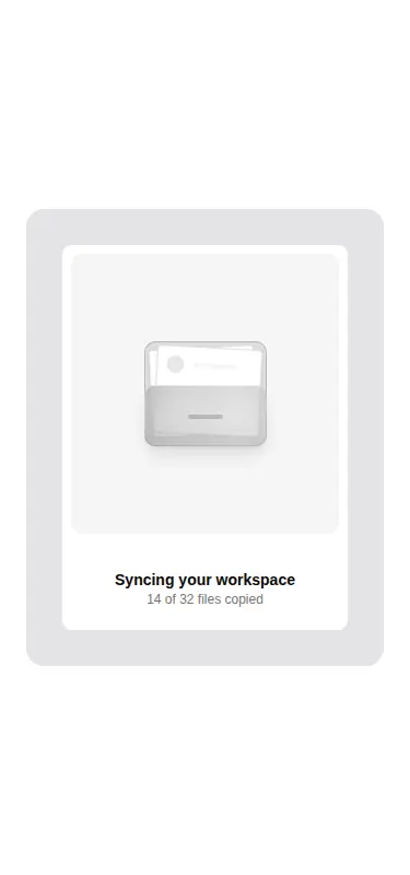
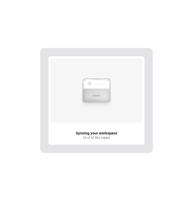
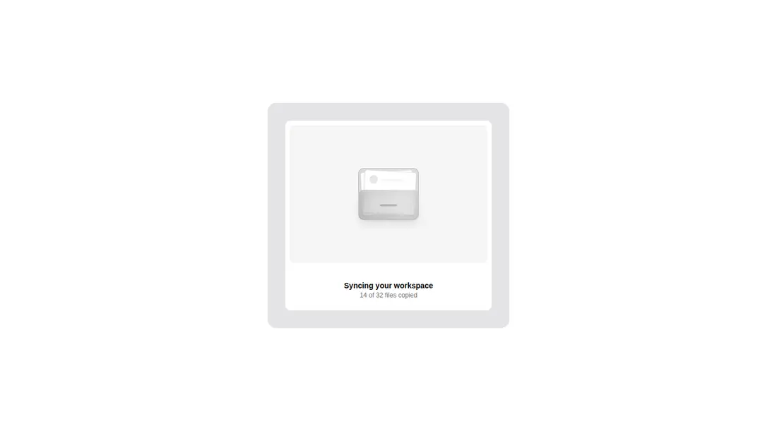
A client-side React status card that animates a folder illustration across its panel on hover or keyboard focus, with reduced-motion handling built in. It ships as registry source, accepts a custom icon and footer content, and uses Framer Motion, Tailwind theme classes, and a cn helper backed by clsx and tailwind-merge.
Measured
Every value below was written by the harness on the run that produced the frames above. None of it is derived from the prose.
| Build | OK |
|---|---|
| Mount | OK |
| Console errors | 0 |
| Uncaught page errors | 0 |
| Horizontal overflow | clean at 375, 768, 1440 |
| Axe critical | 0 |
| Axe serious | 0 |
| Axe moderate | 0 |
| Axe minor | 0 |
| Gzip marginal | 70.8 KB (136.3 KB build, 65.5 KB baseline) |
| Bare mode | OK |
| Provider required | NO |
| Demo used | written from the component source API |
Verdict
A dependable, accessible accent for file-related status states, with clean mounting and responsive behavior. Use it as supporting feedback rather than the sole loading signal, because its motion responds to hover or focus and is not tied to actual progress.
Use it if
- You need a compact visual for file syncing, uploads, imports, or workspace setup.
- Your interface can use hover and focus as an optional animation trigger while keeping the status text visible.
- You want to replace the folder artwork or supply your own footer content without changing the motion sequence.
Skip it if
- You need a loader that starts automatically or reflects real task progress, since this animation is interaction-driven and purely illustrative.
- You want to avoid adding Framer Motion for a single status card.
- Your design system does not use Tailwind utilities or compatible semantic color tokens and you do not want to restyle the component.
Install
| Declared dependencies | framer-motion, react, clsx, tailwind-merge |
|---|---|
| Missing on install | none |
| Bare install | builds and mounts without the shadcn-style helpers |
| Provider | no provider required in the harness |
In a non-shadcn project, add React and Framer Motion, provide a cn utility using clsx and tailwind-merge, and map the Tailwind semantic classes for card, border, muted, background, primary, and focus-ring colors. Keep it in a client-rendered boundary.
Source and credit
This page is a review, not a copy. The component source lives with its author and this site does not republish it. Read the license before you use anything.
Author repository
github.com/moumen-soliman/uitripledAlternatives
Other published entries for the loader pattern, ordered by what they measured: mounts first, then clean axe scans, then bare-mode passes, then the smaller bundle.
- ruixen-solar-loaderspatial
- Renders
- YES
- A11y
- 0
- Gzip
- 19.5KB
- Bare
- pass
- Prov
- NO
- tripled-folder-animationminimal-flat
- Renders
- YES
- A11y
- 0
- Gzip
- 70.8KB
- Bare
- pass
- Prov
- NO
- shadcn-spinnerunclassified
- Renders
- YES
- A11y
- 0
- Gzip
- 29.9KB
- Bare
- fail
- Prov
- NO
- 8bitcn-spinnerskeuomorphism
- Renders
- YES
- A11y
- 0
- Gzip
- 30.0KB
- Bare
- fail
- Prov
- NO
- hextaui-spinnerminimal-flat
- Renders
- YES
- A11y
- 0
- Gzip
- 30.2KB
- Bare
- fail
- Prov
- NO
- kokonut-ai-loadingdark-futuristic
- Renders
- YES
- A11y
- 1
- Gzip
- 21.9KB
- Bare
- pass
- Prov
- NO