Measured entry
tailark-dusk-features-4
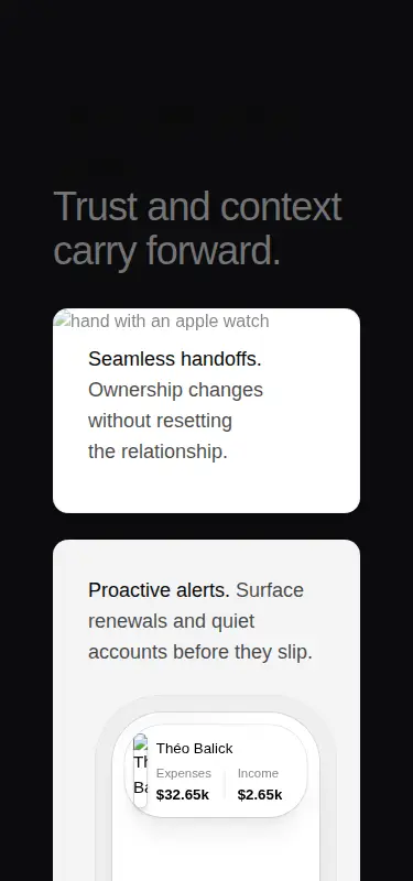
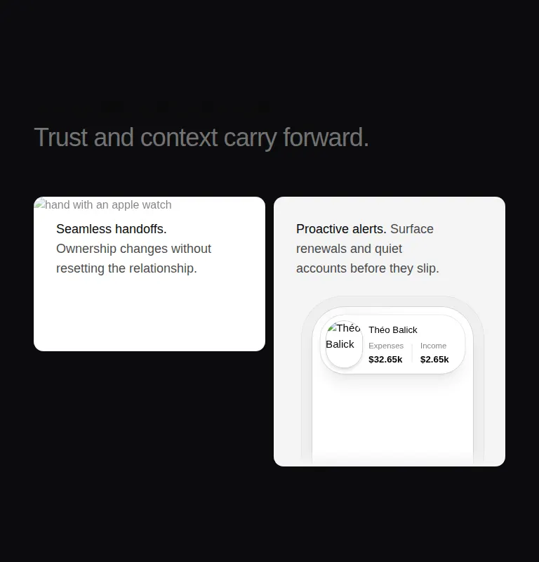
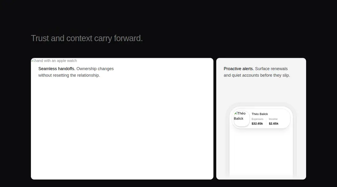
A Tailark feature section delivered as a registry block. It renders a responsive card grid with remote imagery, a framed account illustration, and Next.js Image, while Tailwind theme utilities and a local component alias provide its presentation.
Measured
Every value below was written by the harness on the run that produced the frames above. None of it is derived from the prose.
| Build | OK |
|---|---|
| Mount | OK |
| Console errors | 3 |
| Uncaught page errors | 0 |
| Horizontal overflow | clean at 375, 768, 1440 |
| Axe critical | 0 |
| Axe serious | 1 |
| Axe moderate | 0 |
| Axe minor | 0 |
| Gzip marginal | 37.6 KB (103.0 KB build, 65.4 KB baseline) |
| Bare mode | OK |
| Provider required | NO |
| Demo used | written from the component source API |
What the harness recorded
CONSOLE
Failed to load resource: the server responded with a status of 404 (Not Found)
CONSOLE
Failed to load resource: the server responded with a status of 404 (Not Found)
CONSOLE
Failed to load resource: the server responded with a status of 404 (Not Found)
Verdict
The corrected run builds and mounts this block cleanly without shadcn scaffolding. Its grid is usable, but the remote images failed to load in the harness and muted text has a serious contrast issue, so both need attention before release.
Use it if
- You want a dark product feature grid with photographic and account-style cards.
- Your project can support Next.js Image or adapt the image elements to its own framework.
- You can host the supplied imagery locally or allow its remote sources.
Skip it if
- You want a framework-neutral section with no Tailwind theme assumptions.
- Your release cannot tolerate remote image failures or externally hosted artwork.
- You need an accessibility-ready default without revising the muted text colors.
Install
| Declared dependencies | clsx, tailwind-merge |
|---|---|
| Missing on install | none |
| Bare install | builds and mounts without the shadcn-style helpers |
| Provider | no provider required in the harness |
Copy the registry component and its card primitive, configure the referenced Tailwind theme utilities and import alias, and use Next.js Image or replace it with the project's image element. Host the artwork locally or allow its sources. No shadcn setup is required when these pieces are wired directly.
Source and credit
This page is a review, not a copy. The component source lives with its author and this site does not republish it. Read the license before you use anything.
Author repository
github.com/tailark/blocksAlternatives
Other published entries for the feature-grid pattern, ordered by what they measured: mounts first, then clean axe scans, then bare-mode passes, then the smaller bundle.
- hyperui-feature-grids-3editorial
- Renders
- YES
- A11y
- 0
- Gzip
- 17.7KB
- Bare
- pass
- Prov
- NO
- hyperui-feature-grids-1editorial
- Renders
- YES
- A11y
- 0
- Gzip
- 17.9KB
- Bare
- pass
- Prov
- NO
- hyperui-feature-grids-4editorial
- Renders
- YES
- A11y
- 0
- Gzip
- 17.9KB
- Bare
- pass
- Prov
- NO
- hyperui-feature-grids-2editorial
- Renders
- YES
- A11y
- 0
- Gzip
- 18.3KB
- Bare
- pass
- Prov
- NO
- meraki-feature-grid-list-with-imageminimal-flat
- Renders
- YES
- A11y
- 0
- Gzip
- 18.5KB
- Bare
- pass
- Prov
- NO
- meraki-feature-simpleminimal-flat
- Renders
- YES
- A11y
- 0
- Gzip
- 20.2KB
- Bare
- pass
- Prov
- NO