Measured entry
tailark-dusk-features-5
A client-side React and Next.js feature section with sticky navigation, scroll-aware active states, icon lists, and decorative product illustrations. It ships as a shadcn registry block and imports React, next/image, lucide-react, Tailwind theme utilities, the local Button alias, a bundled image path, and a remote image.
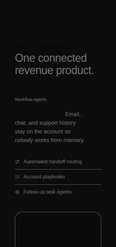
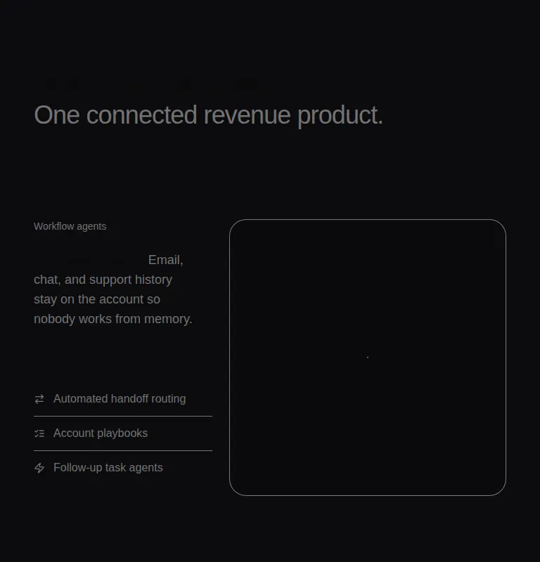
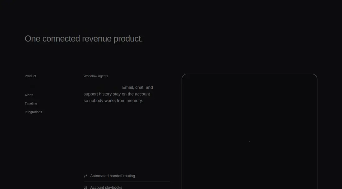
Measured
Every value below was written by the harness on the run that produced the frames above. None of it is derived from the prose.
| Build | OK |
|---|---|
| Mount | OK |
| Console errors | 1 |
| Uncaught page errors | 0 |
| Horizontal overflow | clean at 375, 768, 1440 |
| Axe critical | 0 |
| Axe serious | 1 |
| Axe moderate | 0 |
| Axe minor | 0 |
| Gzip marginal | 44.2 KB (109.6 KB build, 65.4 KB baseline) |
| Bare mode | FAIL |
| Provider required | NO |
| Demo used | written from the component source API |
What the harness recorded
CONSOLE
Failed to load resource: the server responded with a status of 404 (Not Found)
BARE BUILD
✗ Build failed in 618ms
error during build:
[vite]: Rollup failed to resolve import "lucide-react" from "<sandbox>re-7e2ca46ffe76/src/cut/components/features-5.tsx".
Verdict
Do not publish this as a working drop-in. Installation fails because the Tailark Button dependency resolves to a missing shadcn registry URL, so the component never builds or mounts. It needs a shadcn-style setup plus a repaired or locally substituted Button entry before evaluation.
Use it if
- You can repair or replace the unresolved Tailark Button registry dependency before adoption.
- Your Next.js product page needs a long-form feature tour with sticky desktop navigation.
- Your design system already supplies the expected shadcn aliases, color tokens, and Button API.
Skip it if
- You need a registry block that installs and builds without manual repair.
- Your site is not based on React and Next.js or cannot support client-side intersection tracking.
- You do not want to supply the referenced product artwork or configure the remote image source.
- Your page cannot accommodate a tall, scroll-driven feature section.
Install
| Declared dependencies | clsx, tailwind-merge |
|---|---|
| Missing on install | none |
| Bare install | fails once the shadcn-style helpers are removed, so it needs that setup |
| Provider | no provider required in the harness |
A non-shadcn project must add React, Next.js image support, lucide-react, Tailwind utilities and matching theme tokens, the configured component alias, and a compatible Button with the variants and composition API used here. Supply the local payment artwork, allow or replace the remote image, and bypass the broken registry dependency with a local Button implementation.
Source and credit
This page is a review, not a copy. The component source lives with its author and this site does not republish it. Read the license before you use anything.
Author repository
github.com/tailark/blocksAlternatives
Other published entries for the feature-grid pattern, ordered by what they measured: mounts first, then clean axe scans, then bare-mode passes, then the smaller bundle.
- hyperui-feature-grids-3editorial
- Renders
- YES
- A11y
- 0
- Gzip
- 17.7KB
- Bare
- pass
- Prov
- NO
- hyperui-feature-grids-1editorial
- Renders
- YES
- A11y
- 0
- Gzip
- 17.9KB
- Bare
- pass
- Prov
- NO
- hyperui-feature-grids-4editorial
- Renders
- YES
- A11y
- 0
- Gzip
- 17.9KB
- Bare
- pass
- Prov
- NO
- hyperui-feature-grids-2editorial
- Renders
- YES
- A11y
- 0
- Gzip
- 18.3KB
- Bare
- pass
- Prov
- NO
- meraki-feature-grid-list-with-imageminimal-flat
- Renders
- YES
- A11y
- 0
- Gzip
- 18.5KB
- Bare
- pass
- Prov
- NO
- meraki-feature-simpleminimal-flat
- Renders
- YES
- A11y
- 0
- Gzip
- 20.2KB
- Bare
- pass
- Prov
- NO