Measured entry
tripled-animated-checkbox-shadcnui
checkboxminimal-flatmotion on file
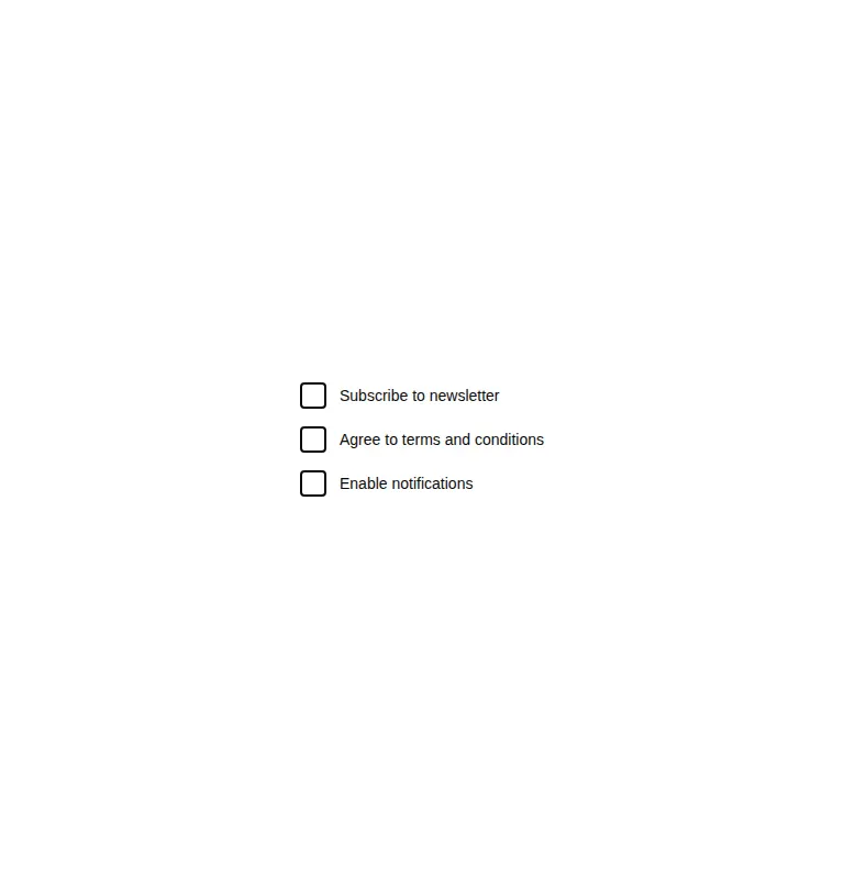
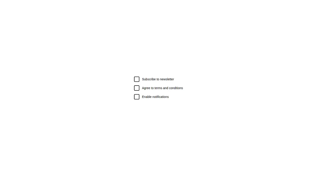
A client-side React registry component that renders a short list of checkbox-like rows, with a spring-animated checkmark on the first row only. It ships as shadcn registry source and relies on React state, Framer Motion, a Lucide icon, utility classes, and theme CSS variables.

Measured
Every value below was written by the harness on the run that produced the frames above. None of it is derived from the prose.
| Build | OK |
|---|---|
| Mount | OK |
| Console errors | 0 |
| Uncaught page errors | 0 |
| Horizontal overflow | clean at 375, 768, 1440 |
| Axe critical | 0 |
| Axe serious | 0 |
| Axe moderate | 0 |
| Axe minor | 0 |
| Gzip marginal | 58.8 KB (124.2 KB build, 65.4 KB baseline) |
| Bare mode | FAIL |
| Provider required | NO |
| Demo used | written from the component source API |
What the harness recorded
BARE BUILD
✗ Build failed in 895ms
error during build:
[vite]: Rollup failed to resolve import "lucide-react" from "<sandbox>re-1a498704d79c/src/cut/components/uitripled/animated-checkbox-shadcnui.tsx".
Verdict
It builds and mounts cleanly, but it is better treated as an animation sample than a finished checkbox. The control is a clickable div without native checkbox semantics, and most displayed rows are inert. Rework the behavior and accessibility before production use.
Use it if
- You want a compact motion treatment to adapt into an existing checkbox implementation.
- Your project already uses React, Framer Motion, Lucide icons, and Tailwind-style utility classes.
- You only need the first row to act as an interactive demo while the remaining rows are visual examples.
Skip it if
- You need a production form control with native checkbox semantics, keyboard input, focus behavior, or form submission.
- Every displayed row must manage its own checked state.
- You do not want to add an animation library for a small control.
- Your design system does not provide the expected utility classes and theme variables.
Install
| Declared dependencies | framer-motion, react, radix-ui |
|---|---|
| Missing on install | none |
| Bare install | fails once the shadcn-style helpers are removed, so it needs that setup |
| Provider | no provider required in the harness |
In a non-shadcn project, add React, Framer Motion, and Lucide React, then supply equivalents for the utility classes and the accent, border, and muted foreground theme variables. Replace the styled div with a native checkbox or an accessible checkbox primitive, and manage state for each row you keep.
Source and credit
This page is a review, not a copy. The component source lives with its author and this site does not republish it. Read the license before you use anything.
Author repository
github.com/moumen-soliman/uitripledAlternatives
Other published entries for the checkbox pattern, ordered by what they measured: mounts first, then clean axe scans, then bare-mode passes, then the smaller bundle.
- neu-checkboxneumorphism
- Renders
- YES
- A11y
- 0
- Gzip
- 17.9KB
- Bare
- pass
- Prov
- NO
- clay-checkboxclaymorphism
- Renders
- YES
- A11y
- 0
- Gzip
- 18.2KB
- Bare
- pass
- Prov
- NO
- shadcn-checkboxunclassified
- Renders
- YES
- A11y
- 0
- Gzip
- 18.4KB
- Bare
- fail
- Prov
- NO
- originui-comp-132minimal-flat
- Renders
- YES
- A11y
- 0
- Gzip
- 32.5KB
- Bare
- fail
- Prov
- NO
- originui-comp-135minimal-flat
- Renders
- YES
- A11y
- 0
- Gzip
- 32.5KB
- Bare
- fail
- Prov
- NO
- originui-comp-140minimal-flat
- Renders
- YES
- A11y
- 0
- Gzip
- 32.5KB
- Bare
- fail
- Prov
- NO