Measured entry
tripled-feature-grid-section-shadcnui
feature-gridminimal-flatmotion on file
A client-side React feature section with a responsive card grid and staggered reveal animations. It ships as a shadcn registry page and relies on shadcn Card primitives, Tailwind theme utilities, Framer Motion, React, and Lucide icons. Its feature copy and icon choices are defined directly in the component.
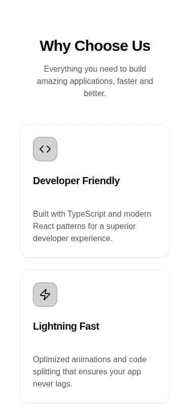
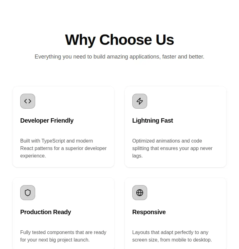
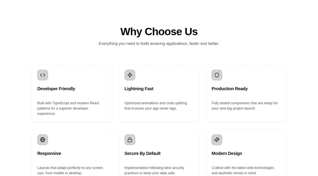
Measured
Every value below was written by the harness on the run that produced the frames above. None of it is derived from the prose.
| Build | OK |
|---|---|
| Mount | OK |
| Console errors | 0 |
| Uncaught page errors | 0 |
| Horizontal overflow | clean at 375, 768, 1440 |
| Axe critical | 0 |
| Axe serious | 1 |
| Axe moderate | 0 |
| Axe minor | 0 |
| Gzip marginal | 69.4 KB (134.8 KB build, 65.4 KB baseline) |
| Bare mode | FAIL |
| Provider required | NO |
| Demo used | written from the component source API |
What the harness recorded
BARE BUILD
✗ Build failed in 51.38s
error during build:
[vite:load-fallback] Could not load <sandbox>/src/lib/utils (imported by src/components/ui/card.tsx): ENOENT: no such file or directory, open '<sandbox>/src/lib/utils'
Verdict
A sound fit for an existing shadcn marketing site, with responsive mounting and restrained motion. It needs a shadcn-style setup in a bare project, and the muted text contrast should be fixed before release. The hard-coded content also limits reuse without refactoring.
Use it if
- You already use shadcn conventions and want a ready-made marketing feature grid.
- You want scroll-triggered card reveals and subtle hover movement without building the motion sequence yourself.
- You are comfortable replacing the bundled generic feature copy and icons in source.
Skip it if
- Your accessibility release gate rejects known color-contrast violations until they are corrected.
- You need a data-driven component whose content is supplied through props rather than edited in source.
- You want to avoid adding an animation library for a largely presentational section.
- Your project does not use Tailwind theme tokens or shadcn-style component aliases and you cannot add that setup.
Install
| Declared dependencies | framer-motion, react |
|---|---|
| Missing on install | none |
| Bare install | fails once the shadcn-style helpers are removed, so it needs that setup |
| Provider | no provider required in the harness |
In a non-shadcn project, add compatible Card primitives, the source alias, the shared class-name utility expected by those primitives, and Tailwind theme tokens for background, foreground, border, and primary colors. Install Framer Motion and Lucide React, then mark the component for client rendering where the framework requires it.
Source and credit
This page is a review, not a copy. The component source lives with its author and this site does not republish it. Read the license before you use anything.
Author repository
github.com/moumen-soliman/uitripledAlternatives
Other published entries for the feature-grid pattern, ordered by what they measured: mounts first, then clean axe scans, then bare-mode passes, then the smaller bundle.
- hyperui-feature-grids-3editorial
- Renders
- YES
- A11y
- 0
- Gzip
- 17.7KB
- Bare
- pass
- Prov
- NO
- hyperui-feature-grids-1editorial
- Renders
- YES
- A11y
- 0
- Gzip
- 17.9KB
- Bare
- pass
- Prov
- NO
- hyperui-feature-grids-4editorial
- Renders
- YES
- A11y
- 0
- Gzip
- 17.9KB
- Bare
- pass
- Prov
- NO
- hyperui-feature-grids-2editorial
- Renders
- YES
- A11y
- 0
- Gzip
- 18.3KB
- Bare
- pass
- Prov
- NO
- meraki-feature-grid-list-with-imageminimal-flat
- Renders
- YES
- A11y
- 0
- Gzip
- 18.5KB
- Bare
- pass
- Prov
- NO
- meraki-feature-simpleminimal-flat
- Renders
- YES
- A11y
- 0
- Gzip
- 20.2KB
- Bare
- pass
- Prov
- NO