Measured entry
tripled-kanban-board-shadcnui
feature-gridglassmorphismmotion on file
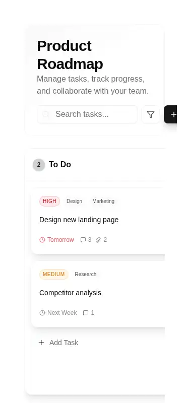
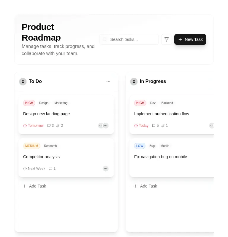
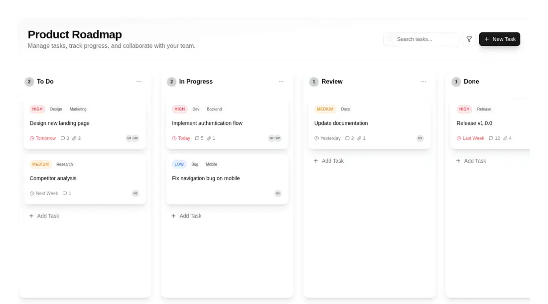
A client-side React kanban board shipped as a shadcn registry block. It keeps mock tasks and columns in local state, supports search and keyboard or pointer sorting through dnd-kit, and uses shadcn Avatar, Badge, Button, and Input primitives, the cn utility, Lucide icons, Tailwind theme tokens, and fixed avatar paths.
Measured
Every value below was written by the harness on the run that produced the frames above. None of it is derived from the prose.
| Build | OK |
|---|---|
| Mount | OK |
| Console errors | 5 |
| Uncaught page errors | 0 |
| Horizontal overflow | clean at 375, 768, 1440 |
| Axe critical | 1 |
| Axe serious | 2 |
| Axe moderate | 1 |
| Axe minor | 0 |
| Gzip marginal | 52.7 KB (118.1 KB build, 65.4 KB baseline) |
| Bare mode | FAIL |
| Provider required | NO |
| Demo used | written from the component source API |
What the harness recorded
CONSOLE
Failed to load resource: the server responded with a status of 404 (Not Found)
CONSOLE
Failed to load resource: the server responded with a status of 404 (Not Found)
CONSOLE
Failed to load resource: the server responded with a status of 404 (Not Found)
Verdict
A credible visual prototype with working search and drag sorting, but not a production-ready task system. It needs a shadcn-style setup, accessibility repairs, real data wiring, working control actions, and valid avatar assets before shipping.
Use it if
- You need a polished roadmap prototype with sortable columns and task cards.
- Your app already uses shadcn conventions, Tailwind theme tokens, and path aliases.
- You are prepared to connect the local mock state and inactive controls to real product behavior.
Skip it if
- You need an accessible production board without first fixing unnamed icon buttons, nested controls, contrast, and heading structure.
- You need persistence, task creation, filter controls, or menu actions to work out of the box.
- You want a lightweight static feature grid without drag-and-drop dependencies and application-level state.
- Your interface cannot supply the referenced avatar assets or tolerate replacing them.
Install
| Declared dependencies | framer-motion, react, radix-ui |
|---|---|
| Missing on install | none |
| Bare install | fails once the shadcn-style helpers are removed, so it needs that setup |
| Provider | no provider required in the harness |
In a non-shadcn project, add the shadcn-style source alias and cn helper, recreate the Avatar, Badge, Button, and Input primitives, configure the expected Tailwind color and border tokens, install the dnd-kit and Lucide packages plus the declared React dependencies, and provide or replace the avatar assets. Ensure the component runs on the client.
Source and credit
This page is a review, not a copy. The component source lives with its author and this site does not republish it. Read the license before you use anything.
Author repository
github.com/moumen-soliman/uitripledAlternatives
Other published entries for the feature-grid pattern, ordered by what they measured: mounts first, then clean axe scans, then bare-mode passes, then the smaller bundle.
- hyperui-feature-grids-3editorial
- Renders
- YES
- A11y
- 0
- Gzip
- 17.7KB
- Bare
- pass
- Prov
- NO
- hyperui-feature-grids-1editorial
- Renders
- YES
- A11y
- 0
- Gzip
- 17.9KB
- Bare
- pass
- Prov
- NO
- hyperui-feature-grids-4editorial
- Renders
- YES
- A11y
- 0
- Gzip
- 17.9KB
- Bare
- pass
- Prov
- NO
- hyperui-feature-grids-2editorial
- Renders
- YES
- A11y
- 0
- Gzip
- 18.3KB
- Bare
- pass
- Prov
- NO
- meraki-feature-grid-list-with-imageminimal-flat
- Renders
- YES
- A11y
- 0
- Gzip
- 18.5KB
- Bare
- pass
- Prov
- NO
- meraki-feature-simpleminimal-flat
- Renders
- YES
- A11y
- 0
- Gzip
- 20.2KB
- Bare
- pass
- Prov
- NO