Measured entry
tripled-native-action-dropdown-shadcnui
selectminimal-flatmotion on file
A client-side React and TypeScript action picker for grouped, nested choices. It ships as a shadcn registry component, uses Framer Motion for transitions, Lucide icons, Tailwind theme classes, and a local cn utility, and supports controlled or uncontrolled selection.

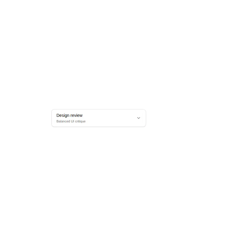
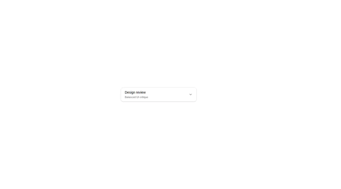
Measured
Every value below was written by the harness on the run that produced the frames above. None of it is derived from the prose.
| Build | OK |
|---|---|
| Mount | OK |
| Console errors | 0 |
| Uncaught page errors | 0 |
| Horizontal overflow | clean at 375, 768, 1440 |
| Axe critical | 0 |
| Axe serious | 0 |
| Axe moderate | 0 |
| Axe minor | 0 |
| Gzip marginal | 75.7 KB (141.2 KB build, 65.5 KB baseline) |
| Bare mode | FAIL |
| Provider required | NO |
| Demo used | written from the component source API |
What the harness recorded
BARE BUILD
✗ Build failed in 748ms
error during build:
[vite]: Rollup failed to resolve import "lucide-react" from "<sandbox>re-cf02f4dc77e2/src/cut/components/uitripled/native-action-dropdown-shadcnui.tsx".
Verdict
A thoughtful fit for compact hierarchical action choices, with solid keyboard behavior and responsive submenu placement. It needs a shadcn-style setup and is less suitable for ordinary forms or long, searchable datasets.
Use it if
- You need grouped choices with nested branches and descriptive metadata.
- You want keyboard navigation, reduced-motion handling, and viewport-aware submenu placement.
- Your product benefits from showing the current selection and its parent context in the trigger.
Skip it if
- You need a native form select with built-in name, validation, and form submission behavior.
- You have a large searchable option set, since this component has no filtering or typeahead.
- You want to avoid adding an animation library for a single picker.
- Your design system does not use Tailwind theme tokens or shadcn-style utility conventions.
Install
| Declared dependencies | framer-motion, react, clsx, tailwind-merge |
|---|---|
| Missing on install | none |
| Bare install | fails once the shadcn-style helpers are removed, so it needs that setup |
| Provider | no provider required in the harness |
In a non-shadcn project, add React, Framer Motion, Lucide React, clsx, and tailwind-merge; provide the cn helper and map the Tailwind theme classes for borders, surfaces, text, focus rings, and accents. Preserve the client-component directive where the framework requires it.
Source and credit
This page is a review, not a copy. The component source lives with its author and this site does not republish it. Read the license before you use anything.
Author repository
github.com/moumen-soliman/uitripledAlternatives
Other published entries for the select pattern, ordered by what they measured: mounts first, then clean axe scans, then bare-mode passes, then the smaller bundle.
- hextaui-native-selectminimal-flat
- Renders
- YES
- A11y
- 0
- Gzip
- 30.6KB
- Bare
- fail
- Prov
- NO
- 8bitcn-difficulty-selectskeuomorphism
- Renders
- YES
- A11y
- 0
- Gzip
- 32.7KB
- Bare
- fail
- Prov
- NO
- hextaui-checkboxminimal-flat
- Renders
- YES
- A11y
- 0
- Gzip
- 35.8KB
- Bare
- fail
- Prov
- NO
- hextaui-radio-groupminimal-flat
- Renders
- YES
- A11y
- 0
- Gzip
- 40.3KB
- Bare
- fail
- Prov
- NO
- ruixen-tag-cloud-selectunclassified
- Renders
- YES
- A11y
- 0
- Gzip
- 58.8KB
- Bare
- fail
- Prov
- NO
- tripled-animated-select-shadcnuiminimal-flat
- Renders
- YES
- A11y
- 0
- Gzip
- 60.4KB
- Bare
- fail
- Prov
- NO