Measured entry
tripled-native-avatar-expand-shadcnui
avatarminimal-flatmotion on file
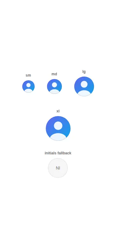
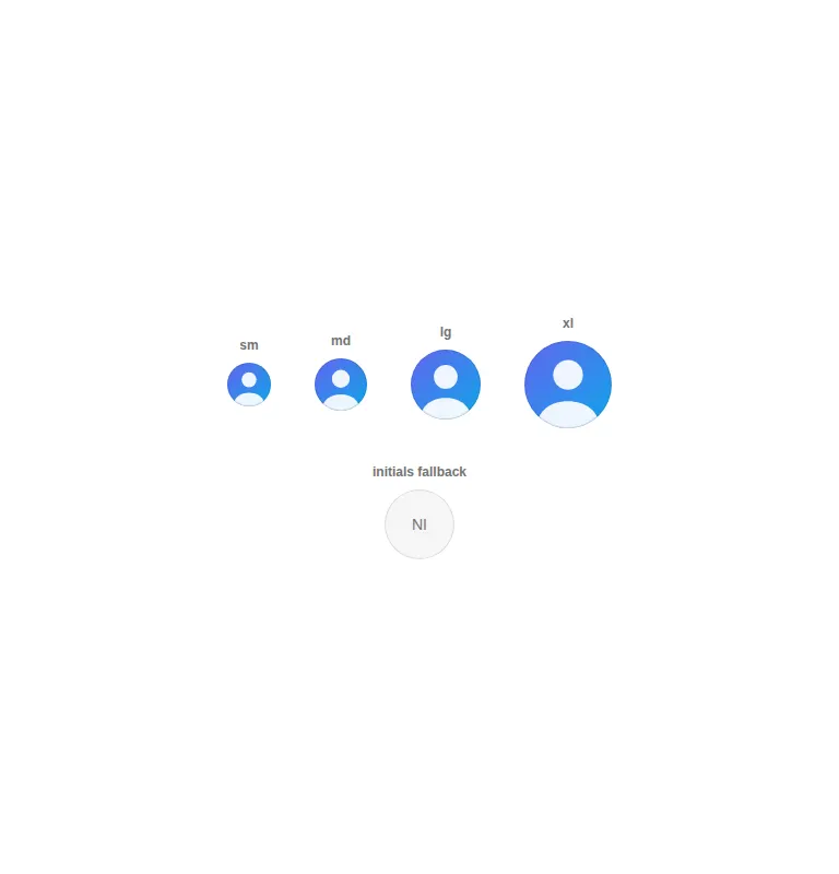
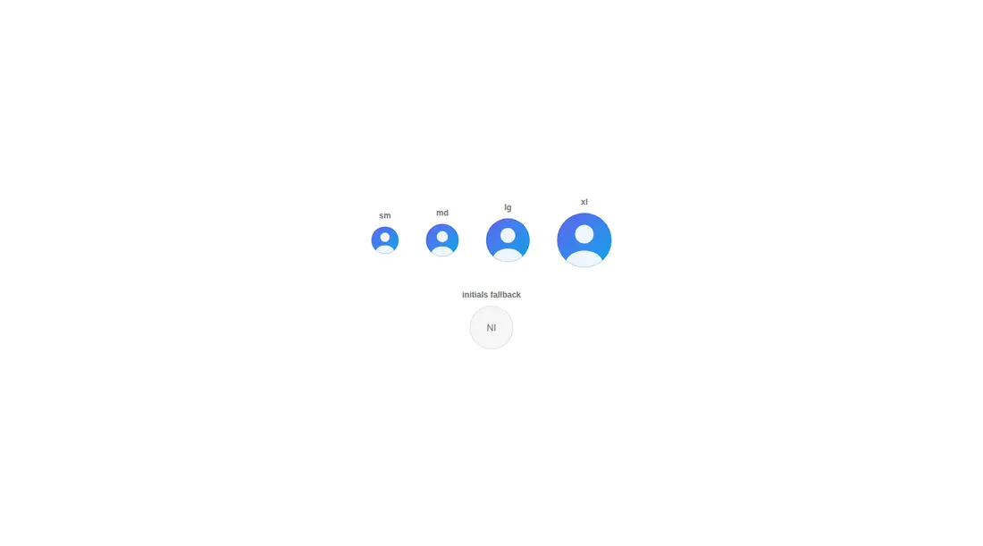
A client-side React avatar button that expands on click to reveal a name, with size variants, initials fallback, tap feedback, and reduced-motion handling. It ships as shadcn registry source and depends on Framer Motion, shadcn Avatar primitives, Tailwind classes and theme tokens, plus the project's cn utility.
Measured
Every value below was written by the harness on the run that produced the frames above. None of it is derived from the prose.
| Build | OK |
|---|---|
| Mount | OK |
| Console errors | 1 |
| Uncaught page errors | 0 |
| Horizontal overflow | clean at 375, 768, 1440 |
| Axe critical | 0 |
| Axe serious | 0 |
| Axe moderate | 0 |
| Axe minor | 0 |
| Gzip marginal | 75.4 KB (140.9 KB build, 65.5 KB baseline) |
| Bare mode | OK |
| Provider required | NO |
| Demo used | written from the component source API |
What the harness recorded
CONSOLE
Failed to load resource: the server responded with a status of 404 (Not Found)
BARE BUILD
Failed to load resource: the server responded with a status of 404 (Not Found)
Verdict
A focused, accessible interaction that builds and mounts cleanly across the tested layouts. It is a good fit inside an existing shadcn stack, but the animation dependency is substantial for the effect and the default missing-image path requests a placeholder asset, which can create console noise unless supplied or changed.
Use it if
- You want an avatar to disclose a short identity label only after interaction.
- Your interface already uses shadcn Avatar primitives, Tailwind theme tokens, and Framer Motion.
- You need initials fallback and user motion preferences handled in the component.
Skip it if
- Names must remain visible without a click, such as in dense member lists or approval flows.
- You want to avoid the animation dependency for a small avatar interaction.
- Your design system does not provide shadcn-compatible Avatar primitives, Tailwind tokens, or a cn helper.
- A missing image must not trigger a request for a placeholder asset.
Install
| Declared dependencies | framer-motion, react, radix-ui, clsx, tailwind-merge |
|---|---|
| Missing on install | none |
| Bare install | builds and mounts without the shadcn-style helpers |
| Provider | no provider required in the harness |
In a non-shadcn project, add Framer Motion, a Radix-based Avatar implementation, Tailwind styles and the expected theme tokens, and a cn helper backed by clsx and tailwind-merge. Configure the import alias or rewrite the imports. Also provide the placeholder asset or change the missing-image behavior.
Source and credit
This page is a review, not a copy. The component source lives with its author and this site does not republish it. Read the license before you use anything.
Author repository
github.com/moumen-soliman/uitripledAlternatives
Other published entries for the avatar pattern, ordered by what they measured: mounts first, then clean axe scans, then bare-mode passes, then the smaller bundle.
- hextaui-avatarminimal-flat
- Renders
- YES
- A11y
- 0
- Gzip
- 32.7KB
- Bare
- pass
- Prov
- NO
- neobrutalism-avatarbrutalism
- Renders
- YES
- A11y
- 0
- Gzip
- 32.7KB
- Bare
- pass
- Prov
- NO
- shadcn-avatarunclassified
- Renders
- YES
- A11y
- 0
- Gzip
- 33.0KB
- Bare
- pass
- Prov
- NO
- tripled-native-avatar-with-name-shadcnuiminimal-flat
- Renders
- YES
- A11y
- 0
- Gzip
- 75.5KB
- Bare
- pass
- Prov
- NO
- magicui-avatar-circlesbento
- Renders
- YES
- A11y
- 0
- Gzip
- 26.0KB
- Bare
- fail
- Prov
- NO
- 8bitcn-avatarskeuomorphism
- Renders
- YES
- A11y
- 0
- Gzip
- 30.5KB
- Bare
- fail
- Prov
- NO