Measured entry
tripled-simple-calendar-shadcnui
selectminimal-flatmotion on file
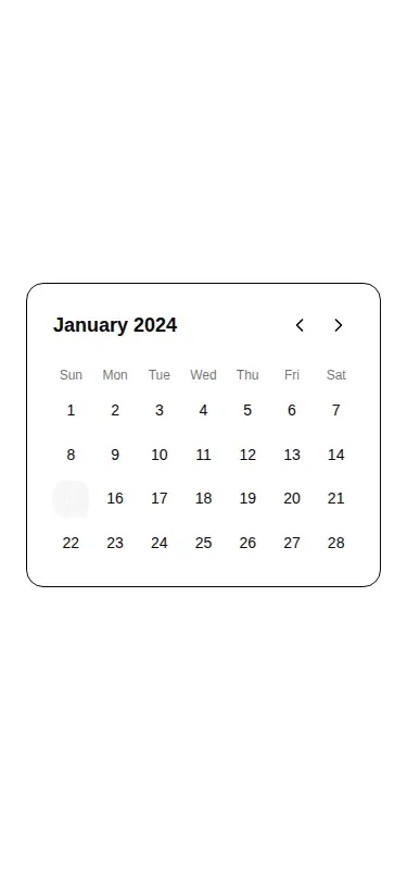
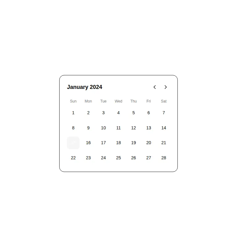
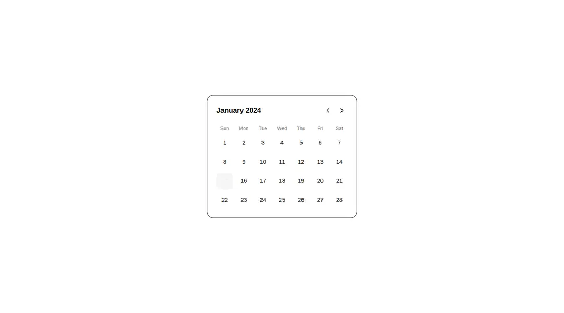
A client-side React calendar card distributed as a shadcn registry component. It renders a fixed January view, animates day selection with Framer Motion, and uses Lucide chevrons plus Tailwind and shadcn-style theme tokens. The registry also declares the shared button component, although this source uses native motion buttons.
Measured
Every value below was written by the harness on the run that produced the frames above. None of it is derived from the prose.
| Build | OK |
|---|---|
| Mount | OK |
| Console errors | 0 |
| Uncaught page errors | 0 |
| Horizontal overflow | clean at 375, 768, 1440 |
| Axe critical | 1 |
| Axe serious | 1 |
| Axe moderate | 0 |
| Axe minor | 0 |
| Gzip marginal | 61.8 KB (127.2 KB build, 65.4 KB baseline) |
| Bare mode | FAIL |
| Provider required | NO |
| Demo used | written from the component source API |
What the harness recorded
BARE BUILD
✗ Build failed in 1.19s
error during build:
[vite]: Rollup failed to resolve import "lucide-react" from "<sandbox>re-143e314cdd3a/src/cut/components/uitripled/simple-calendar-shadcnui.tsx".
Verdict
Useful as a polished interaction sketch, but too hardcoded to ship as a real date picker. The month controls do nothing, the calendar data is fixed, and the verified accessibility issues require attention. Treat it as starter UI, not finished form infrastructure.
Use it if
- You need a compact single-day selection demo inside an existing Tailwind and shadcn-themed React app.
- You want an animated selection treatment to adapt into a real date picker.
- Your product only needs a fixed calendar mockup or prototype.
Skip it if
- You need working previous and next month navigation or calendar-aware date calculations.
- You need a production-ready date picker with dates supplied by props, form integration, or disabled-date rules.
- You require accessible output without first labeling the icon controls and correcting the flagged contrast.
- You want to avoid adding an animation library for a small selection effect.
Install
| Declared dependencies | framer-motion, react, radix-ui |
|---|---|
| Missing on install | none |
| Bare install | fails once the shadcn-style helpers are removed, so it needs that setup |
| Provider | no provider required in the harness |
A non-shadcn project must add React, Framer Motion, and Lucide React, configure Tailwind utilities, and define the card, foreground, and accent theme values used by the classes. Add accessible names to the chevron buttons and adjust the low-contrast text before release. The declared shared button registry item is not actually imported by this component.
Source and credit
This page is a review, not a copy. The component source lives with its author and this site does not republish it. Read the license before you use anything.
Author repository
github.com/moumen-soliman/uitripledAlternatives
Other published entries for the select pattern, ordered by what they measured: mounts first, then clean axe scans, then bare-mode passes, then the smaller bundle.
- hextaui-native-selectminimal-flat
- Renders
- YES
- A11y
- 0
- Gzip
- 30.6KB
- Bare
- fail
- Prov
- NO
- 8bitcn-difficulty-selectskeuomorphism
- Renders
- YES
- A11y
- 0
- Gzip
- 32.7KB
- Bare
- fail
- Prov
- NO
- hextaui-checkboxminimal-flat
- Renders
- YES
- A11y
- 0
- Gzip
- 35.8KB
- Bare
- fail
- Prov
- NO
- hextaui-radio-groupminimal-flat
- Renders
- YES
- A11y
- 0
- Gzip
- 40.3KB
- Bare
- fail
- Prov
- NO
- ruixen-tag-cloud-selectunclassified
- Renders
- YES
- A11y
- 0
- Gzip
- 58.8KB
- Bare
- fail
- Prov
- NO
- tripled-animated-select-shadcnuiminimal-flat
- Renders
- YES
- A11y
- 0
- Gzip
- 60.4KB
- Bare
- fail
- Prov
- NO