Measured entry
tripled-smart-hover-card-shadcnui
popoverminimal-flatmotion on file
A client-side React card that detects the cursor entry direction and animates an overlay reveal from that edge. It ships as a shadcn registry component, uses Framer Motion for the transition, and expects Tailwind utilities plus shadcn theme tokens; its registry also declares the button and card primitives.
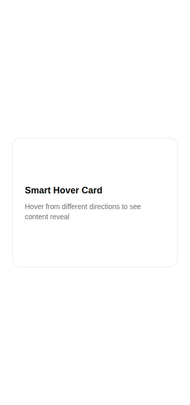
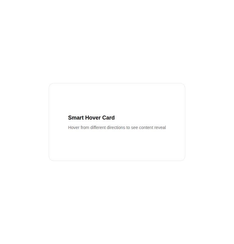
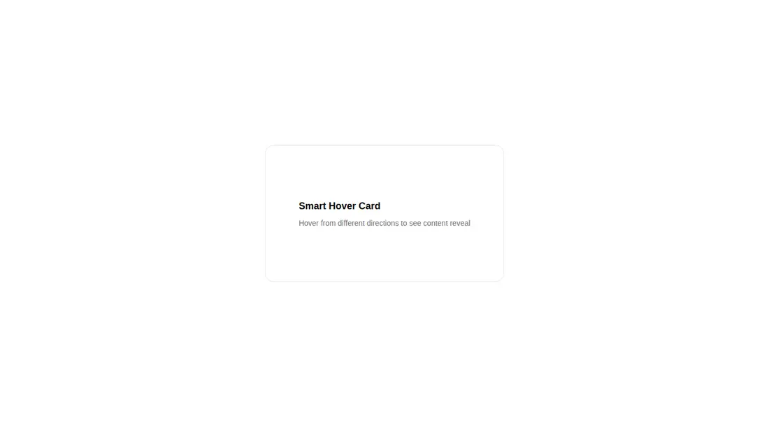
Measured
Every value below was written by the harness on the run that produced the frames above. None of it is derived from the prose.
| Build | OK |
|---|---|
| Mount | OK |
| Console errors | 0 |
| Uncaught page errors | 0 |
| Horizontal overflow | clean at 375, 768, 1440 |
| Axe critical | 0 |
| Axe serious | 0 |
| Axe moderate | 0 |
| Axe minor | 0 |
| Gzip marginal | 61.4 KB (126.8 KB build, 65.4 KB baseline) |
| Bare mode | OK |
| Provider required | NO |
| Demo used | written from the component source API |
Verdict
A polished directional reveal with clean mounting and no detected accessibility or overflow issues. Use it as an enhancement for pointer-driven cards, but add equivalent focus and touch behavior before placing essential actions or information inside the overlay.
Use it if
- You want a directional hover reveal for portfolio tiles, feature cards, or media previews.
- Your project already uses Tailwind theme tokens and Framer Motion.
- The revealed content is supplementary and the base card remains useful without hovering.
Skip it if
- The hidden content must be available through keyboard focus or touch interaction.
- You need a semantic popover with focus management, dismissal behavior, and assistive technology state.
- You do not want to add Framer Motion for a single decorative interaction.
Install
| Declared dependencies | framer-motion, react, radix-ui |
|---|---|
| Missing on install | none |
| Bare install | builds and mounts without the shadcn-style helpers |
| Provider | no provider required in the harness |
In a non-shadcn project, add React and Framer Motion, configure Tailwind, and define equivalents for the card, border, primary, and muted foreground theme tokens. The declared button and card registry dependencies can be omitted unless your surrounding implementation uses them.
Source and credit
This page is a review, not a copy. The component source lives with its author and this site does not republish it. Read the license before you use anything.
Author repository
github.com/moumen-soliman/uitripledAlternatives
Other published entries for the popover pattern, ordered by what they measured: mounts first, then clean axe scans, then bare-mode passes, then the smaller bundle.
- hextaui-hover-cardminimal-flat
- Renders
- YES
- A11y
- 0
- Gzip
- 46.9KB
- Bare
- fail
- Prov
- NO
- 8bitcn-hover-cardskeuomorphism
- Renders
- YES
- A11y
- 0
- Gzip
- 47.0KB
- Bare
- fail
- Prov
- NO
- neobrutalism-popoverbrutalism
- Renders
- YES
- A11y
- 0
- Gzip
- 49.6KB
- Bare
- fail
- Prov
- NO
- shadcn-popoverunclassified
- Renders
- YES
- A11y
- 0
- Gzip
- 49.6KB
- Bare
- fail
- Prov
- NO
- 8bitcn-popoverskeuomorphism
- Renders
- YES
- A11y
- 0
- Gzip
- 53.2KB
- Bare
- fail
- Prov
- NO