Measured entry
tripled-social-login-button-shadcnui
auth-formminimal-flatmotion on file
A shadcn registry component for branded sign-in buttons covering GitHub, Google, X, Vercel, and LinkedIn, with slide, scale, glow, shine, or static treatments. It ships as React source and relies on a local shadcn Button, a cn utility, Tailwind theme classes, Framer Motion, and Lucide icons.
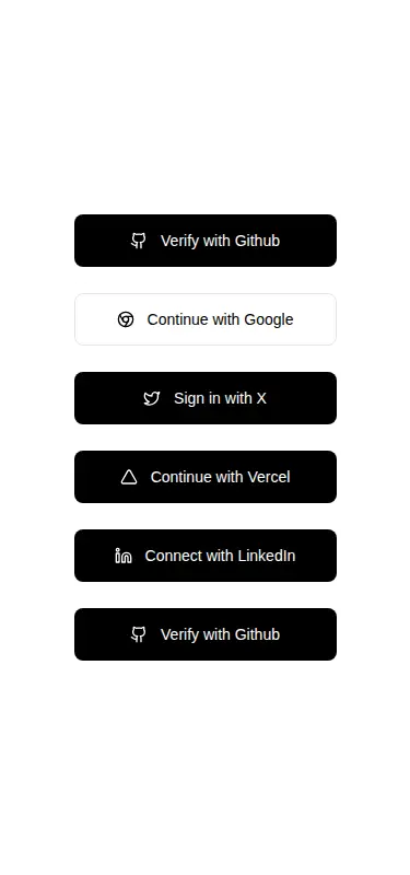
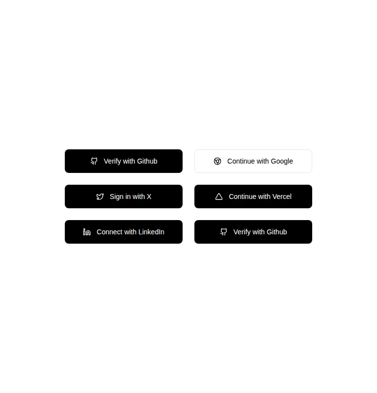
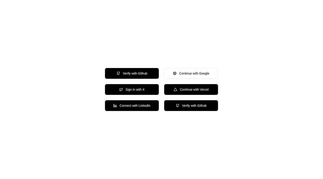
Measured
Every value below was written by the harness on the run that produced the frames above. None of it is derived from the prose.
| Build | OK |
|---|---|
| Mount | OK |
| Console errors | 0 |
| Uncaught page errors | 0 |
| Horizontal overflow | clean at 375, 768, 1440 |
| Axe critical | 0 |
| Axe serious | 0 |
| Axe moderate | 0 |
| Axe minor | 0 |
| Gzip marginal | 33.7 KB (99.2 KB build, 65.5 KB baseline) |
| Bare mode | FAIL |
| Provider required | NO |
| Demo used | written from the component source API |
What the harness recorded
BARE BUILD
✗ Build failed in 860ms
error during build:
[vite]: Rollup failed to resolve import "lucide-react" from "<sandbox>re-00f0f9917ebd/src/cut/components/uitripled/social-login-button-shadcnui.tsx".
Verdict
A practical fit for an existing shadcn authentication screen, with useful motion choices and clean responsive behavior. It needs a shadcn-style setup and will not mount in a bare React app as supplied because its local Button, cn helper, theme utilities, and Lucide import must be available.
Use it if
- You already use shadcn conventions and want matching social sign-in controls with selectable hover treatments.
- Your authentication screen uses one of the included providers and can attach its login handler through standard button props.
- You want full-width controls on small screens that contract to content-sized buttons in wider layouts.
Skip it if
- You need the component to perform OAuth flows or manage authentication state; it only renders and forwards button props.
- You need providers outside the fixed set without editing the source and adding their icons and styles.
- You want official provider artwork or strict brand compliance, since several marks are represented by generic Lucide icons and shared monochrome styling.
- You are avoiding a shadcn and Tailwind dependency layer for a small sign-in control.
Install
| Declared dependencies | framer-motion, react, radix-ui, clsx, tailwind-merge |
|---|---|
| Missing on install | none |
| Bare install | fails once the shadcn-style helpers are removed, so it needs that setup |
| Provider | no provider required in the harness |
In a non-shadcn project, add a compatible Button component and ButtonProps export, provide the cn class-merging helper, configure Tailwind with the referenced theme tokens and motion utilities, and install Lucide React plus the declared React and animation dependencies. Preserve the source path aliases or rewrite those imports.
Source and credit
This page is a review, not a copy. The component source lives with its author and this site does not republish it. Read the license before you use anything.
Author repository
github.com/moumen-soliman/uitripledAlternatives
Other published entries for the auth-form pattern, ordered by what they measured: mounts first, then clean axe scans, then bare-mode passes, then the smaller bundle.
- meraki-auth-sign-in-card-with-side-imageminimal-flat
- Renders
- YES
- A11y
- 0
- Gzip
- 18.9KB
- Bare
- pass
- Prov
- NO
- shadcn-block-login-01minimal-flat
- Renders
- YES
- A11y
- 0
- Gzip
- 30.3KB
- Bare
- fail
- Prov
- NO
- shadcn-block-login-02minimal-flat
- Renders
- YES
- A11y
- 0
- Gzip
- 31.9KB
- Bare
- fail
- Prov
- NO
- shadcn-block-login-05minimal-flat
- Renders
- YES
- A11y
- 0
- Gzip
- 31.9KB
- Bare
- fail
- Prov
- NO
- 8bitcn-login-formskeuomorphism
- Renders
- YES
- A11y
- 0
- Gzip
- 33.2KB
- Bare
- fail
- Prov
- NO
- 8bitcn-advanced3skeuomorphism
- Renders
- YES
- A11y
- 0
- Gzip
- 33.3KB
- Bare
- fail
- Prov
- NO