Measured entry
tripled-stocks-dashboard-shadcnui
feature-gridminimal-flatmotion on file
A client-side React stock portfolio block with animated summary cards, a holdings table, and a dialog opened from each row. It ships as a shadcn registry block with mock market data and relies on shadcn Card, Badge, and Dialog primitives, Tailwind theme classes, Framer Motion, Lucide icons, and React state.
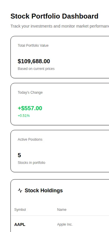
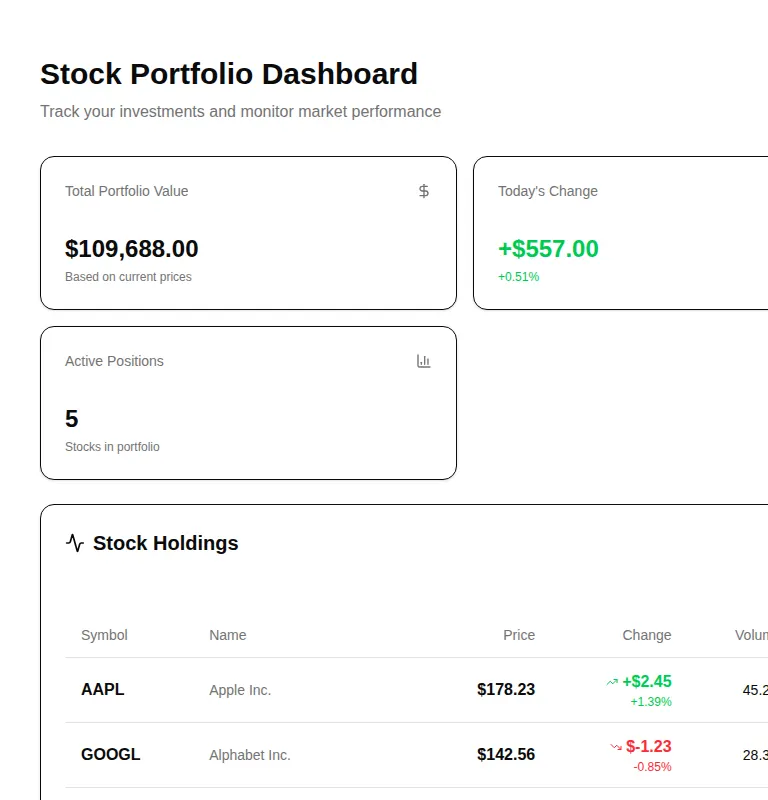
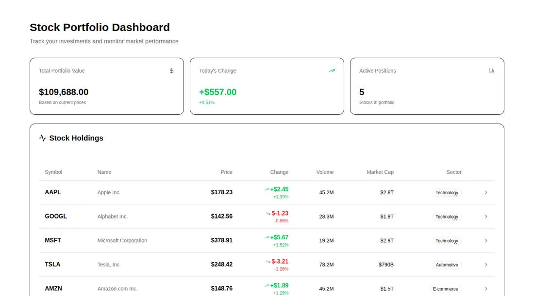
Measured
Every value below was written by the harness on the run that produced the frames above. None of it is derived from the prose.
| Build | OK |
|---|---|
| Mount | OK |
| Console errors | 0 |
| Uncaught page errors | 0 |
| Horizontal overflow | flagged at 375, 768 |
| Axe critical | 0 |
| Axe serious | 1 |
| Axe moderate | 0 |
| Axe minor | 0 |
| Gzip marginal | 86.9 KB (152.3 KB build, 65.4 KB baseline) |
| Bare mode | FAIL |
| Provider required | NO |
| Demo used | written from the component source API |
What the harness recorded
BARE BUILD
✗ Build failed in 1m 36s
error during build:
[vite:load-fallback] Could not load <sandbox>/src/lib/utils (imported by src/components/ui/badge.tsx): ENOENT: no such file or directory, open '<sandbox>/src/lib/utils'
Verdict
A useful desktop-oriented dashboard scaffold, but not production-ready unchanged. It needs a shadcn-style setup, its narrow layouts overflow, and the muted text colors need contrast work. Choose it when the table and detail-dialog structure save more time than the required responsive and accessibility fixes.
Use it if
- You need a ready-made portfolio dashboard shell and will replace the embedded mock holdings with live data.
- Your product already uses shadcn conventions and can reuse its cards, badges, dialogs, theme tokens, and import aliases.
- A desktop-first holdings table with animated entry and drill-down details suits the workflow.
Skip it if
- The dashboard must fit narrow or medium screens without horizontal overflow or a scrolling table.
- You need an accessible release without first correcting the flagged text color contrast.
- You want a standalone component with no shadcn utility, theme, and primitive setup.
- You need production market data, charting, sorting, filtering, or portfolio calculations beyond the fixed sample.
Install
| Declared dependencies | framer-motion, react, radix-ui |
|---|---|
| Missing on install | none |
| Bare install | fails once the shadcn-style helpers are removed, so it needs that setup |
| Provider | no provider required in the harness |
For a non-shadcn project, add Tailwind with the expected theme tokens, the shadcn class-merging utility and import aliases, plus compatible Card, Badge, and Dialog primitives. Install React, Framer Motion, Lucide React, and the Radix dialog dependency, then provide the global styles used by the shadcn classes.
Source and credit
This page is a review, not a copy. The component source lives with its author and this site does not republish it. Read the license before you use anything.
Author repository
github.com/moumen-soliman/uitripledAlternatives
Other published entries for the feature-grid pattern, ordered by what they measured: mounts first, then clean axe scans, then bare-mode passes, then the smaller bundle.
- hyperui-feature-grids-3editorial
- Renders
- YES
- A11y
- 0
- Gzip
- 17.7KB
- Bare
- pass
- Prov
- NO
- hyperui-feature-grids-1editorial
- Renders
- YES
- A11y
- 0
- Gzip
- 17.9KB
- Bare
- pass
- Prov
- NO
- hyperui-feature-grids-4editorial
- Renders
- YES
- A11y
- 0
- Gzip
- 17.9KB
- Bare
- pass
- Prov
- NO
- hyperui-feature-grids-2editorial
- Renders
- YES
- A11y
- 0
- Gzip
- 18.3KB
- Bare
- pass
- Prov
- NO
- meraki-feature-grid-list-with-imageminimal-flat
- Renders
- YES
- A11y
- 0
- Gzip
- 18.5KB
- Bare
- pass
- Prov
- NO
- meraki-feature-simpleminimal-flat
- Renders
- YES
- A11y
- 0
- Gzip
- 20.2KB
- Bare
- pass
- Prov
- NO