Measured entry
uilayouts-btn-hover-left-flip
hover-effect3dmotion on file
A client-marked React button that swaps between two fixed-label layers with a leftward hover transition. It ships as a shadcn registry component with no package dependencies, but its appearance and motion rely on Tailwind utility classes and dark-mode variants.
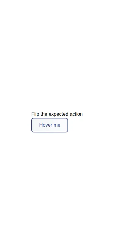
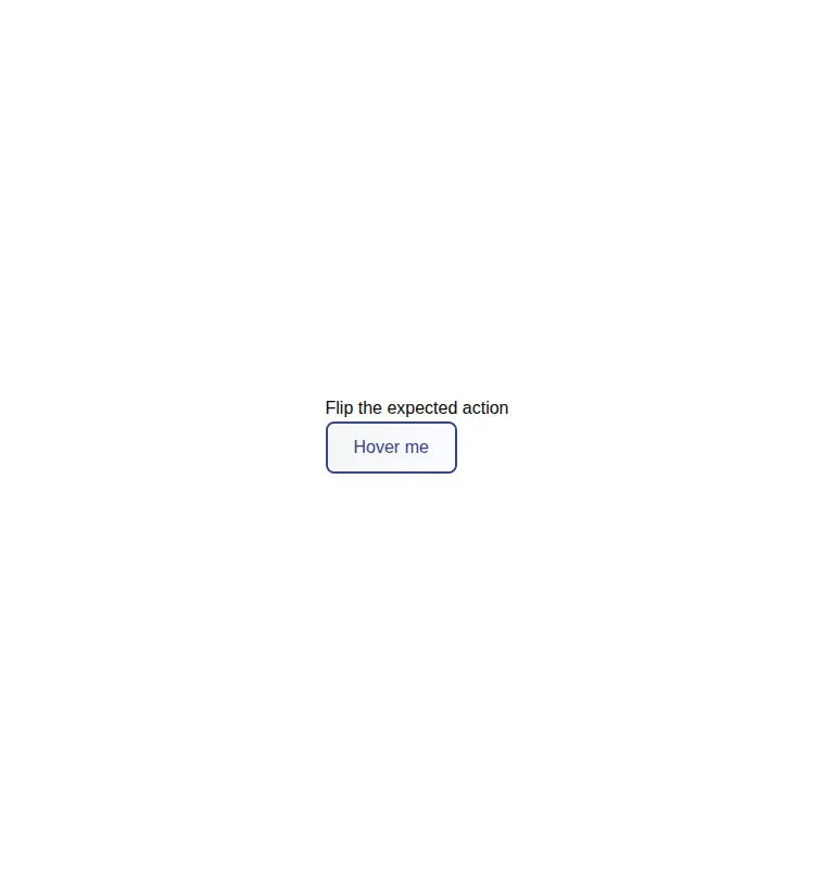
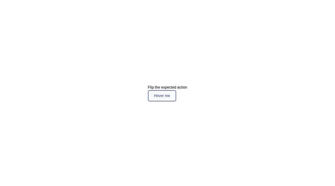
Measured
Every value below was written by the harness on the run that produced the frames above. None of it is derived from the prose.
| Build | OK |
|---|---|
| Mount | OK |
| Console errors | 0 |
| Uncaught page errors | 0 |
| Horizontal overflow | clean at 375, 768, 1440 |
| Axe critical | 0 |
| Axe serious | 0 |
| Axe moderate | 0 |
| Axe minor | 0 |
| Gzip marginal | 17.5 KB (82.9 KB build, 65.4 KB baseline) |
| Bare mode | OK |
| Provider required | NO |
| Demo used | written from the component source API |
Verdict
A tidy, dependency-free hover idea, but not a finished design-system primitive. The fixed copy, hover-only behavior, hardcoded colors, and missing explicit button type make it best treated as a small animation recipe that you customize before shipping.
Use it if
- You need a compact hover treatment for a secondary call to action.
- Your interface already uses Tailwind and can absorb the component's fixed color palette.
- You are willing to adapt the hardcoded label and styling into your button API.
Skip it if
- The action must communicate its state equally well through keyboard focus or touch.
- You need a drop-in button that renders supplied child content without editing the source.
- The button will sit inside forms where an explicit button type is required.
- Your design system avoids hover-only motion or hardcoded light and dark colors.
Install
| Declared dependencies | none declared |
|---|---|
| Missing on install | none |
| Bare install | builds and mounts without the shadcn-style helpers |
| Provider | no provider required in the harness |
In a non-shadcn project, add the React component file, enable the Tailwind utilities used for gradients, transforms, transitions, grouping, and dark mode, then replace the fixed label and colors. Add an explicit button type and matching focus behavior for production use.
Source and credit
This page is a review, not a copy. The component source lives with its author and this site does not republish it. Read the license before you use anything.
Author repository
github.com/ui-layouts/uilayoutsAlternatives
Other published entries for the hover-effect pattern, ordered by what they measured: mounts first, then clean axe scans, then bare-mode passes, then the smaller bundle.
- eldora-card-flip-hover3d
- Renders
- YES
- A11y
- 0
- Gzip
- 17.5KB
- Bare
- pass
- Prov
- NO
- uilayouts-btn-hover-down3d
- Renders
- YES
- A11y
- 0
- Gzip
- 17.6KB
- Bare
- pass
- Prov
- NO
- uilayouts-btn-hover-multiplegradient-glow
- Renders
- YES
- A11y
- 0
- Gzip
- 17.9KB
- Bare
- pass
- Prov
- NO
- magicui-cool-modespatial
- Renders
- YES
- A11y
- 0
- Gzip
- 21.8KB
- Bare
- pass
- Prov
- NO
- uilayouts-hovercard2gradient-glow
- Renders
- YES
- A11y
- 0
- Gzip
- 24.0KB
- Bare
- pass
- Prov
- NO
- fancy-drag-elementsspatial
- Renders
- YES
- A11y
- 0
- Gzip
- 58.1KB
- Bare
- pass
- Prov
- NO