Measured entry
uilayouts-hovercard2
hover-effectgradient-glowmotion on file
A fixed-size profile card whose image expands and shifts from grayscale to color on hover while its caption gives way to a button. It ships as a shadcn registry TSX component styled with Tailwind classes, uses Next.js Image and lucide-react imports, and declares motion even though the source does not use it.
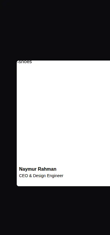
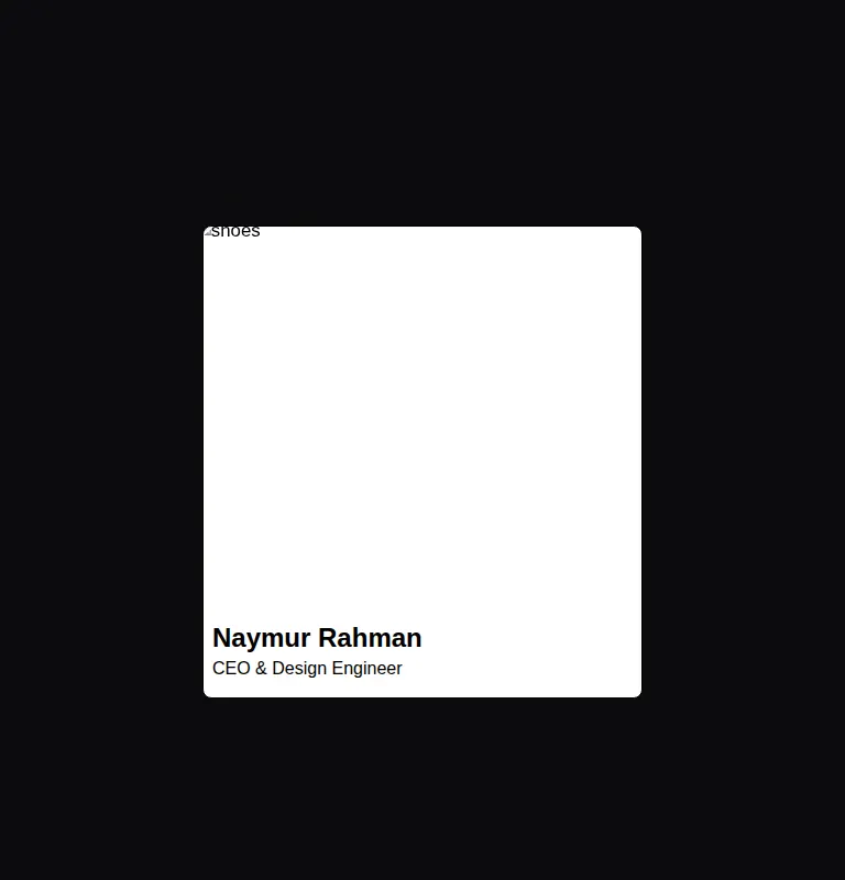
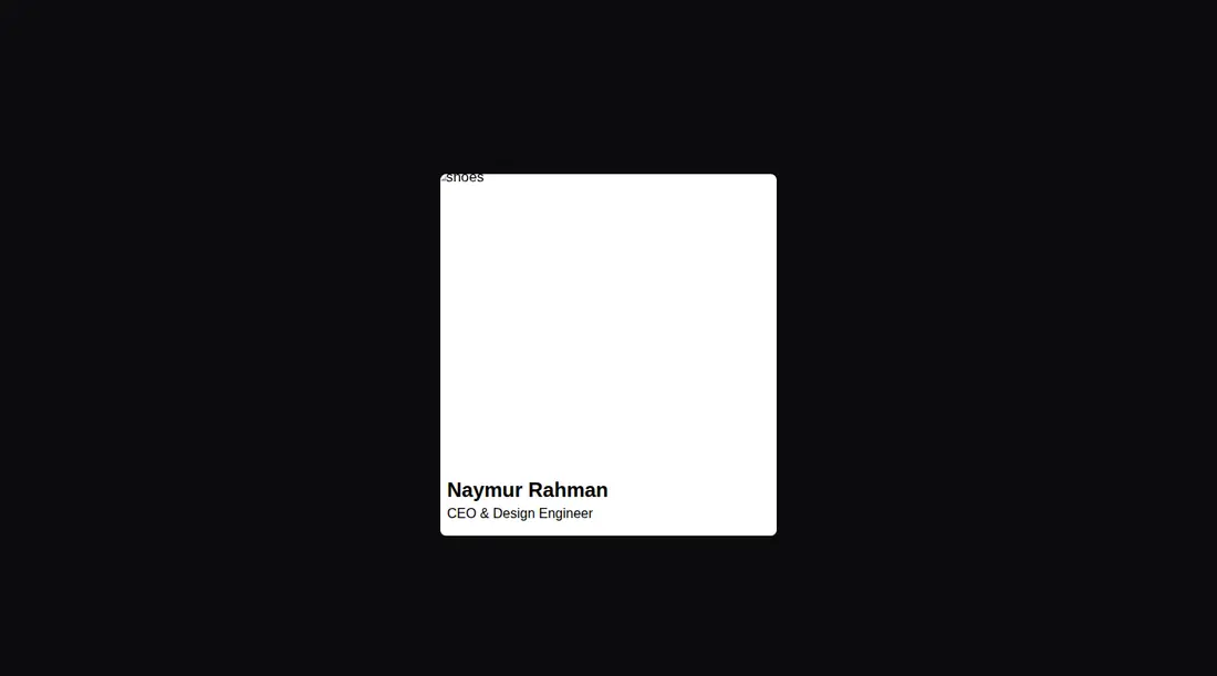
Measured
Every value below was written by the harness on the run that produced the frames above. None of it is derived from the prose.
| Build | OK |
|---|---|
| Mount | OK |
| Console errors | 1 |
| Uncaught page errors | 0 |
| Horizontal overflow | flagged at 375 |
| Axe critical | 0 |
| Axe serious | 0 |
| Axe moderate | 0 |
| Axe minor | 0 |
| Gzip marginal | 24.0 KB (89.4 KB build, 65.4 KB baseline) |
| Bare mode | OK |
| Provider required | NO |
| Demo used | written from the component source API |
What the harness recorded
CONSOLE
Failed to load resource: the server responded with a status of 404 (Not Found)
BARE BUILD
Failed to load resource: the server responded with a status of 404 (Not Found)
Verdict
A usable visual starter, but not a drop-in product component. It builds and mounts without shadcn scaffolding, yet the demo content is ignored, the bundled portrait path is missing, narrow layouts overflow, and the reveal is hover-dependent. Choose it only if you plan to parameterize and harden it.
Use it if
- You need a dark-friendly profile or team card with a simple image-led hover reveal.
- Your project already uses Tailwind and can supply the expected local portrait asset.
- The card will sit in a layout with enough width for its fixed sizing.
Skip it if
- You need the supplied title or children to appear, because this component accepts no content props.
- Your design must fit narrow phone screens without modifying the fixed card width.
- The revealed action must work equally well for keyboard and touch users rather than relying on hover.
- You want a reusable card with configurable image, name, role, and action behavior.
Install
| Declared dependencies | motion |
|---|---|
| Missing on install | none |
| Bare install | builds and mounts without the shadcn-style helpers |
| Provider | no provider required in the harness |
In a non-shadcn project, add Tailwind styling, lucide-react, and either Next.js Image or a standard image replacement. Provide the referenced portrait asset or make the image a prop. The registry declares motion, but this source does not use it, so it can be removed unless other code needs it. Add focus and touch behavior for the revealed action.
Source and credit
This page is a review, not a copy. The component source lives with its author and this site does not republish it. Read the license before you use anything.
Author repository
github.com/ui-layouts/uilayoutsAlternatives
Other published entries for the hover-effect pattern, ordered by what they measured: mounts first, then clean axe scans, then bare-mode passes, then the smaller bundle.
- eldora-card-flip-hover3d
- Renders
- YES
- A11y
- 0
- Gzip
- 17.5KB
- Bare
- pass
- Prov
- NO
- uilayouts-btn-hover-left-flip3d
- Renders
- YES
- A11y
- 0
- Gzip
- 17.5KB
- Bare
- pass
- Prov
- NO
- uilayouts-btn-hover-down3d
- Renders
- YES
- A11y
- 0
- Gzip
- 17.6KB
- Bare
- pass
- Prov
- NO
- uilayouts-btn-hover-multiplegradient-glow
- Renders
- YES
- A11y
- 0
- Gzip
- 17.9KB
- Bare
- pass
- Prov
- NO
- magicui-cool-modespatial
- Renders
- YES
- A11y
- 0
- Gzip
- 21.8KB
- Bare
- pass
- Prov
- NO
- fancy-drag-elementsspatial
- Renders
- YES
- A11y
- 0
- Gzip
- 58.1KB
- Bare
- pass
- Prov
- NO