Measured entry
uilayouts-sticky-hero-scroll
hero-effect3dmotion on file
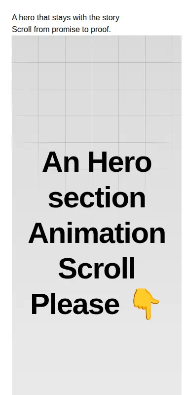
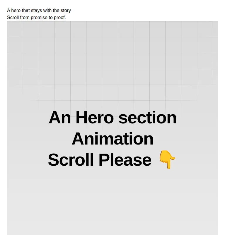
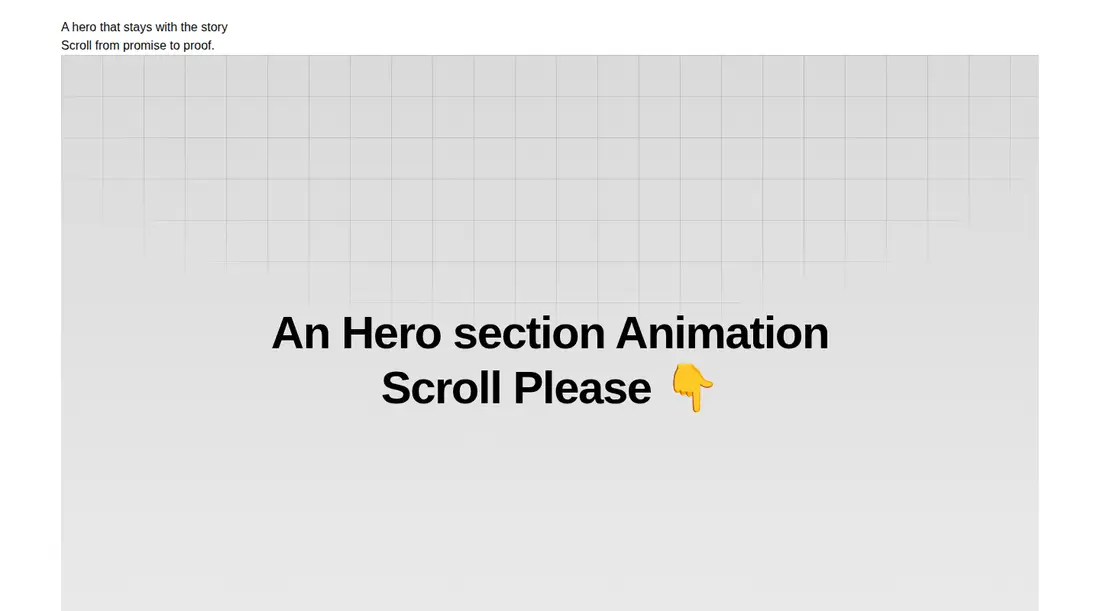
A client-side React hero that pins one full-screen section while scroll progress scales and rotates it into a second gallery section. It ships as a shadcn registry component, imports Motion for React despite declaring no package dependencies, relies on Tailwind utility classes, and loads its sample imagery from Unsplash.
Measured
Every value below was written by the harness on the run that produced the frames above. None of it is derived from the prose.
| Build | OK |
|---|---|
| Mount | OK |
| Console errors | 0 |
| Uncaught page errors | 0 |
| Horizontal overflow | clean at 375, 768, 1440 |
| Axe critical | 0 |
| Axe serious | 0 |
| Axe moderate | 3 |
| Axe minor | 0 |
| Gzip marginal | 62.1 KB (127.5 KB build, 65.4 KB baseline) |
| Bare mode | FAIL |
| Provider required | NO |
| Demo used | written from the component source API |
What the harness recorded
BARE BUILD
✗ Build failed in 762ms
error during build:
[vite]: Rollup failed to resolve import "motion/react" from "<sandbox>re-b33612306322/src/cut/registry/components/scroll-animation/sticky-hero-scroll.tsx".
Verdict
The scroll transition works, mounts without a provider, and stays contained across the tested layouts. It is a strong visual prototype, but the nested main landmark, generic image text, remote demo assets, and added Motion cost make it a component to adapt rather than ship unchanged.
Use it if
- You want a cinematic handoff from a headline to a visual proof section driven by page scroll.
- Your React app already uses Tailwind and can support client-only Motion components.
- You are prepared to replace the placeholder copy, gallery images, and branded footer with production content.
Skip it if
- Your page already owns its main landmark and you do not want to revise the component's nested page structure.
- You need a lightweight hero without a sizable animation dependency.
- You require production-ready image semantics, local assets, or careful reduced-motion behavior out of the box.
Install
| Declared dependencies | none declared |
|---|---|
| Missing on install | none |
| Bare install | fails once the shadcn-style helpers are removed, so it needs that setup |
| Provider | no provider required in the harness |
In a non-shadcn project, copy the client component, add Motion for React, and provide a Tailwind setup that supports its gradient, mask, viewport, grid, and transform utilities. Replace the remote images and placeholder content, change the outer main element when embedding it inside an existing page landmark, and add a reduced-motion treatment.
Source and credit
This page is a review, not a copy. The component source lives with its author and this site does not republish it. Read the license before you use anything.
Author repository
github.com/ui-layouts/uilayoutsAlternatives
Other published entries for the hero-effect pattern, ordered by what they measured: mounts first, then clean axe scans, then bare-mode passes, then the smaller bundle.
- ruixen-hero-title-animationunclassified
- Renders
- YES
- A11y
- 0
- Gzip
- 18.7KB
- Bare
- pass
- Prov
- NO
- tripled-glassmorphism-hero-block-shadcnuiglassmorphism
- Renders
- YES
- A11y
- 0
- Gzip
- 30.4KB
- Bare
- fail
- Prov
- NO
- cultui-three-d-carousel3d
- Renders
- YES
- A11y
- 0
- Gzip
- 61.2KB
- Bare
- fail
- Prov
- NO
- ruixen-card-carousel-herounclassified
- Renders
- YES
- A11y
- 0
- Gzip
- 63.3KB
- Bare
- fail
- Prov
- NO
- fancy-circling-elements3d
- Renders
- YES
- A11y
- 0
- Gzip
- 66.5KB
- Bare
- fail
- Prov
- NO
- motion-primitives-spotlightgradient-glow
- Renders
- YES
- A11y
- 0
- Gzip
- 67.8KB
- Bare
- fail
- Prov
- NO