Measured entry
8bitcn-date-picker
An uncontrolled client-side single-date picker with a pixel-art trigger, popover calendar, and retro month and year controls. It ships as shadcn registry source layered over Button, Calendar, Popover, and Select primitives, with date-fns, React DayPicker, Radix-based controls, Tailwind utilities, and an imported Google font.

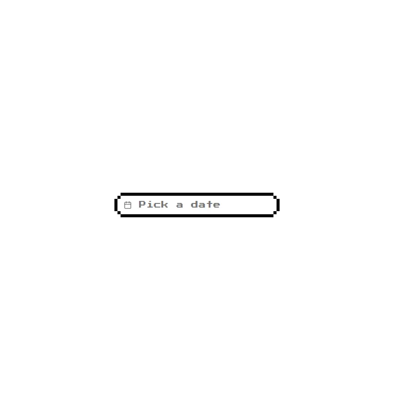
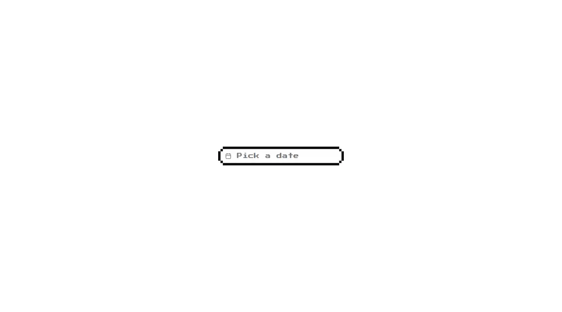
Measured
Every value below was written by the harness on the run that produced the frames above. None of it is derived from the prose.
| Build | OK |
|---|---|
| Mount | OK |
| Console errors | 0 |
| Uncaught page errors | 0 |
| Horizontal overflow | clean at 375, 768, 1440 |
| Axe critical | 0 |
| Axe serious | 0 |
| Axe moderate | 0 |
| Axe minor | 0 |
| Gzip marginal | 87.4 KB (152.8 KB build, 65.4 KB baseline) |
| Bare mode | FAIL |
| Provider required | NO |
| Demo used | written from the component source API |
What the harness recorded
BARE BUILD
✗ Build failed in 1.14s
error during build:
[vite]: Rollup failed to resolve import "lucide-react" from "<sandbox>re-b3d0f2a4038f/src/cut/components/ui/8bit/date-picker.tsx".
Verdict
A credible niche pick when the retro treatment is part of the product, not a novelty accent. The component is structurally straightforward and self-contained in use, but its broad primitive stack and internal-only date state make it less attractive for ordinary forms.
Use it if
- Your product deliberately uses a retro or pixel-art visual language.
- You need a compact single-date choice that can manage its own local state.
- Your app already follows shadcn conventions and can reuse its theme tokens and base primitives.
Skip it if
- Your form needs a controlled value, validation hooks, or a change callback without modifying the component.
- You need date ranges, time selection, or domain-specific disabled-date rules out of the box.
- You want a small dependency surface or cannot allow the stylesheet to request a Google-hosted font.
- Your interface has a neutral design system where the pixel borders and retro type would feel out of place.
Install
| Declared dependencies | date-fns, radix-ui, react-day-picker@latest, clsx, tailwind-merge |
|---|---|
| Missing on install | none |
| Bare install | fails once the shadcn-style helpers are removed, so it needs that setup |
| Provider | no provider required in the harness |
In a non-shadcn project, add compatible Button, Calendar, Popover, and Select primitives, Tailwind theme tokens, the cn class-merging helper, and matching import aliases. Install date-fns, React DayPicker, Radix controls, class variance utilities, Lucide icons, clsx, and tailwind-merge, then include the retro stylesheet or replace its external font import.
Source and credit
This page is a review, not a copy. The component source lives with its author and this site does not republish it. Read the license before you use anything.
Author repository
github.com/TheOrcDev/8bitcn-uiAlternatives
Other published entries for the calendar pattern, ordered by what they measured: mounts first, then clean axe scans, then bare-mode passes, then the smaller bundle.
- shadcn-calendarunclassified
- Renders
- YES
- A11y
- 0
- Gzip
- 37.3KB
- Bare
- fail
- Prov
- NO
- shadcn-block-calendar-01minimal-flat
- Renders
- YES
- A11y
- 0
- Gzip
- 50.8KB
- Bare
- fail
- Prov
- NO
- shadcn-block-calendar-02minimal-flat
- Renders
- YES
- A11y
- 0
- Gzip
- 50.9KB
- Bare
- fail
- Prov
- NO
- shadcn-block-calendar-03minimal-flat
- Renders
- YES
- A11y
- 0
- Gzip
- 50.9KB
- Bare
- fail
- Prov
- NO
- shadcn-block-calendar-04minimal-flat
- Renders
- YES
- A11y
- 0
- Gzip
- 50.9KB
- Bare
- fail
- Prov
- NO
- shadcn-block-calendar-05minimal-flat
- Renders
- YES
- A11y
- 0
- Gzip
- 50.9KB
- Bare
- fail
- Prov
- NO