Measured entry
8bitcn-timeline2
progressskeuomorphismmotion on file
A responsive React timeline block that lays milestones across a dashed track, then stacks them on narrow screens. It ships through a shadcn registry with Tailwind utility classes and retro CSS, depends on the shared cn helper, and imports its pixel font from Google Fonts.
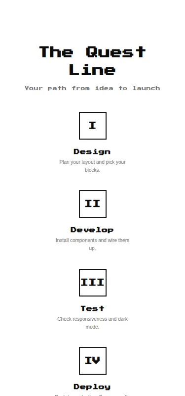
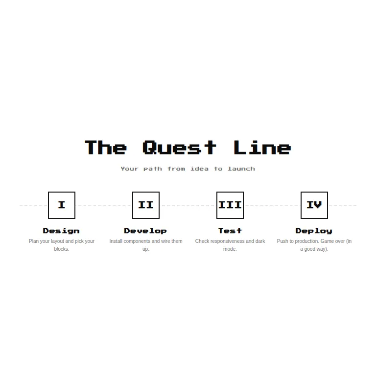
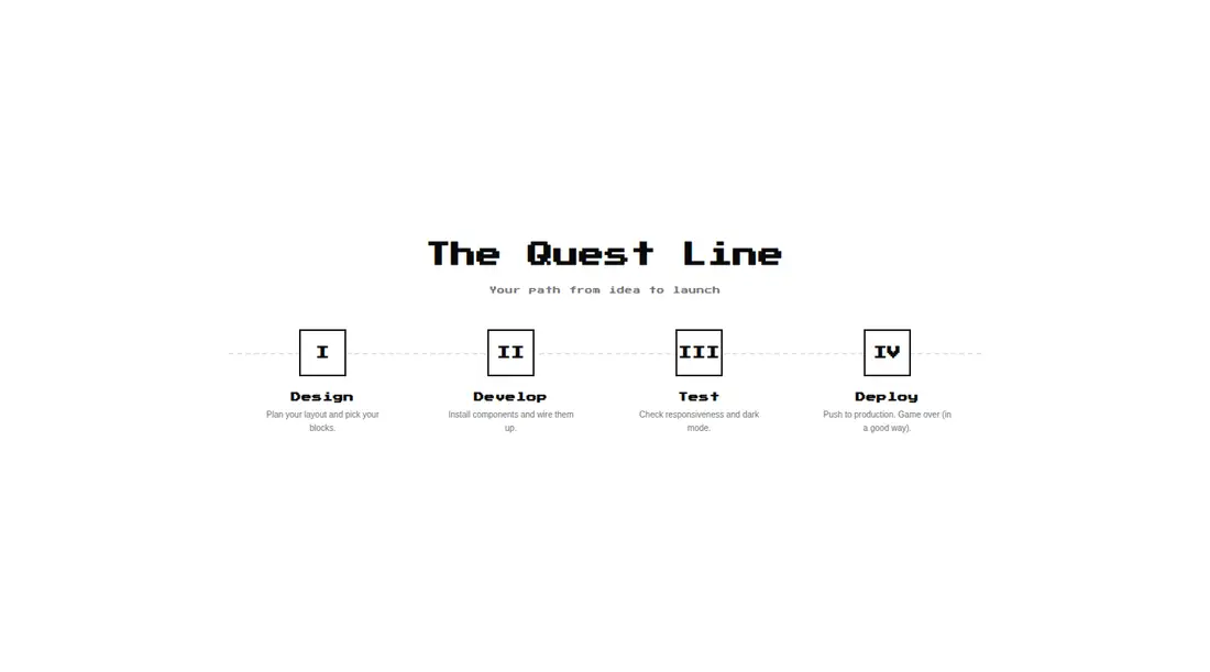
Measured
Every value below was written by the harness on the run that produced the frames above. None of it is derived from the prose.
| Build | OK |
|---|---|
| Mount | OK |
| Console errors | 0 |
| Uncaught page errors | 0 |
| Horizontal overflow | clean at 375, 768, 1440 |
| Axe critical | 0 |
| Axe serious | 0 |
| Axe moderate | 0 |
| Axe minor | 0 |
| Gzip marginal | 26.7 KB (92.1 KB build, 65.4 KB baseline) |
| Bare mode | FAIL |
| Provider required | NO |
| Demo used | written from the component source API |
What the harness recorded
BARE BUILD
✗ Build failed in 52.67s
error during build:
[vite:load-fallback] Could not load <sandbox>/src/lib/utils (imported by src/cut/components/ui/8bit/blocks/timeline2.tsx): ENOENT: no such file or directory, open '<sandbox>/src/lib/utils'
Verdict
A convincing themed milestone strip for short, fixed journeys, with a sensible mobile stack. It needs a shadcn-style setup before it will build, and its equal-looking checkpoints convey sequence rather than actual completion state.
Use it if
- You need a short sequence of milestones for a launch plan, onboarding path, or project overview.
- Your interface already uses pixel-art styling and can support the bundled retro font treatment.
- You want milestone icons and copy supplied as React data while keeping the layout responsive.
Skip it if
- You need current, complete, and blocked states to be visually or programmatically distinct.
- You need an ordered-list structure or richer progress semantics without revising the markup.
- Your product cannot load an external Google Font and you do not plan to self-host it.
- You expect long milestone titles or descriptions, since the compact layout gives each item limited room.
Install
| Declared dependencies | none declared |
|---|---|
| Missing on install | none |
| Bare install | fails once the shadcn-style helpers are removed, so it needs that setup |
| Provider | no provider required in the harness |
In a non-shadcn project, add Tailwind with the referenced theme tokens, configure the at-sign source alias, provide the shared cn class-merging helper, and copy the retro stylesheet. Permit the Google Fonts import or replace it with a self-hosted font.
Source and credit
This page is a review, not a copy. The component source lives with its author and this site does not republish it. Read the license before you use anything.
Author repository
github.com/TheOrcDev/8bitcn-uiAlternatives
Other published entries for the progress pattern, ordered by what they measured: mounts first, then clean axe scans, then bare-mode passes, then the smaller bundle.
- neu-progressneumorphism
- Renders
- YES
- A11y
- 0
- Gzip
- 17.8KB
- Bare
- pass
- Prov
- NO
- clay-progressclaymorphism
- Renders
- YES
- A11y
- 0
- Gzip
- 18.0KB
- Bare
- pass
- Prov
- NO
- tripled-scroll-progress-tracker-shadcnuigradient-glow
- Renders
- YES
- A11y
- 0
- Gzip
- 64.3KB
- Bare
- pass
- Prov
- NO
- magicui-animated-circular-progress-barbento
- Renders
- YES
- A11y
- 0
- Gzip
- 26.3KB
- Bare
- fail
- Prov
- NO
- magicui-scroll-progressdark-futuristic
- Renders
- YES
- A11y
- 0
- Gzip
- 69.0KB
- Bare
- fail
- Prov
- NO
- ruixen-progressive-flux-loadergradient-glow
- Renders
- YES
- A11y
- 0
- Gzip
- 69.6KB
- Bare
- fail
- Prov
- NO