Measured entry
neu-progress
progressneumorphismfirst party
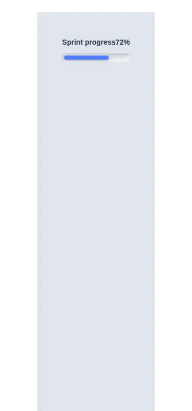
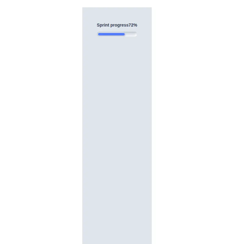
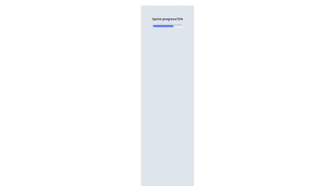
NeuProgress is a compact React progress indicator with a neumorphic track, a blue fill, an optional percentage readout, and an accessible progressbar role. It ships as one default-exported component with no package dependencies, but its layout, colors, shadows, and fill states rely on Tailwind utility classes and arbitrary-value support.
Measured
Every value below was written by the harness on the run that produced the frames above. None of it is derived from the prose.
| Build | OK |
|---|---|
| Mount | OK |
| Console errors | 0 |
| Uncaught page errors | 0 |
| Horizontal overflow | clean at 375, 768, 1440 |
| Axe critical | 0 |
| Axe serious | 0 |
| Axe moderate | 0 |
| Axe minor | 0 |
| Gzip marginal | 17.8 KB (83.2 KB build, 65.4 KB baseline) |
| Bare mode | OK |
| Provider required | NO |
| Demo used | written from the component source API |
Verdict
A focused, dependency-free React component that builds and mounts cleanly and includes sensible progress semantics. It is a good fit for neumorphic Tailwind screens, provided its stepped visual precision and fixed styling match the product.
Use it if
- You need a labeled determinate progress bar that accepts value and maximum props.
- Your interface already uses a soft neumorphic surface and Tailwind utilities.
- You are comfortable with the fill snapping to a small set of predefined width steps.
Skip it if
- You need visually continuous or highly precise progress changes rather than stepped fill widths.
- Your design system does not use neumorphic shadows or the component's fixed blue accent.
- You need an indeterminate state, segmented milestones, or built-in status messaging.
Install
| Declared dependencies | none declared |
|---|---|
| Missing on install | none |
| Bare install | builds and mounts without the shadcn-style helpers |
| Provider | no provider required in the harness |
First-party component from the sir-originals set. A non-shadcn project only needs React and Tailwind CSS configured to scan this component and preserve its arbitrary shadow and width utilities. No provider, helper library, or additional package is required.
Source and credit
This page is a review, not a copy. The component source lives with its author and this site does not republish it. Read the license before you use anything.
Author repository
mrkeyoor/sir-originalsAlternatives
Other published entries for the progress pattern, ordered by what they measured: mounts first, then clean axe scans, then bare-mode passes, then the smaller bundle.
- clay-progressclaymorphism
- Renders
- YES
- A11y
- 0
- Gzip
- 18.0KB
- Bare
- pass
- Prov
- NO
- tripled-scroll-progress-tracker-shadcnuigradient-glow
- Renders
- YES
- A11y
- 0
- Gzip
- 64.3KB
- Bare
- pass
- Prov
- NO
- magicui-animated-circular-progress-barbento
- Renders
- YES
- A11y
- 0
- Gzip
- 26.3KB
- Bare
- fail
- Prov
- NO
- 8bitcn-timeline2skeuomorphism
- Renders
- YES
- A11y
- 0
- Gzip
- 26.7KB
- Bare
- fail
- Prov
- NO
- magicui-scroll-progressdark-futuristic
- Renders
- YES
- A11y
- 0
- Gzip
- 69.0KB
- Bare
- fail
- Prov
- NO
- ruixen-progressive-flux-loadergradient-glow
- Renders
- YES
- A11y
- 0
- Gzip
- 69.6KB
- Bare
- fail
- Prov
- NO