Measured entry
8bitcn-xp-bar
transition-effectskeuomorphismmotion on file
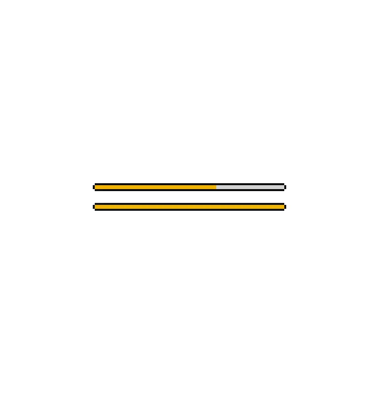
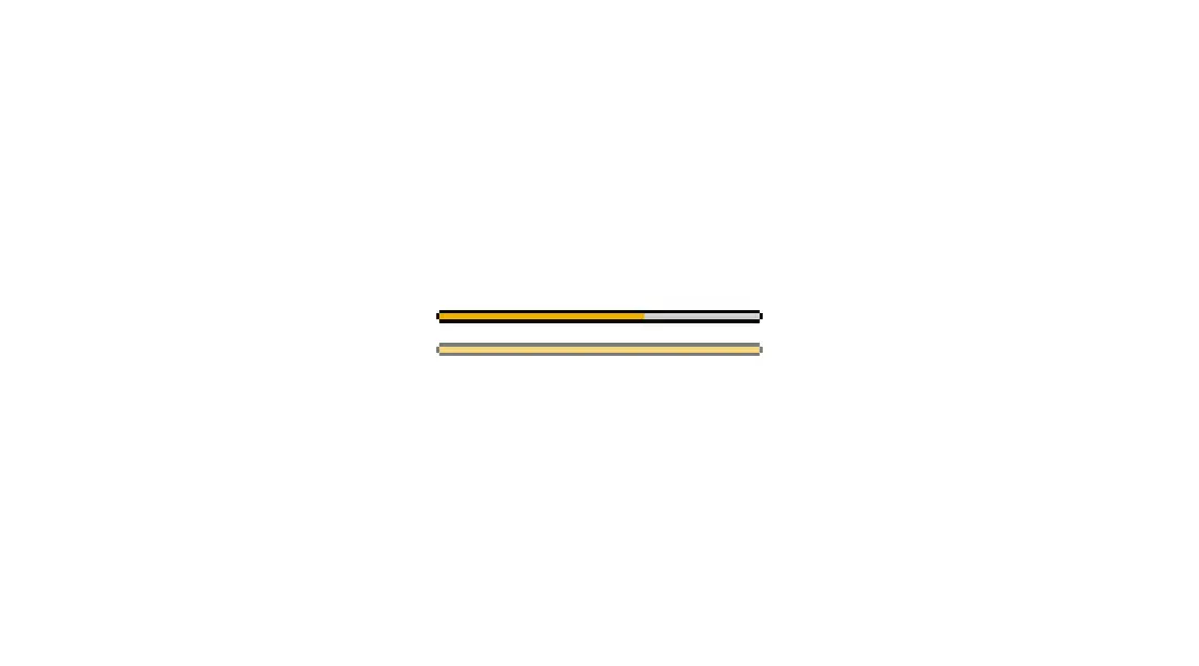
A pixel-styled experience bar that fills with a transition and flashes a configurable level-up message when complete. It ships as a shadcn registry bundle containing the wrapper, a Radix Progress primitive, and retro CSS, with Tailwind classes, CVA, a shared cn helper, and a Google-hosted font in the dependency chain.

Measured
Every value below was written by the harness on the run that produced the frames above. None of it is derived from the prose.
| Build | OK |
|---|---|
| Mount | OK |
| Console errors | 0 |
| Uncaught page errors | 0 |
| Horizontal overflow | flagged at 375 |
| Axe critical | 0 |
| Axe serious | 1 |
| Axe moderate | 0 |
| Axe minor | 0 |
| Gzip marginal | 33.0 KB (98.5 KB build, 65.5 KB baseline) |
| Bare mode | FAIL |
| Provider required | NO |
| Demo used | written from the component source API |
What the harness recorded
BARE BUILD
✗ Build failed in 1.13s
error during build:
[vite]: Rollup failed to resolve import "@radix-ui/react-progress" from "<sandbox>re-7929bf2c0db7/src/components/ui/8bit/progress.tsx".
Verdict
A focused, characterful choice for retro dashboards and game interfaces, and it builds and mounts cleanly. Adopt it only after supplying an accessible label and checking narrow layouts; the completion blink should also respect your motion policy.
Use it if
- You need a game-like progress indicator with an explicit completion celebration.
- Your interface already uses Tailwind and can accommodate the component's pixel-art styling.
- You want both a continuous fill and an optional segmented retro variant.
Skip it if
- You need an accessible progress bar without adding a label yourself, since the supplied component has no accessible name.
- Your layout must remain overflow-free in narrow containers without adjustment.
- Your visual system is restrained or corporate and the heavy pixel border and blinking completion message would feel out of place.
- Your project cannot load a font from Google or bundle a local replacement.
Install
| Declared dependencies | clsx, tailwind-merge |
|---|---|
| Missing on install | none |
| Bare install | fails once the shadcn-style helpers are removed, so it needs that setup |
| Provider | no provider required in the harness |
In a non-shadcn project, add Radix Progress, class-variance-authority, clsx, and tailwind-merge; provide the cn utility and matching import aliases; configure Tailwind to scan the component files; and include the retro stylesheet plus either its Google font import or a local font replacement. Add an accessible label when rendering the bar.
Source and credit
This page is a review, not a copy. The component source lives with its author and this site does not republish it. Read the license before you use anything.
Author repository
github.com/TheOrcDev/8bitcn-uiAlternatives
Other published entries for the transition-effect pattern, ordered by what they measured: mounts first, then clean axe scans, then bare-mode passes, then the smaller bundle.
- motion-primitives-morphing-dialogspatial
- Renders
- YES
- A11y
- 0
- Gzip
- 17.2KB
- Bare
- pass
- Prov
- NO
- motion-primitives-morphing-popoverspatial
- Renders
- YES
- A11y
- 0
- Gzip
- 17.3KB
- Bare
- pass
- Prov
- NO
- motion-primitives-animated-groupspatial
- Renders
- YES
- A11y
- 0
- Gzip
- 58.2KB
- Bare
- pass
- Prov
- NO
- ruixen-glass-shipment-flowliquid-glass
- Renders
- YES
- A11y
- 0
- Gzip
- 60.0KB
- Bare
- pass
- Prov
- NO
- magicui-animated-listunclassified
- Renders
- YES
- A11y
- 0
- Gzip
- 54.0KB
- Bare
- fail
- Prov
- NO
- magicui-blur-fadedark-futuristic
- Renders
- YES
- A11y
- 0
- Gzip
- 63.2KB
- Bare
- fail
- Prov
- NO