Measured entry
magicui-blur-fade
transition-effectdark-futuristicmotion on file
A client-side React wrapper that animates its child from blurred, offset, and transparent to clear and visible, optionally when it enters the viewport. It ships as a shadcn registry UI file and imports AnimatePresence, motion, and useInView from Motion.
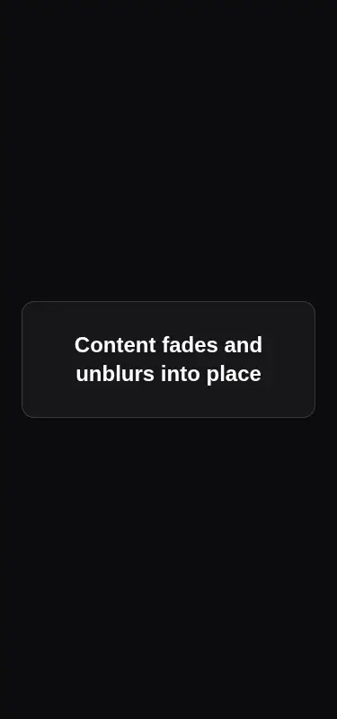

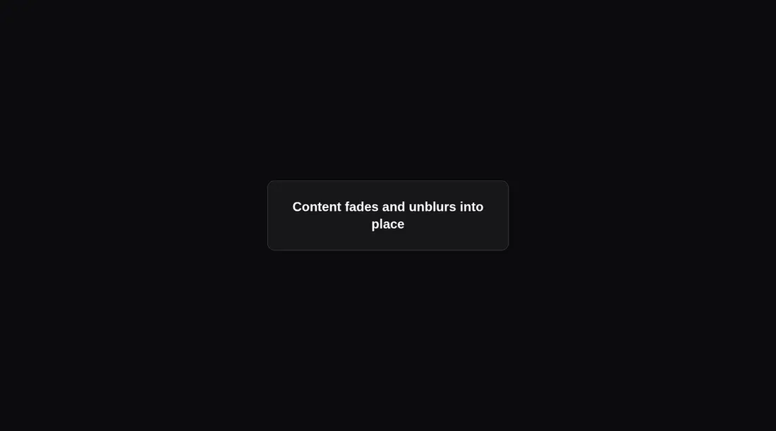
Measured
Every value below was written by the harness on the run that produced the frames above. None of it is derived from the prose.
| Build | OK |
|---|---|
| Mount | OK |
| Console errors | 0 |
| Uncaught page errors | 0 |
| Horizontal overflow | clean at 375, 768, 1440 |
| Axe critical | 0 |
| Axe serious | 0 |
| Axe moderate | 0 |
| Axe minor | 0 |
| Gzip marginal | 63.2 KB (128.7 KB build, 65.5 KB baseline) |
| Bare mode | FAIL |
| Provider required | NO |
| Demo used | written from the component source API |
What the harness recorded
BARE BUILD
spawnSync npx ETIMEDOUT
Verdict
A sound, configurable reveal primitive that builds and mounts cleanly in the configured harness. The bare check did not mount, so it needs a shadcn-style setup. It is easiest to justify when Motion is already part of the app; otherwise the dependency cost is steep for one transition.
Use it if
- You want one reusable wrapper for entrance reveals across cards, headings, or media.
- Your app already uses Motion and can absorb another animated client component.
- You need configurable direction, delay, blur, or viewport-triggered playback.
Skip it if
- You would add Motion solely for this effect and prefer a small CSS transition.
- You require built-in reduced-motion handling rather than adding that policy yourself.
- Your layout cannot accept the extra div that wraps every animated child.
- You need the content to remain a server-only React component.
Install
| Declared dependencies | motion |
|---|---|
| Missing on install | none |
| Bare install | fails once the shadcn-style helpers are removed, so it needs that setup |
| Provider | no provider required in the harness |
In a non-shadcn project, add Motion, copy the client component into your source tree, and ensure the React build accepts client directives and resolves motion/react. No context provider is required.
Source and credit
This page is a review, not a copy. The component source lives with its author and this site does not republish it. Read the license before you use anything.
Author repository
github.com/magicuidesign/magicuiAlternatives
Other published entries for the transition-effect pattern, ordered by what they measured: mounts first, then clean axe scans, then bare-mode passes, then the smaller bundle.
- motion-primitives-morphing-dialogspatial
- Renders
- YES
- A11y
- 0
- Gzip
- 17.2KB
- Bare
- pass
- Prov
- NO
- motion-primitives-morphing-popoverspatial
- Renders
- YES
- A11y
- 0
- Gzip
- 17.3KB
- Bare
- pass
- Prov
- NO
- motion-primitives-animated-groupspatial
- Renders
- YES
- A11y
- 0
- Gzip
- 58.2KB
- Bare
- pass
- Prov
- NO
- ruixen-glass-shipment-flowliquid-glass
- Renders
- YES
- A11y
- 0
- Gzip
- 60.0KB
- Bare
- pass
- Prov
- NO
- magicui-animated-listunclassified
- Renders
- YES
- A11y
- 0
- Gzip
- 54.0KB
- Bare
- fail
- Prov
- NO
- motion-primitives-transition-panelspatial
- Renders
- YES
- A11y
- 0
- Gzip
- 67.8KB
- Bare
- fail
- Prov
- NO