Measured entry
ruixen-glass-shipment-flow
transition-effectliquid-glassmotion on file
A client-side React shipment flow that places two glass-styled order cards around animated request and response rails. It ships as a shadcn registry component, but is self-contained: its light and dark theme CSS, SVG, icons, and layout are embedded in the file. Its only added package dependency is Motion for the card entrance animation.
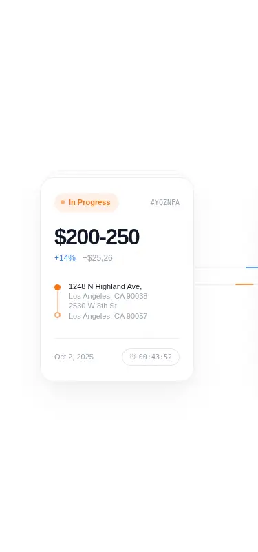
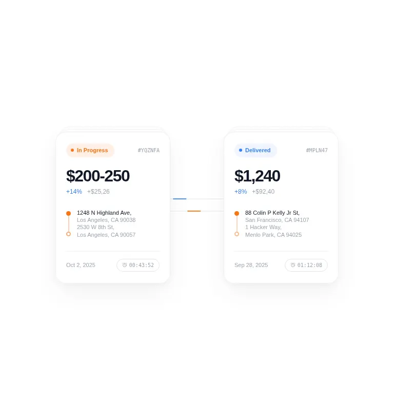
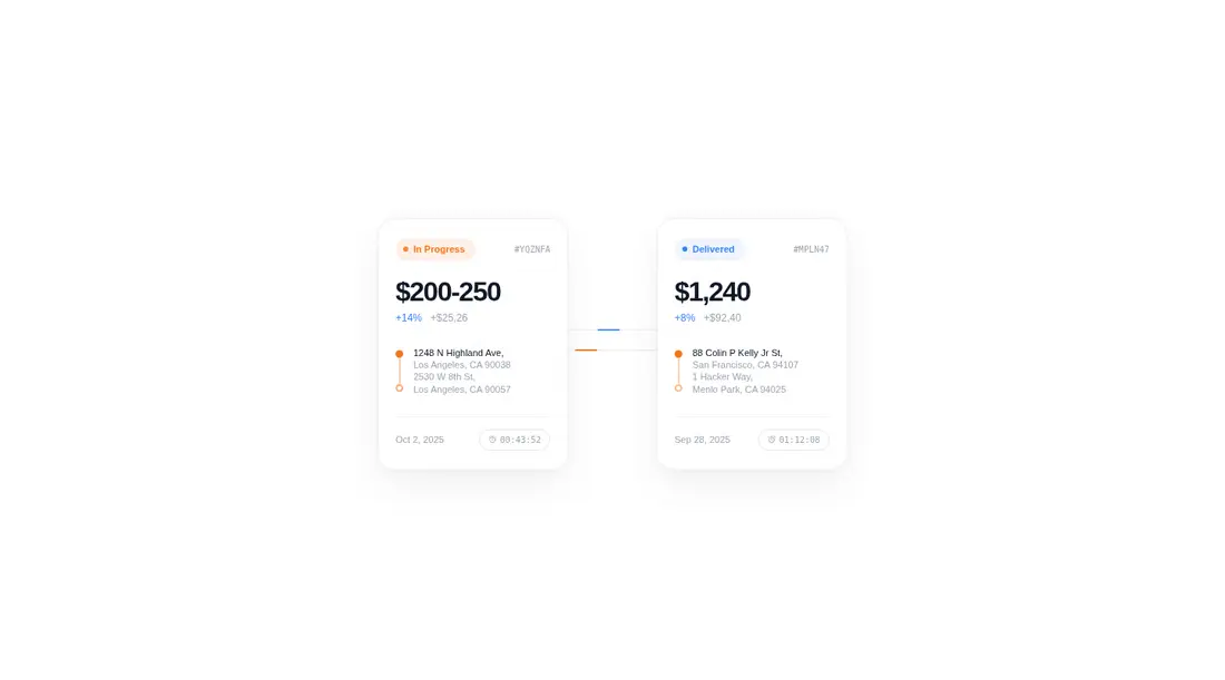
Measured
Every value below was written by the harness on the run that produced the frames above. None of it is derived from the prose.
| Build | OK |
|---|---|
| Mount | OK |
| Console errors | 0 |
| Uncaught page errors | 0 |
| Horizontal overflow | flagged at 375 |
| Axe critical | 0 |
| Axe serious | 0 |
| Axe moderate | 0 |
| Axe minor | 0 |
| Gzip marginal | 60.0 KB (125.4 KB build, 65.4 KB baseline) |
| Bare mode | OK |
| Provider required | NO |
| Demo used | written from the component source API |
Verdict
A focused, polished desktop visual with clean standalone mounting and no provider setup. Use it as a starting point for a shipment showcase, not a drop-in production tracker: mobile layout, real data plumbing, and motion preferences still need deliberate work.
Use it if
- You need a polished, read-only shipment comparison for a roomy dashboard or landing-page section.
- Your interface already uses glass surfaces and can accommodate the component's fixed horizontal composition.
- You are comfortable replacing the sample order content directly in the component or adding data props.
Skip it if
- The flow must fit narrow phone layouts without a responsive rewrite; the current composition clips horizontally.
- You need a reusable data-driven shipment widget out of the box; the content is fixed and the public API only exposes styling.
- You want to avoid adding Motion for a small entrance effect, or need built-in reduced-motion behavior.
Install
| Declared dependencies | motion |
|---|---|
| Missing on install | none |
| Bare install | builds and mounts without the shadcn-style helpers |
| Provider | no provider required in the harness |
Copy the client component into your React project and install Motion. Keep the embedded CSS or move its theme variables and animations into your stylesheet. No shadcn utilities or provider are required, but non-shadcn apps must support client components, JSX, inline SVG, and backdrop filters.
Source and credit
This page is a review, not a copy. The component source lives with its author and this site does not republish it. Read the license before you use anything.
Author repository
github.com/ruixenui/ruixen.comAlternatives
Other published entries for the transition-effect pattern, ordered by what they measured: mounts first, then clean axe scans, then bare-mode passes, then the smaller bundle.
- motion-primitives-morphing-dialogspatial
- Renders
- YES
- A11y
- 0
- Gzip
- 17.2KB
- Bare
- pass
- Prov
- NO
- motion-primitives-morphing-popoverspatial
- Renders
- YES
- A11y
- 0
- Gzip
- 17.3KB
- Bare
- pass
- Prov
- NO
- motion-primitives-animated-groupspatial
- Renders
- YES
- A11y
- 0
- Gzip
- 58.2KB
- Bare
- pass
- Prov
- NO
- magicui-animated-listunclassified
- Renders
- YES
- A11y
- 0
- Gzip
- 54.0KB
- Bare
- fail
- Prov
- NO
- magicui-blur-fadedark-futuristic
- Renders
- YES
- A11y
- 0
- Gzip
- 63.2KB
- Bare
- fail
- Prov
- NO
- motion-primitives-transition-panelspatial
- Renders
- YES
- A11y
- 0
- Gzip
- 67.8KB
- Bare
- fail
- Prov
- NO