Measured entry
clay-avatar
avatarclaymorphismfirst party
A self-contained React avatar with a claymorphic frame, image or initials fallback, preset sizes and colors, and an optional presence dot. It ships as a single JSX component with no package dependencies, but its styling relies on Tailwind utility classes and arbitrary values.
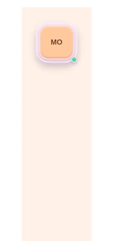
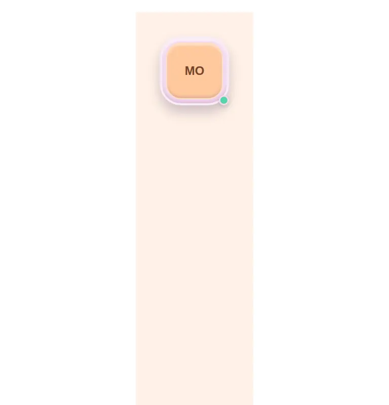
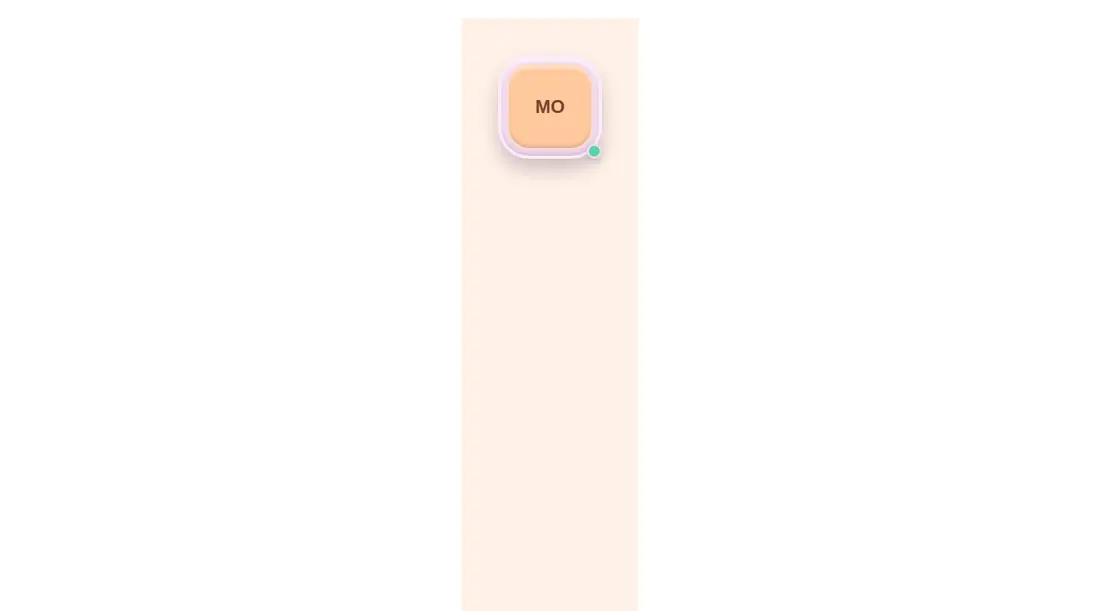
Measured
Every value below was written by the harness on the run that produced the frames above. None of it is derived from the prose.
| Build | OK |
|---|---|
| Mount | OK |
| Console errors | 0 |
| Uncaught page errors | 0 |
| Horizontal overflow | clean at 375, 768, 1440 |
| Axe critical | 0 |
| Axe serious | 1 |
| Axe moderate | 0 |
| Axe minor | 0 |
| Gzip marginal | 18.2 KB (83.6 KB build, 65.4 KB baseline) |
| Bare mode | OK |
| Provider required | NO |
| Demo used | written from the component source API |
Verdict
A focused, dependency-free avatar that builds, mounts, and stays contained across the tested layouts. It is practical for clay-styled interfaces, but the status element uses an ARIA label on a generic span, so fix that accessibility issue before production use.
Use it if
- You need a compact profile avatar that accepts either an image or initials.
- Your interface already uses Tailwind and a soft claymorphic visual language.
- You want a simple optional presence indicator without adding a component library.
Skip it if
- Your product uses a restrained, flat, or highly formal design system.
- You need an accessible status announcement without modifying the component's current generic span markup.
- Your project does not use Tailwind and you do not want to translate its utility-heavy styling.
Install
| Declared dependencies | none declared |
|---|---|
| Missing on install | none |
| Bare install | builds and mounts without the shadcn-style helpers |
| Provider | no provider required in the harness |
First-party component from the sir-originals set. In a non-shadcn project, add the JSX component and ensure React and Tailwind CSS are configured to scan its file. Tailwind must support the arbitrary color, radius, border, inset-shadow, and sizing utilities used here. Replace the status span with accessible markup or expose its meaning in nearby text.
Source and credit
This page is a review, not a copy. The component source lives with its author and this site does not republish it. Read the license before you use anything.
Author repository
mrkeyoor/sir-originalsAlternatives
Other published entries for the avatar pattern, ordered by what they measured: mounts first, then clean axe scans, then bare-mode passes, then the smaller bundle.
- hextaui-avatarminimal-flat
- Renders
- YES
- A11y
- 0
- Gzip
- 32.7KB
- Bare
- pass
- Prov
- NO
- neobrutalism-avatarbrutalism
- Renders
- YES
- A11y
- 0
- Gzip
- 32.7KB
- Bare
- pass
- Prov
- NO
- shadcn-avatarunclassified
- Renders
- YES
- A11y
- 0
- Gzip
- 33.0KB
- Bare
- pass
- Prov
- NO
- tripled-native-avatar-expand-shadcnuiminimal-flat
- Renders
- YES
- A11y
- 0
- Gzip
- 75.4KB
- Bare
- pass
- Prov
- NO
- tripled-native-avatar-with-name-shadcnuiminimal-flat
- Renders
- YES
- A11y
- 0
- Gzip
- 75.5KB
- Bare
- pass
- Prov
- NO
- magicui-avatar-circlesbento
- Renders
- YES
- A11y
- 0
- Gzip
- 26.0KB
- Bare
- fail
- Prov
- NO