Measured entry
clay-button
buttonclaymorphismfirst party
A standalone React button that creates a soft claymorphism treatment with inset highlights, deep shadows, rounded edges, and press feedback. It ships as one JSX component, forwards native button props, and has built-in violet, coral, and mint tones. It needs React and a Tailwind setup that can compile its utility and arbitrary-value classes, but no provider or extra package.
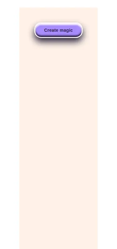
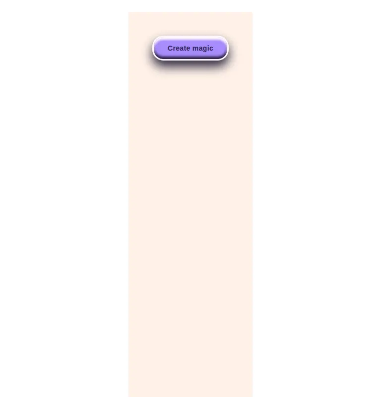
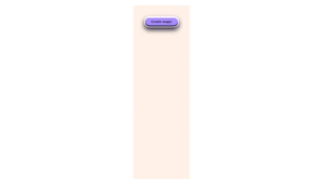
Measured
Every value below was written by the harness on the run that produced the frames above. None of it is derived from the prose.
| Build | OK |
|---|---|
| Mount | OK |
| Console errors | 0 |
| Uncaught page errors | 0 |
| Horizontal overflow | clean at 375, 768, 1440 |
| Axe critical | 0 |
| Axe serious | 0 |
| Axe moderate | 0 |
| Axe minor | 0 |
| Gzip marginal | 18.2 KB (83.6 KB build, 65.4 KB baseline) |
| Bare mode | OK |
| Provider required | NO |
| Demo used | written from the component source API |
Verdict
A focused, dependency-light choice when the clay look is intentional. It mounts cleanly without a provider and covers the essential native button states, but its visual language is strong and its API is deliberately narrow, so it works better as a featured action than a universal button primitive.
Use it if
- You need a playful primary action for a toy, creator, education, or casual consumer interface.
- Your React app already uses Tailwind and can preserve arbitrary color, shadow, radius, and transform utilities.
- You want a native button with disabled, focus, hover, and pressed states already expressed in the component.
Skip it if
- Your product uses a restrained enterprise design system where the thick border and dimensional shadow would feel out of place.
- You need icon sizing, loading state, polymorphic rendering, or a broader button variant API without extending the source.
- Your project does not use Tailwind and you do not want to translate the utility classes into local CSS.
Install
| Declared dependencies | none declared |
|---|---|
| Missing on install | none |
| Bare install | builds and mounts without the shadcn-style helpers |
| Provider | no provider required in the harness |
First-party component from the sir-originals set. In a non-shadcn project, add the component to a React codebase and ensure Tailwind scans the file and supports its arbitrary utility classes. If Tailwind is not present, recreate the utilities in local CSS. No provider, helper library, or additional runtime package is required.
Source and credit
This page is a review, not a copy. The component source lives with its author and this site does not republish it. Read the license before you use anything.
Author repository
mrkeyoor/sir-originalsAlternatives
Other published entries for the button pattern, ordered by what they measured: mounts first, then clean axe scans, then bare-mode passes, then the smaller bundle.
- neu-buttonneumorphism
- Renders
- YES
- A11y
- 0
- Gzip
- 17.8KB
- Bare
- pass
- Prov
- NO
- tripled-animated-radio-shadcnuiminimal-flat
- Renders
- YES
- A11y
- 0
- Gzip
- 58.2KB
- Bare
- pass
- Prov
- NO
- ruixen-glow-link-buttonliquid-glass
- Renders
- YES
- A11y
- 0
- Gzip
- 58.9KB
- Bare
- pass
- Prov
- NO
- tripled-mood-gradient-button-shadcnuigradient-glow
- Renders
- YES
- A11y
- 0
- Gzip
- 59.2KB
- Bare
- pass
- Prov
- NO
- ruixen-glass-ai-cardliquid-glass
- Renders
- YES
- A11y
- 0
- Gzip
- 59.5KB
- Bare
- pass
- Prov
- NO
- ruixen-add-to-cart-buttonunclassified
- Renders
- YES
- A11y
- 0
- Gzip
- 60.4KB
- Bare
- pass
- Prov
- NO