Measured entry
neu-button
buttonneumorphismfirst party
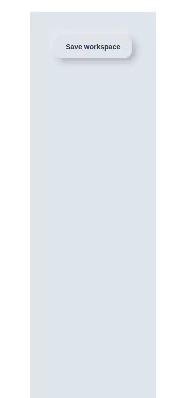
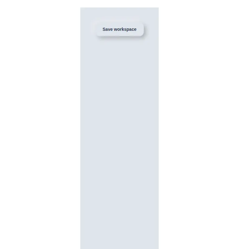
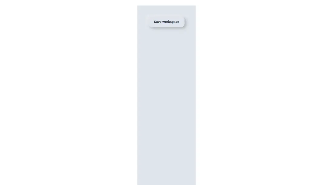
A standalone React button that renders a native button with a fixed soft-gray neumorphic treatment, including raised, pressed, hover, focus, and disabled states. It ships as one JSX component, uses Tailwind utility classes with arbitrary values, accepts normal button props, and has no extra runtime package dependencies.
Measured
Every value below was written by the harness on the run that produced the frames above. None of it is derived from the prose.
| Build | OK |
|---|---|
| Mount | OK |
| Console errors | 0 |
| Uncaught page errors | 0 |
| Horizontal overflow | clean at 375, 768, 1440 |
| Axe critical | 0 |
| Axe serious | 0 |
| Axe moderate | 0 |
| Axe minor | 0 |
| Gzip marginal | 17.8 KB (83.2 KB build, 65.4 KB baseline) |
| Bare mode | OK |
| Provider required | NO |
| Demo used | written from the component source API |
Verdict
A sound, self-contained choice for a light neumorphic interface. Native semantics and complete interaction states make it practical, but the hard-coded surface colors and shadows tie it closely to one visual context and will need refactoring for a themed design system.
Use it if
- You need a compact neumorphic action that works with native button semantics.
- Your interface already uses the same soft-gray surface and light-source illusion.
- You want hover, keyboard focus, pressed, and disabled styling in a single component.
Skip it if
- Your product uses a flat, high-contrast, or dark visual system where the fixed palette would feel out of place.
- You need theme tokens or automatic color-mode support instead of hard-coded colors and shadows.
- Your build does not support Tailwind arbitrary-value utilities and you do not want to translate the styles to CSS.
Install
| Declared dependencies | none declared |
|---|---|
| Missing on install | none |
| Bare install | builds and mounts without the shadcn-style helpers |
| Provider | no provider required in the harness |
First-party component from the sir-originals set. A non-shadcn project needs React with JSX compilation and Tailwind configured to scan this component. If Tailwind is unavailable, reproduce the utility rules in regular CSS. Place the button on a matching light-gray surface so its paired shadows read correctly.
Source and credit
This page is a review, not a copy. The component source lives with its author and this site does not republish it. Read the license before you use anything.
Author repository
mrkeyoor/sir-originalsAlternatives
Other published entries for the button pattern, ordered by what they measured: mounts first, then clean axe scans, then bare-mode passes, then the smaller bundle.
- clay-buttonclaymorphism
- Renders
- YES
- A11y
- 0
- Gzip
- 18.2KB
- Bare
- pass
- Prov
- NO
- tripled-animated-radio-shadcnuiminimal-flat
- Renders
- YES
- A11y
- 0
- Gzip
- 58.2KB
- Bare
- pass
- Prov
- NO
- ruixen-glow-link-buttonliquid-glass
- Renders
- YES
- A11y
- 0
- Gzip
- 58.9KB
- Bare
- pass
- Prov
- NO
- tripled-mood-gradient-button-shadcnuigradient-glow
- Renders
- YES
- A11y
- 0
- Gzip
- 59.2KB
- Bare
- pass
- Prov
- NO
- ruixen-glass-ai-cardliquid-glass
- Renders
- YES
- A11y
- 0
- Gzip
- 59.5KB
- Bare
- pass
- Prov
- NO
- ruixen-add-to-cart-buttonunclassified
- Renders
- YES
- A11y
- 0
- Gzip
- 60.4KB
- Bare
- pass
- Prov
- NO