Measured entry
ruixen-glow-link-button
buttonliquid-glassmotion on file
A client-side React link styled as a liquid-glass pill, distributed through a shadcn registry item. It injects its own light and dark theme CSS, uses Motion for hover, press, and arrow animation, tracks the pointer for a radial glow, and can create a short Web Audio tick on click.

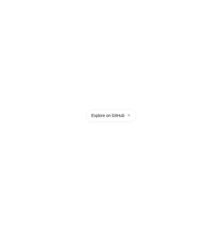
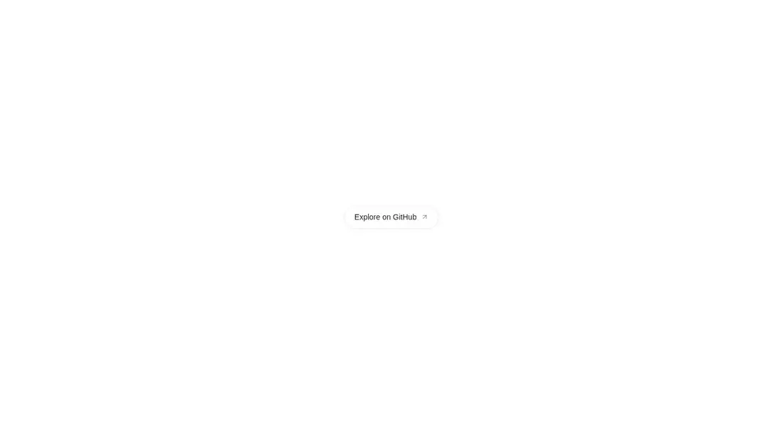
Measured
Every value below was written by the harness on the run that produced the frames above. None of it is derived from the prose.
| Build | OK |
|---|---|
| Mount | OK |
| Console errors | 0 |
| Uncaught page errors | 0 |
| Horizontal overflow | clean at 375, 768, 1440 |
| Axe critical | 0 |
| Axe serious | 0 |
| Axe moderate | 0 |
| Axe minor | 0 |
| Gzip marginal | 58.9 KB (124.3 KB build, 65.4 KB baseline) |
| Bare mode | OK |
| Provider required | NO |
| Demo used | written from the component source API |
Verdict
A focused, working choice for a decorative outbound call-to-action. It mounts without framework scaffolding and keeps its styling local, but the mandatory new-tab behavior, default click sound, and Motion dependency make it less suitable as a general-purpose button.
Use it if
- You need a prominent outbound link with animated hover and press feedback.
- Your React app already uses Motion or can justify adding it for this interaction.
- You want a self-contained control whose colors adapt to a dark class or data-theme attribute.
Skip it if
- You need a submit, reset, or in-app action button rather than an anchor that opens a new tab.
- Your design system forbids component-injected style tags or extensive inline styles.
- You want to avoid an animation dependency for a single call-to-action.
- Click sounds are inappropriate and you do not want to remember to disable the enabled-by-default audio option.
Install
| Declared dependencies | motion |
|---|---|
| Missing on install | none |
| Bare install | builds and mounts without the shadcn-style helpers |
| Provider | no provider required in the harness |
In a non-shadcn React project, copy the client component, install Motion, and ensure the file runs in a browser-rendered client boundary. No provider or shared utility layer is required. Pass a real destination and disable sound where audio feedback is not wanted.
Source and credit
This page is a review, not a copy. The component source lives with its author and this site does not republish it. Read the license before you use anything.
Author repository
github.com/ruixenui/ruixen.comAlternatives
Other published entries for the button pattern, ordered by what they measured: mounts first, then clean axe scans, then bare-mode passes, then the smaller bundle.
- neu-buttonneumorphism
- Renders
- YES
- A11y
- 0
- Gzip
- 17.8KB
- Bare
- pass
- Prov
- NO
- clay-buttonclaymorphism
- Renders
- YES
- A11y
- 0
- Gzip
- 18.2KB
- Bare
- pass
- Prov
- NO
- tripled-animated-radio-shadcnuiminimal-flat
- Renders
- YES
- A11y
- 0
- Gzip
- 58.2KB
- Bare
- pass
- Prov
- NO
- tripled-mood-gradient-button-shadcnuigradient-glow
- Renders
- YES
- A11y
- 0
- Gzip
- 59.2KB
- Bare
- pass
- Prov
- NO
- ruixen-glass-ai-cardliquid-glass
- Renders
- YES
- A11y
- 0
- Gzip
- 59.5KB
- Bare
- pass
- Prov
- NO
- ruixen-add-to-cart-buttonunclassified
- Renders
- YES
- A11y
- 0
- Gzip
- 60.4KB
- Bare
- pass
- Prov
- NO