Measured entry
clay-slider
sliderclaymorphismfirst party
A controlled React range input wrapped in a claymorphism label, value badge, and inset track shell. It ships as one JSX component with no third-party package imports, but its appearance depends on Tailwind utilities, including arbitrary colors, radii, and shadows.
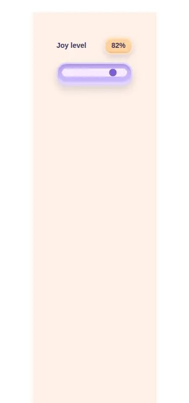
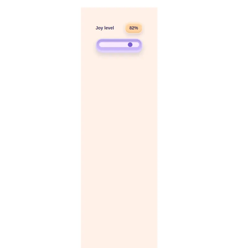
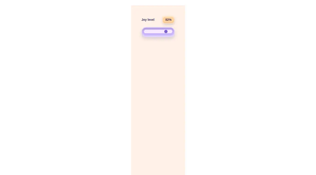
Measured
Every value below was written by the harness on the run that produced the frames above. None of it is derived from the prose.
| Build | OK |
|---|---|
| Mount | OK |
| Console errors | 0 |
| Uncaught page errors | 0 |
| Horizontal overflow | clean at 375, 768, 1440 |
| Axe critical | 0 |
| Axe serious | 0 |
| Axe moderate | 0 |
| Axe minor | 0 |
| Gzip marginal | 18.1 KB (83.5 KB build, 65.4 KB baseline) |
| Bare mode | OK |
| Provider required | NO |
| Demo used | written from the component source API |
Verdict
A focused, dependency-light slider that mounts cleanly and keeps native range semantics. It is a good fit for playful Tailwind screens, but the fixed palette, controlled-value contract, and mostly native thumb treatment make it less suitable as a general-purpose slider primitive.
Use it if
- You want a labeled, controlled range input that fits a playful claymorphism interface.
- Your React app already compiles Tailwind arbitrary-value utilities.
- You are comfortable receiving the native input change event and managing the value in the parent.
Skip it if
- You need a neutral slider that inherits an existing design-token system instead of fixed pastel styling.
- You need a fully custom thumb and track with consistent rendering across browsers.
- You need built-in value clamping, step labels, multiple thumbs, or range selection.
Install
| Declared dependencies | none declared |
|---|---|
| Missing on install | none |
| Bare install | builds and mounts without the shadcn-style helpers |
| Provider | no provider required in the harness |
First-party component from the sir-originals set. Add React and configure Tailwind to scan this component so its arbitrary color, radius, shadow, and focus-ring classes are generated. No shadcn components, provider, or additional package dependency is required.
Source and credit
This page is a review, not a copy. The component source lives with its author and this site does not republish it. Read the license before you use anything.
Author repository
mrkeyoor/sir-originalsAlternatives
Other published entries for the slider pattern, ordered by what they measured: mounts first, then clean axe scans, then bare-mode passes, then the smaller bundle.
- neu-sliderneumorphism
- Renders
- YES
- A11y
- 0
- Gzip
- 17.7KB
- Bare
- pass
- Prov
- NO
- ruixen-fine-tune-sliderunclassified
- Renders
- YES
- A11y
- 0
- Gzip
- 61.5KB
- Bare
- pass
- Prov
- NO
- tripled-volume-component-shadcnuiminimal-flat
- Renders
- YES
- A11y
- 0
- Gzip
- 72.7KB
- Bare
- fail
- Prov
- NO
- tripled-cards-slider-shadcnuiliquid-glass
- Renders
- YES
- A11y
- 0
- Gzip
- 76.4KB
- Bare
- fail
- Prov
- NO
- shadcn-sliderunclassified
- Renders
- YES
- A11y
- 1
- Gzip
- 39.2KB
- Bare
- pass
- Prov
- NO
- neobrutalism-sliderbrutalism
- Renders
- YES
- A11y
- 1
- Gzip
- 39.3KB
- Bare
- pass
- Prov
- NO